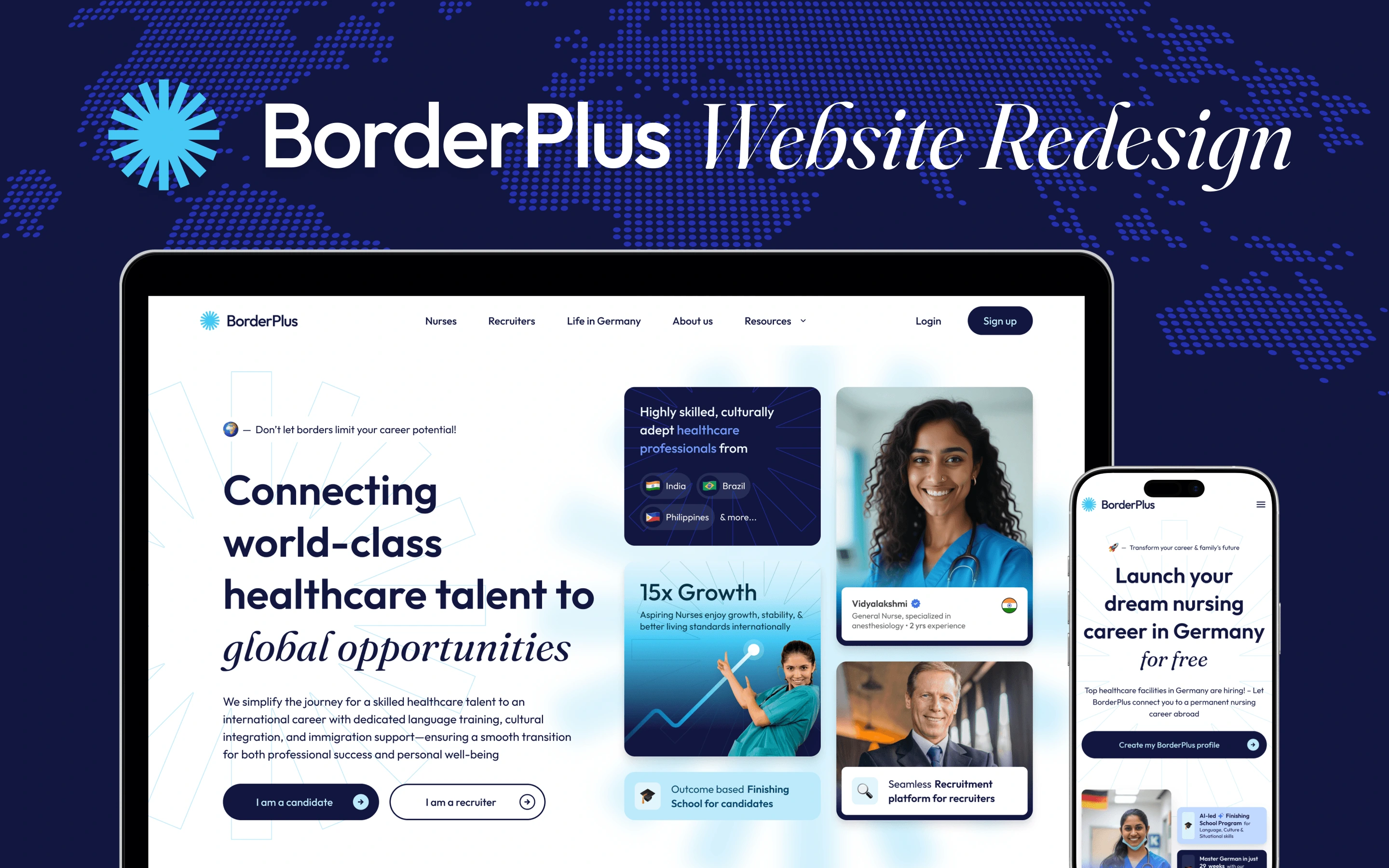
As a freelance Design Lead, I recently took on the challenge of overhauling the digital presence for BorderPlus, a global two-sided talent mobility platform. Their mission is ambitious: helping international nurses build lucrative careers in Germany, while serving as a critical lifeline for European healthcare institutes facing a severe staffing crisis. When I joined the team, they already had early traction, but their digital presence was severely lagging behind their actual business growth.
End-to-End
Owned the full cycle: mapping IA, crafting UX/UI, content strategy, and dual-funnel re-architecture.
Decisions
Candidates are relocating lives; hospitals are risking operations. A flashy UI doesn't convert; genuine trust does.
Engine
Shifted away from a cosmetic redesign to build a comprehensive, transparent acquisition system.
The existing site suffered from poor navigation, shallow messaging, and weak trust signals. But the deeper issue wasn't just a typical conversion problem—it was a contextual one. We were asking users to entirely change their lives, and hospitals to trust a new operational partner.
The real task wasn't just designing pretty pages; it was structuring a two-sided system that users could genuinely believe in and safely act upon.
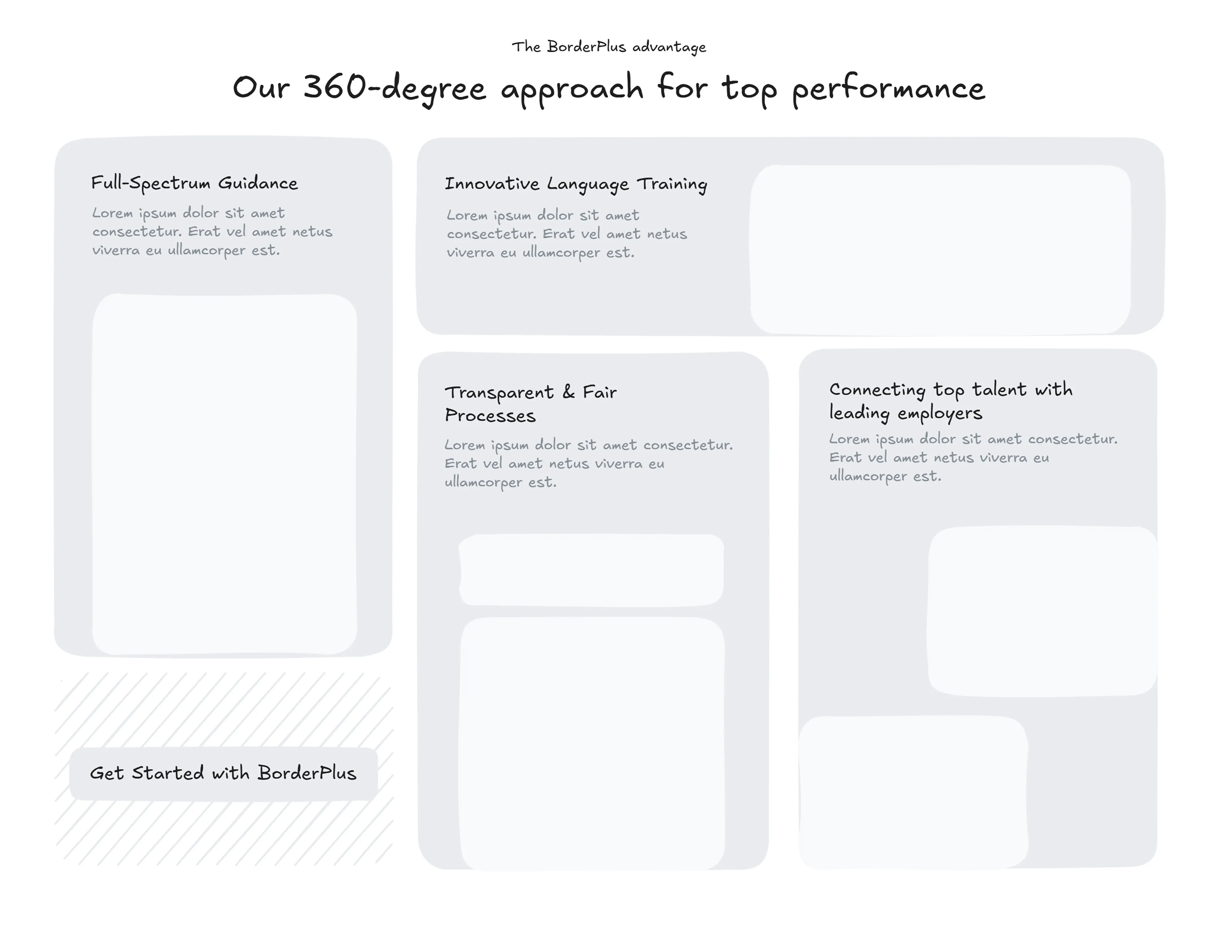
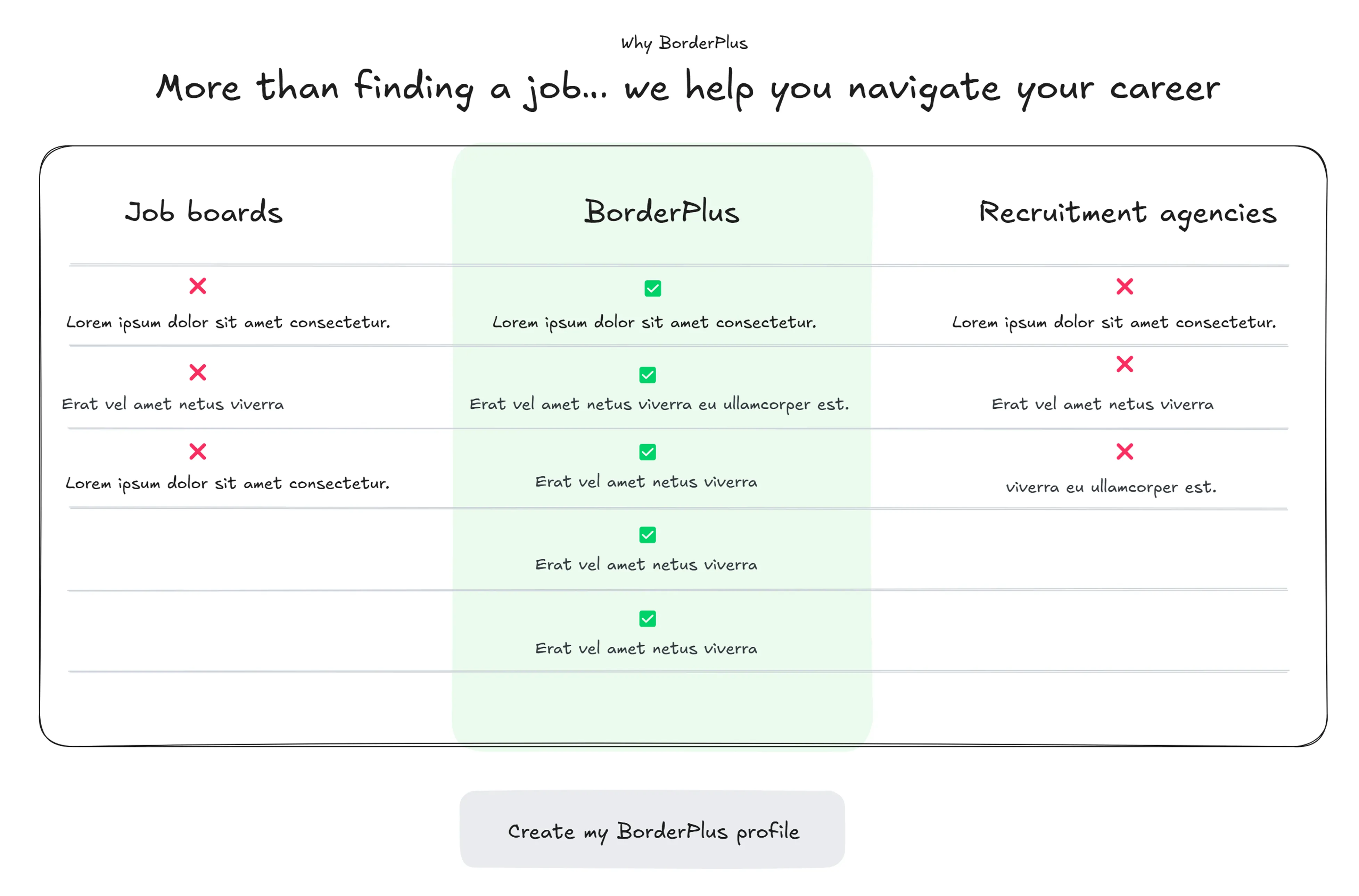
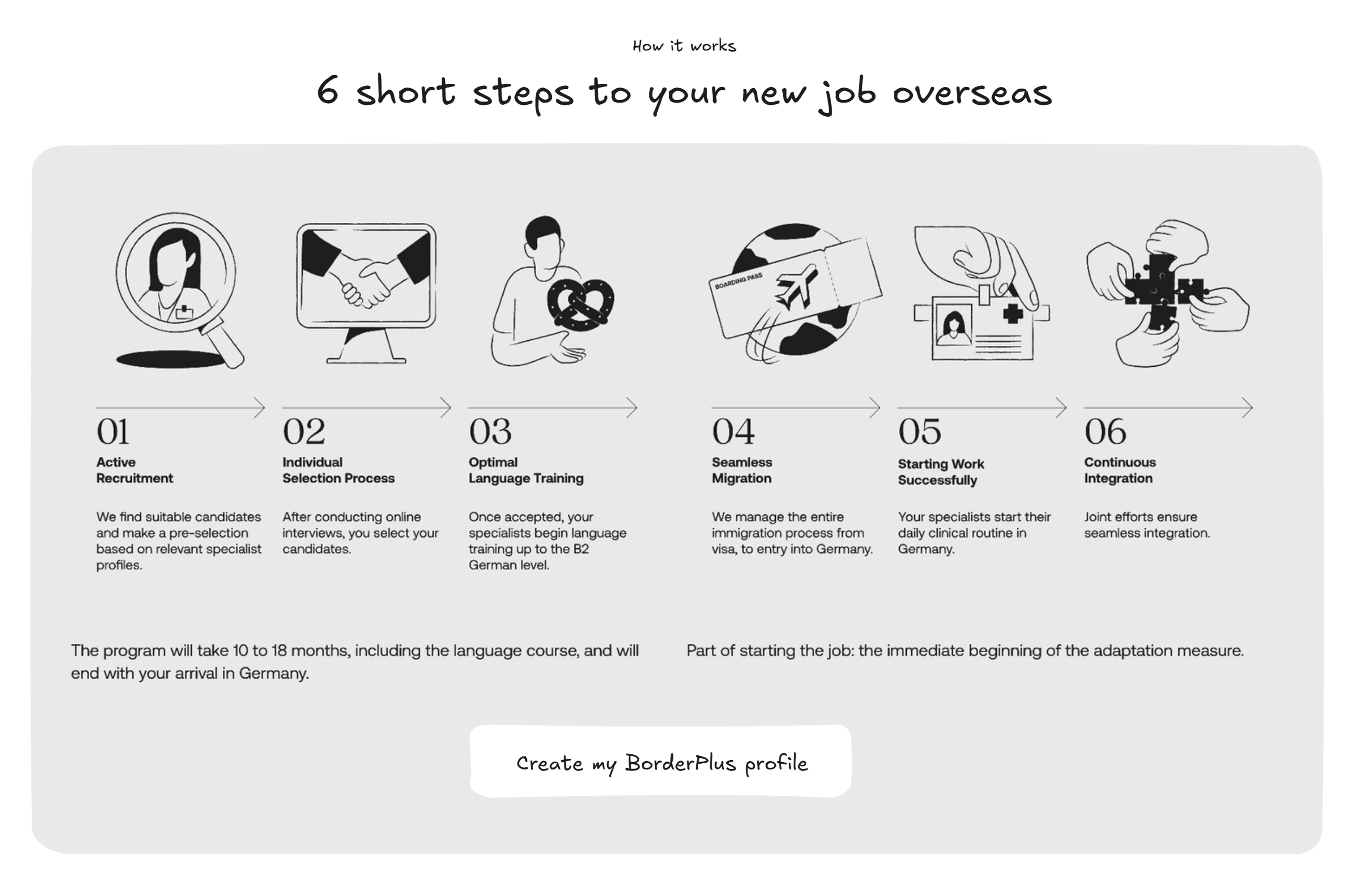
Reframing the Problem
I started by reframing the core problem. The global mobility sector operates in a notoriously low-trust, high-risk environment. The old experience completely ignored the critical anxieties of both sides of the marketplace.
- • Fragmented agents & vendors
- • Inconsistent candidate quality
- • Opaque pricing structures
- • No end-to-end ownership
"Is this agency actually legit?"
"Are these candidates verified?"
"What’s the hidden catch?"
Instead of asking how to simply improve the interface, I asked a much more foundational question:
How might we reduce uncertainty enough for both candidates and hospitals to confidently take that massive first step?
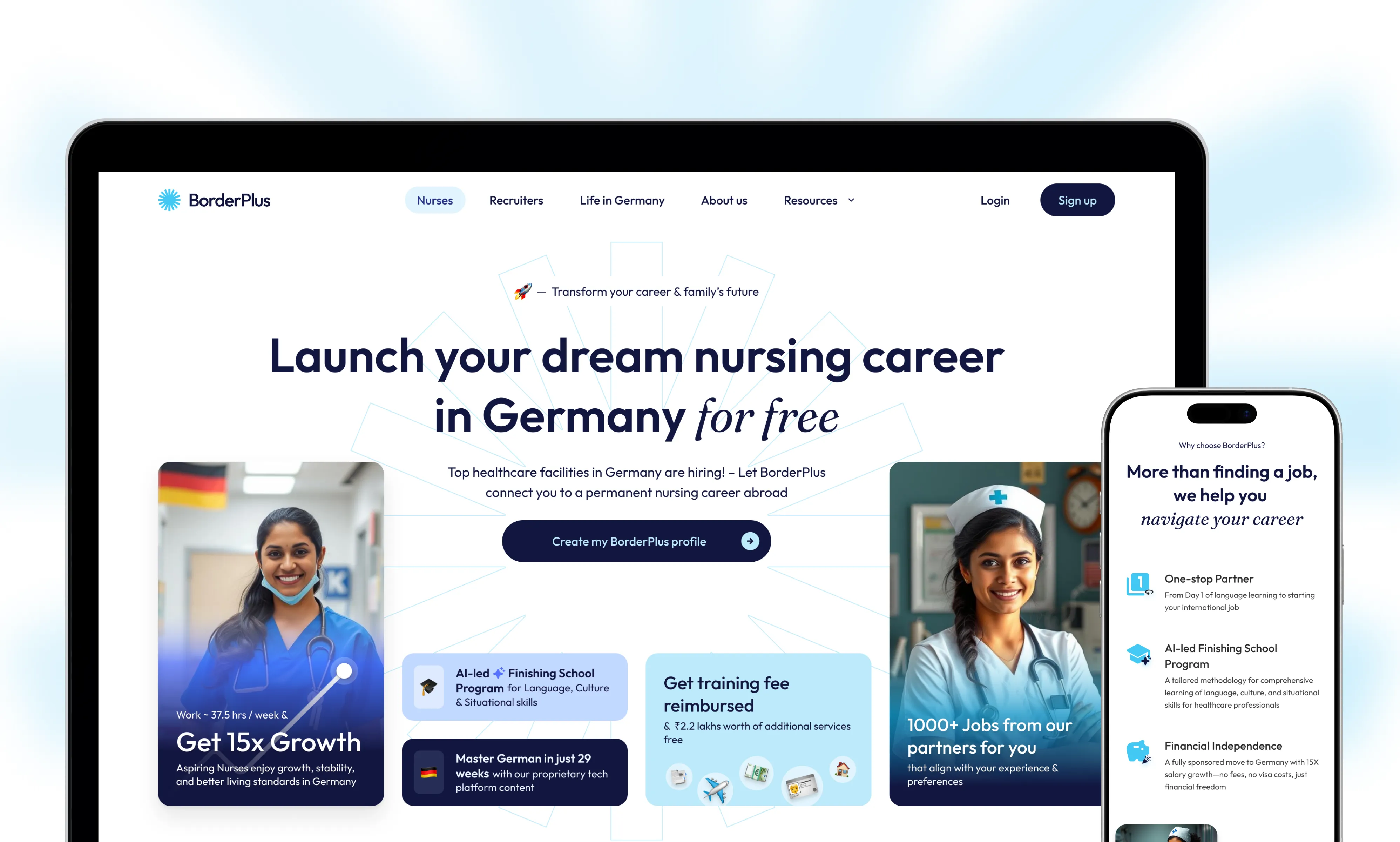
Designing for Trust: The Candidate
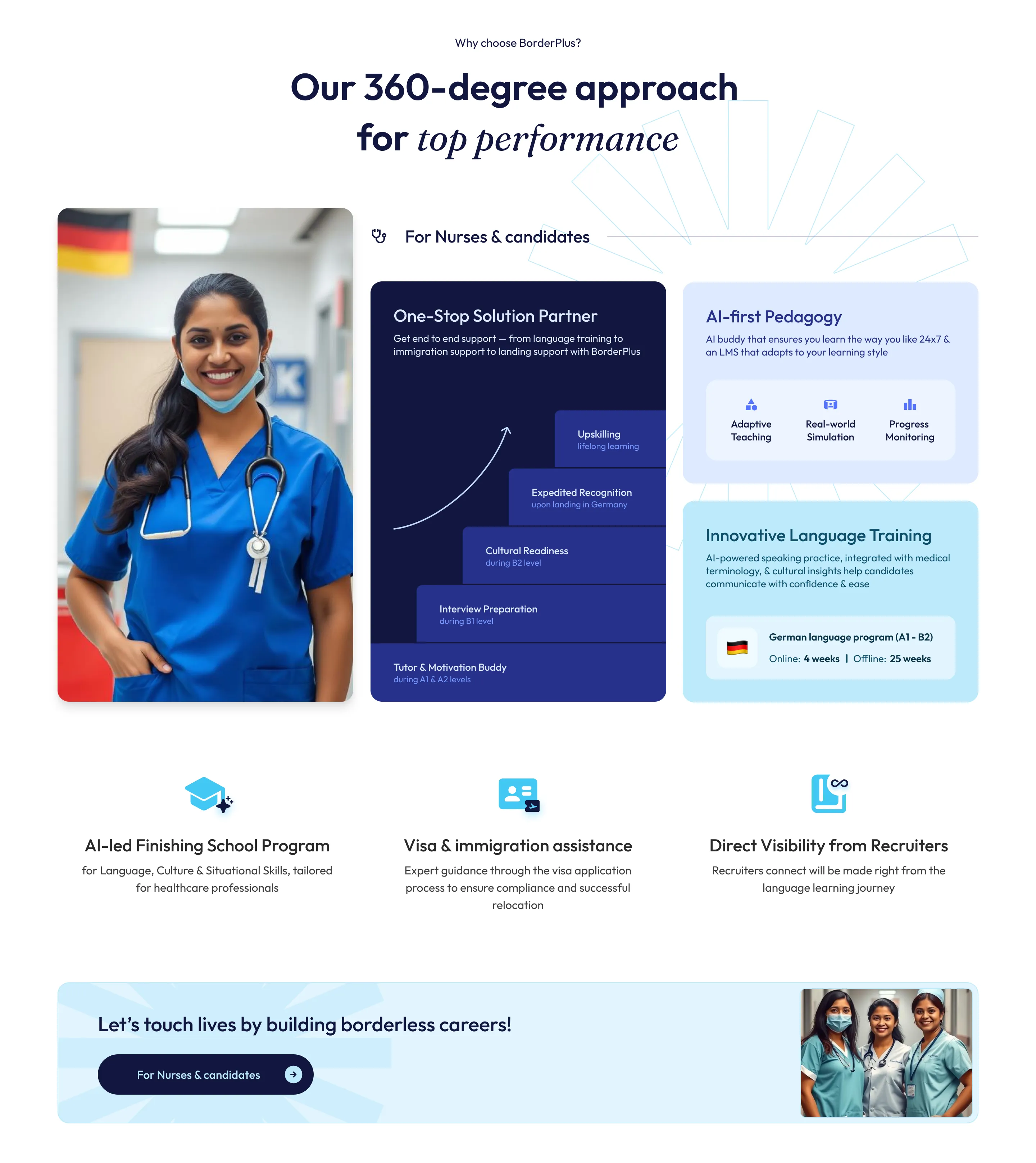
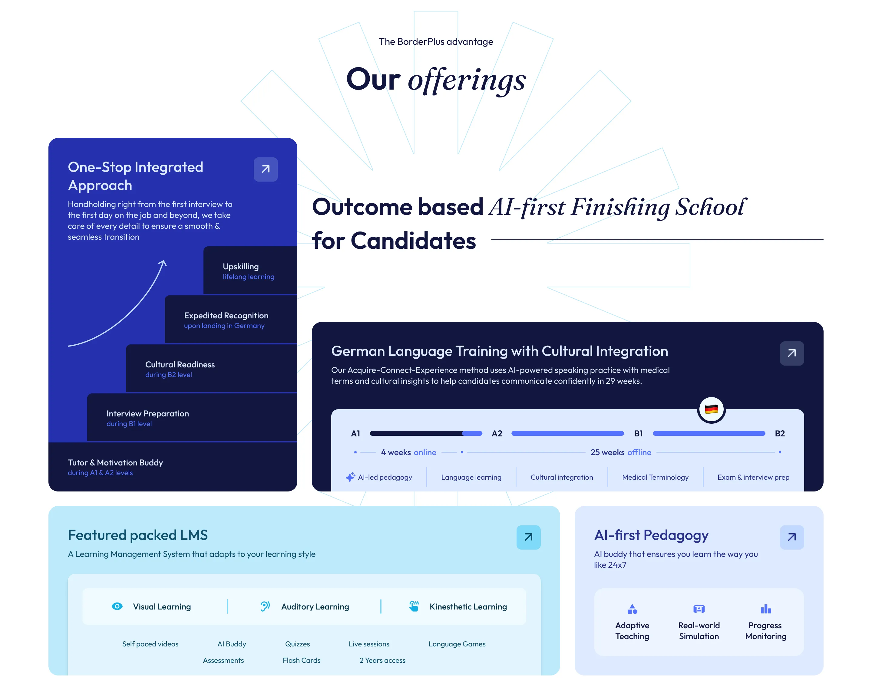
This shift in perspective changed everything. Instead of focusing heavily on what BorderPlus does, I designed the experience around what the users get and who they can become. I shifted the narrative from process features to life-changing outcomes, highlighting the potential for 15x career growth, higher earnings, and a clear pathway to permanent residency.
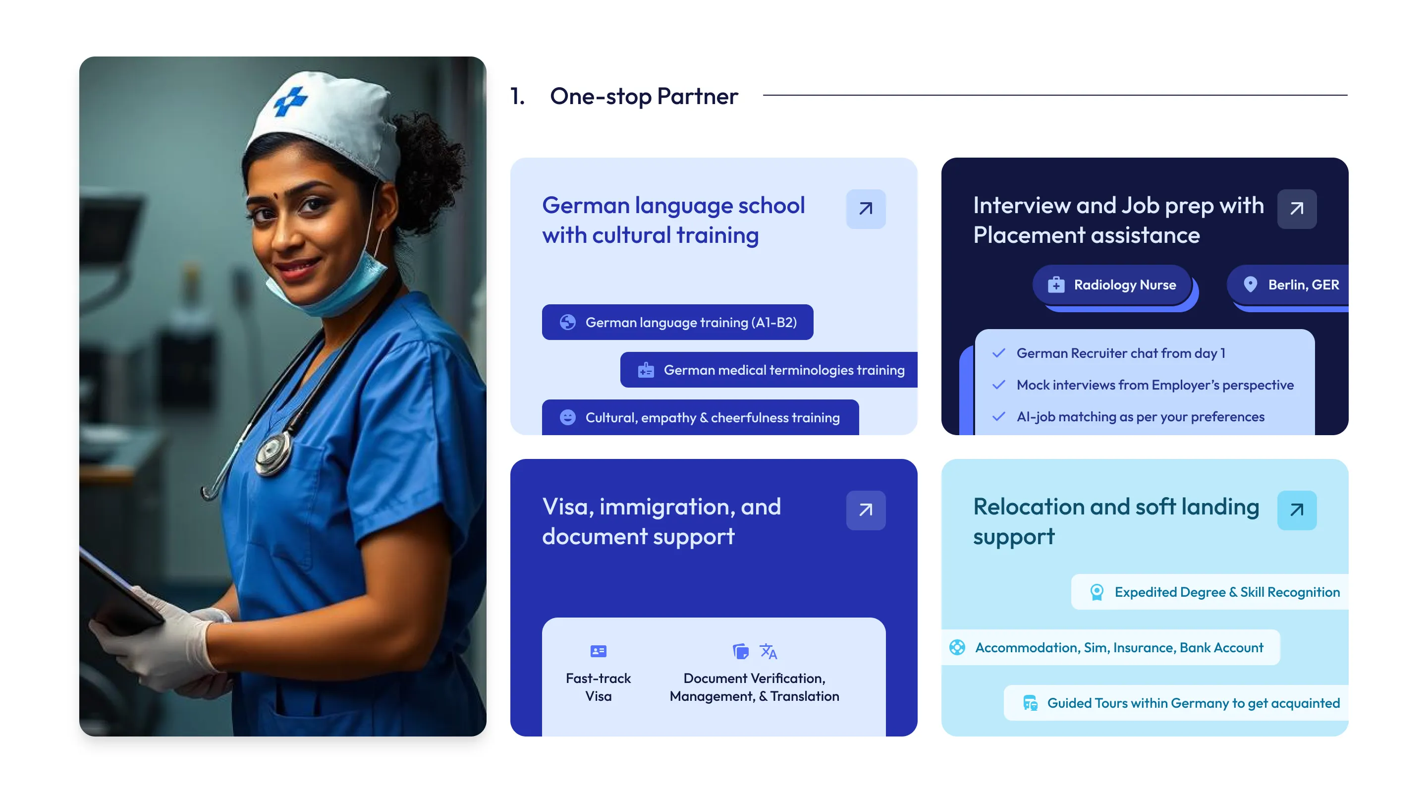
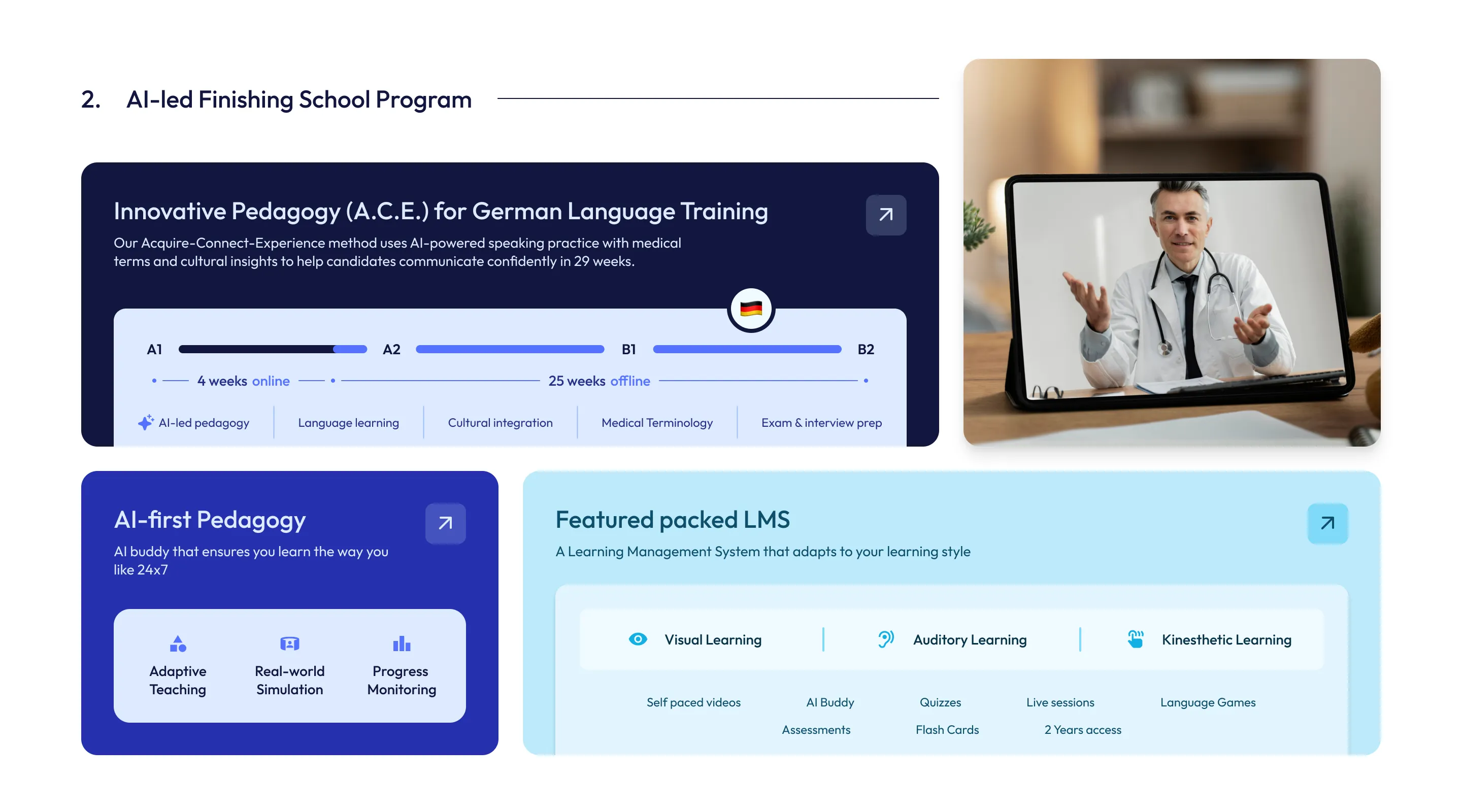
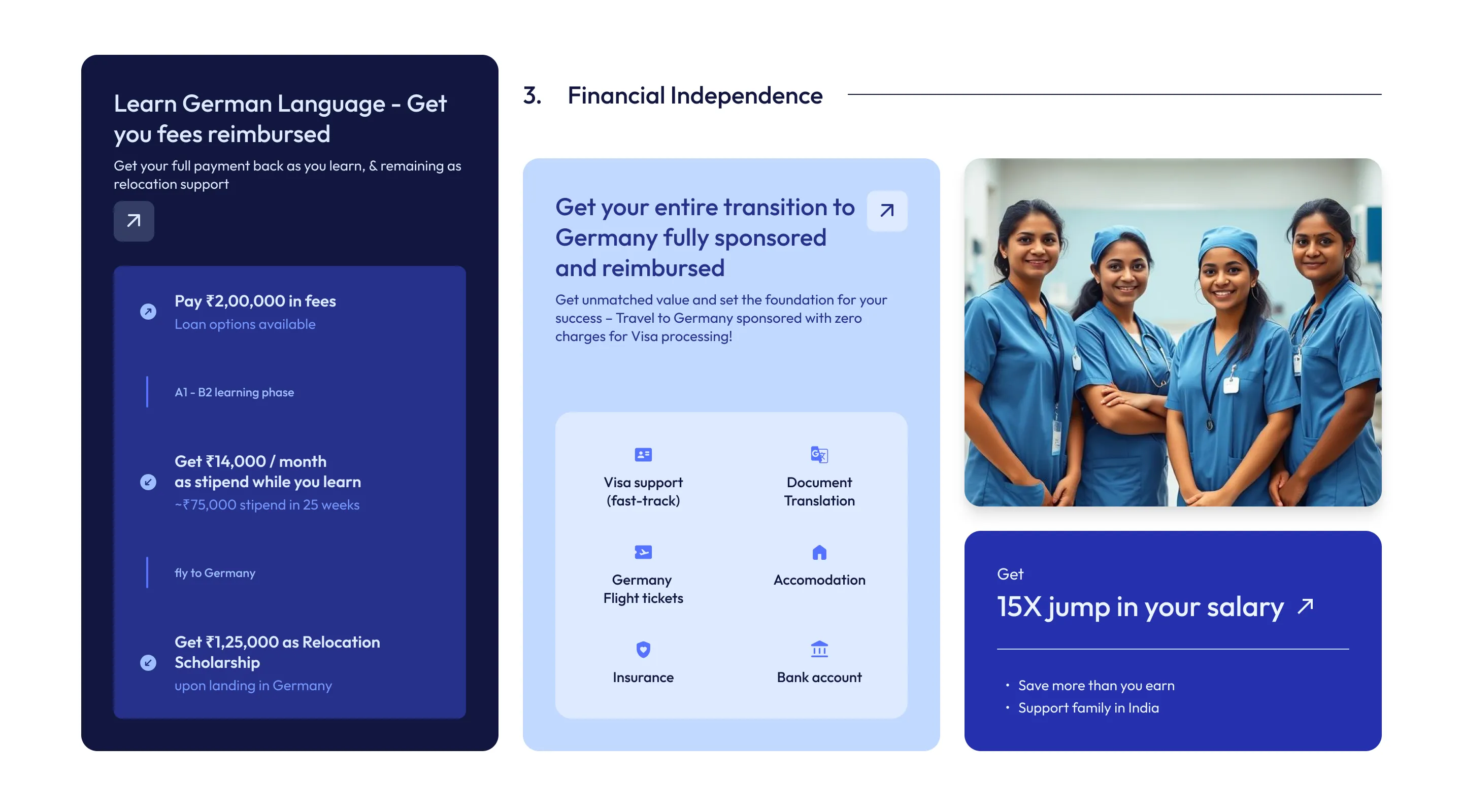
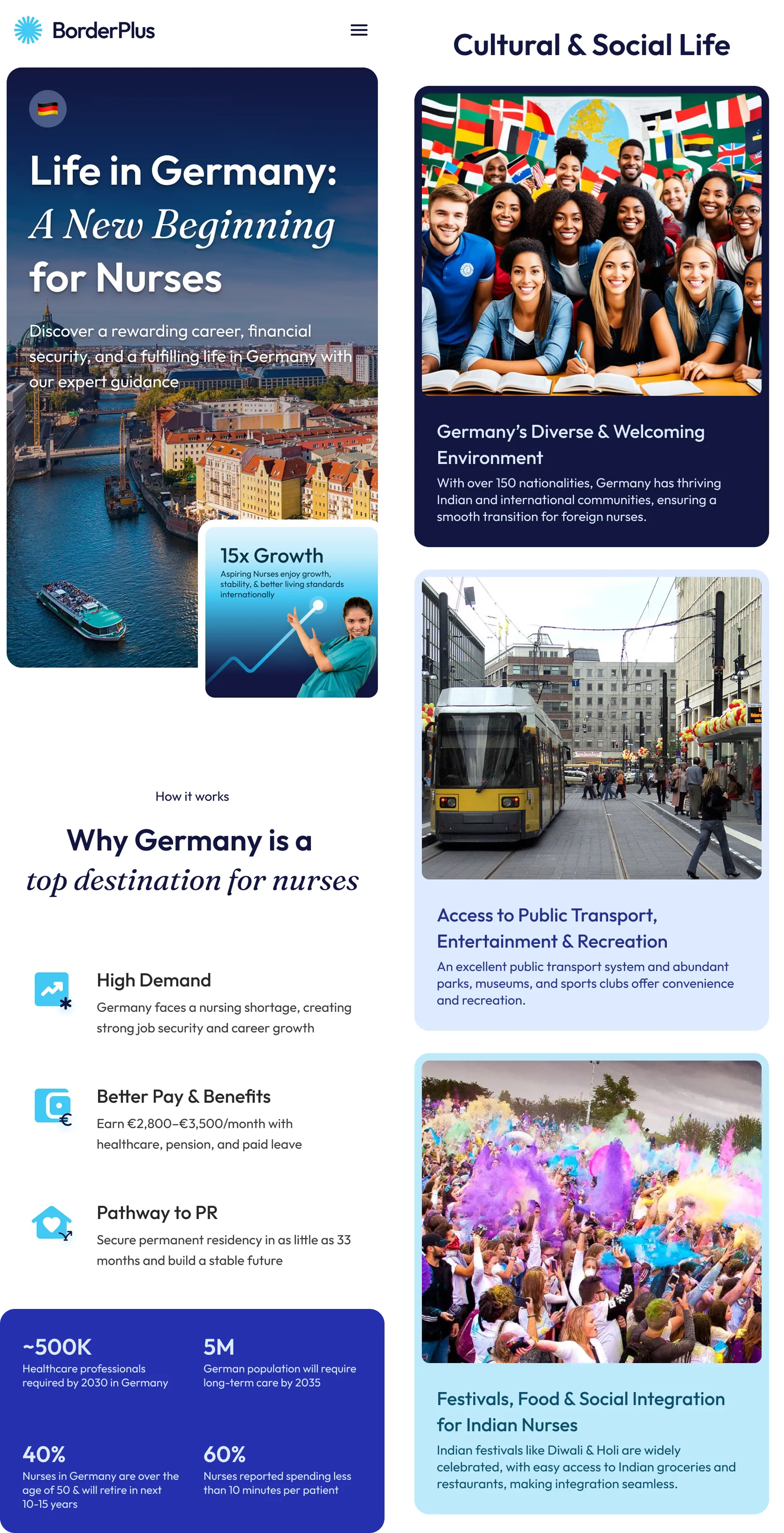
To make this abstract future feel tangible, I introduced a dedicated "Life in Germany" page. Users don't convert just because they understand a service pipeline; they convert when they can vividly visualize their future lifestyle, financial independence, and cultural integration.
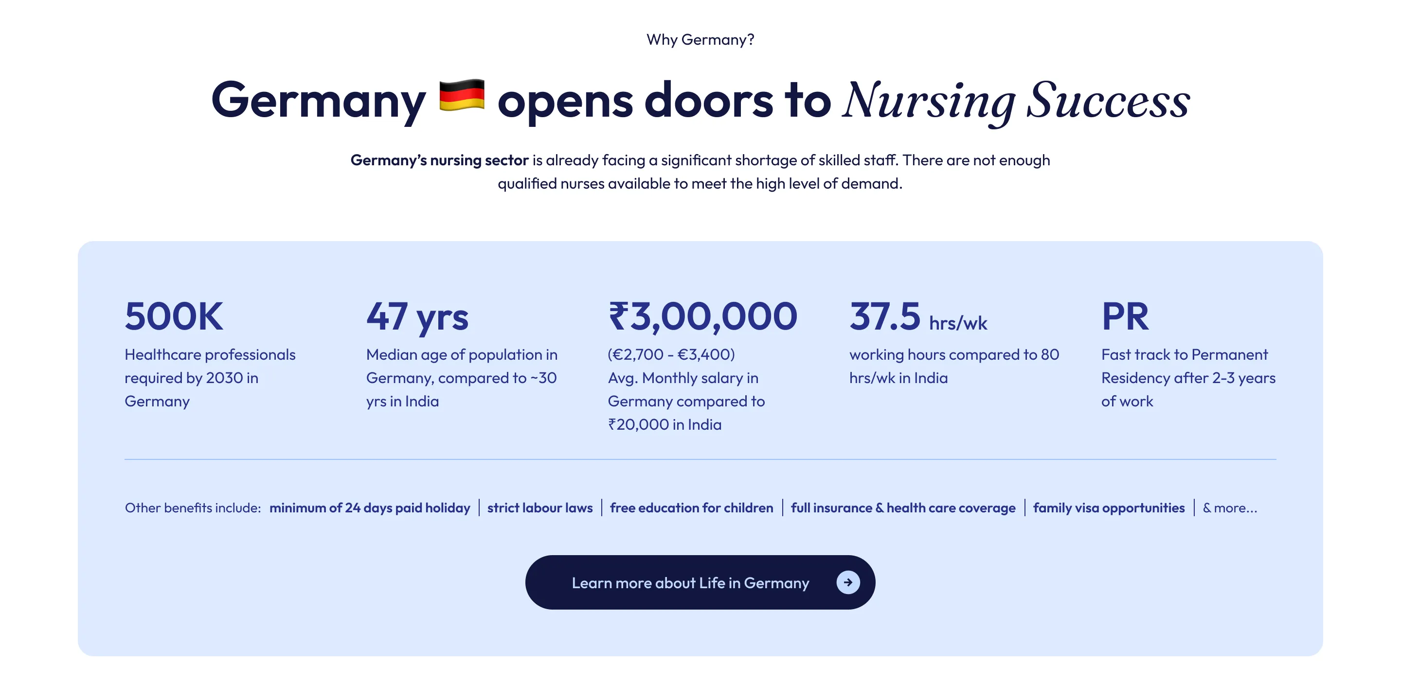
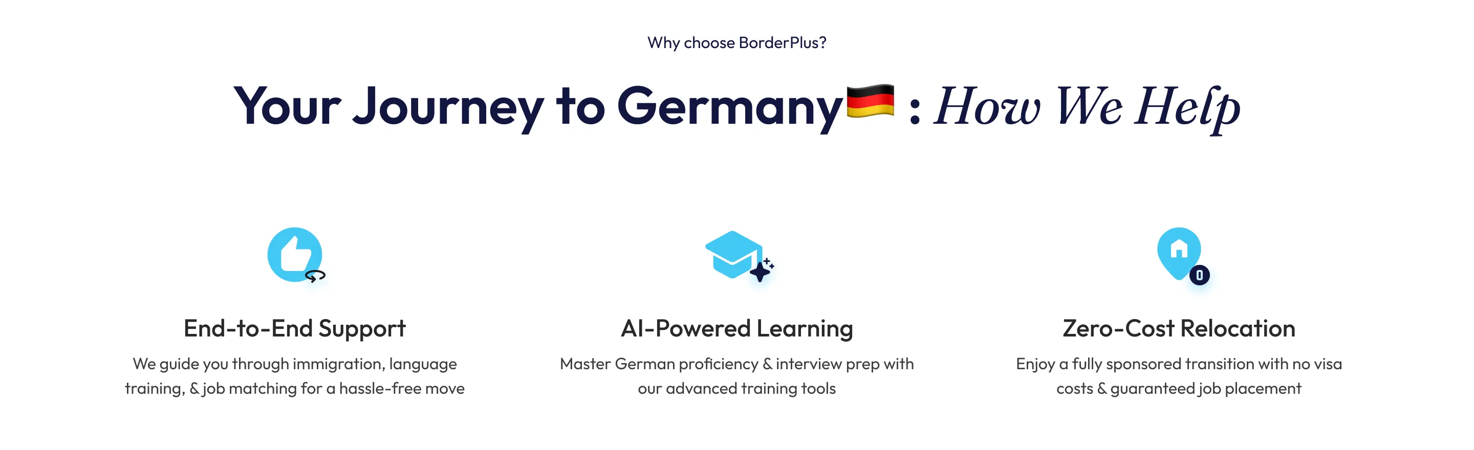
At the architectural level, I transformed the homepage from a simple gateway into a self-sufficient decision layer. It was designed to communicate value and build trust immediately, allowing high-intent users to convert without digging deeper, while still providing robust exploratory paths for users needing more validation.
In an industry riddled with ambiguity, I leaned heavily into radical transparency. I explicitly mapped out costs, process stages, and realistic timelines. There were no hidden layers and no cheap sales tricks—just clear, structured information.
The Dual Journey: Equipping the Recruiter
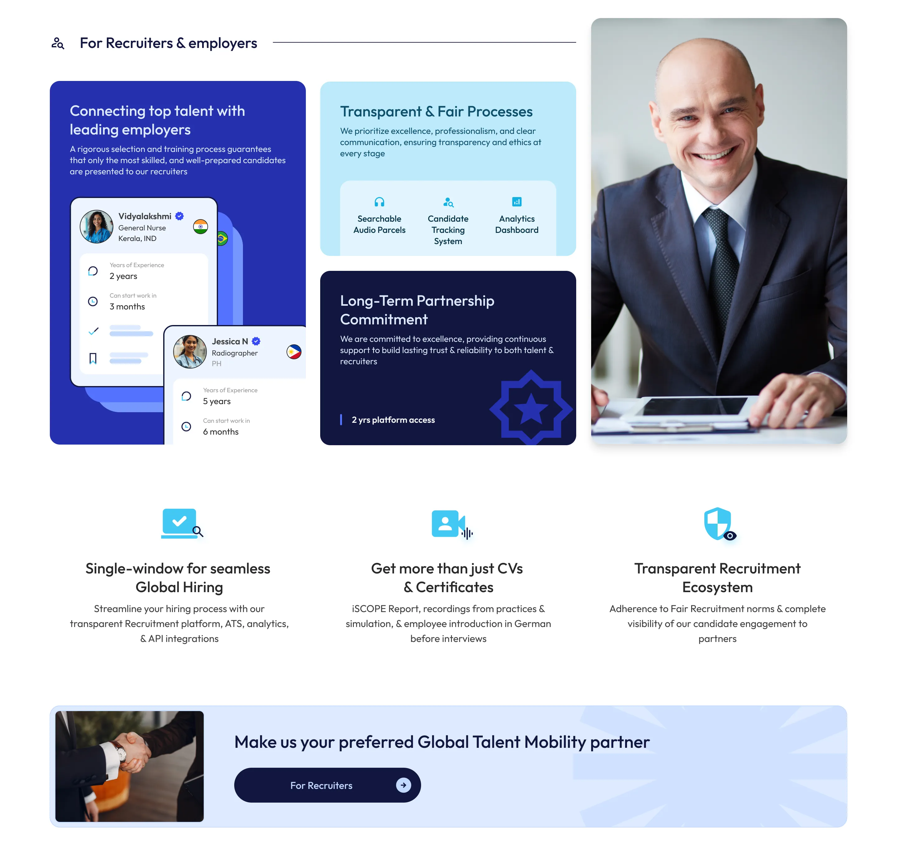
While candidates needed trust and aspiration, our other primary users—German healthcare institutes—needed operational efficiency and absolute assurance.
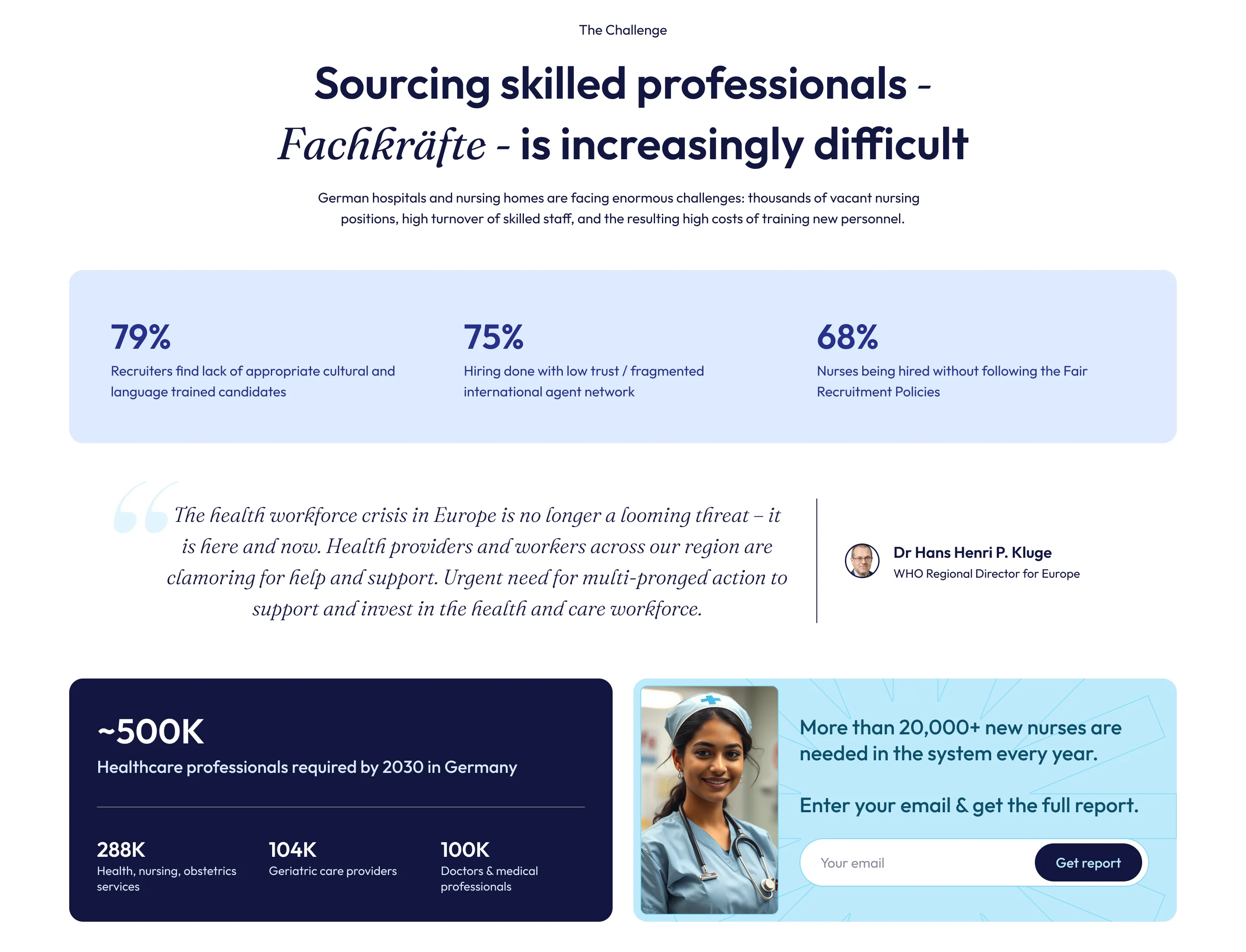
Europe is facing an unprecedented demographic shift; by 2030, Germany alone will require nearly 500,000 new healthcare professionals to support its aging population. Hospitals are desperate for young, language-proficient talent, but are exhausted by unverified candidates and complex hiring processes.
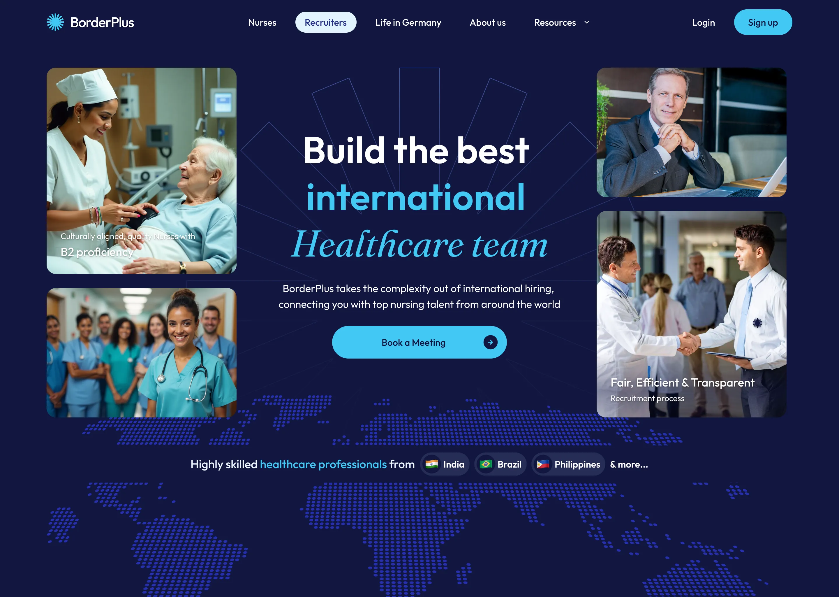
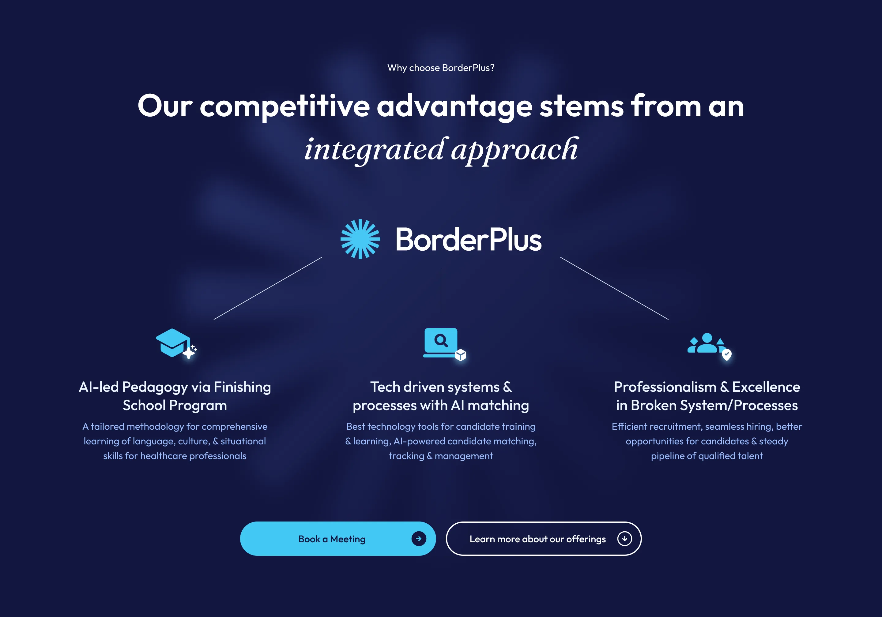
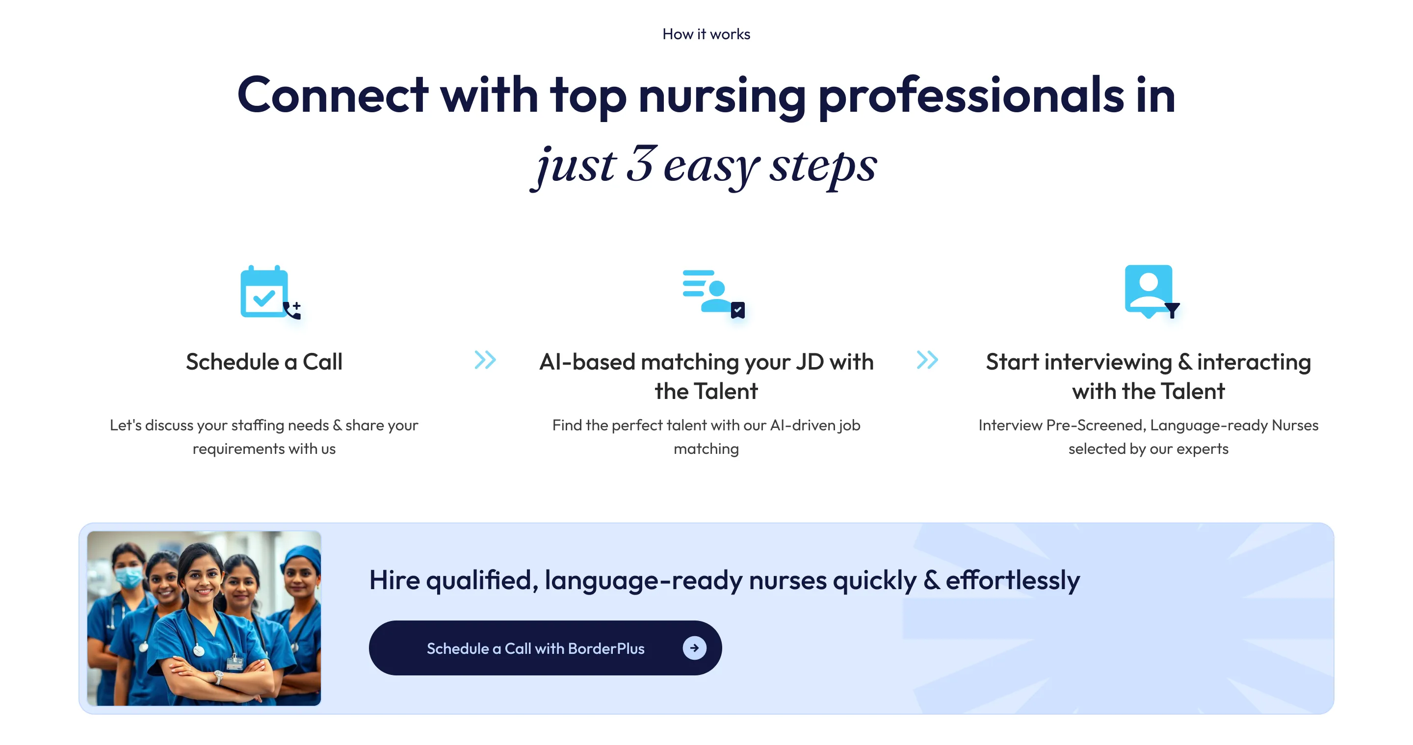
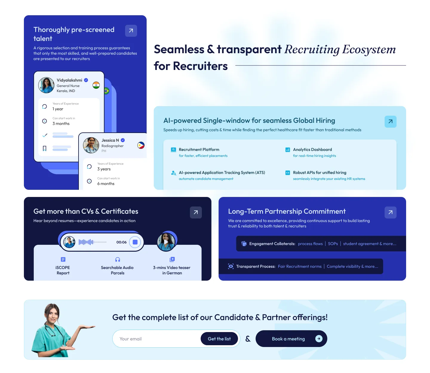
For the B2B persona, the design strategy shifted from aspiration to capability and transparency. I designed a dedicated recruiter hub that positioned BorderPlus not as a transactional vendor, but as a trusted, long-term talent partner.
Showcasing AI-driven applicant tracking systems and real-time hiring analytics dashboards. Beyond the Resume:
To break the barrier of the 'unknown candidate', we highlighted rich profiles featuring iSCOPE reports, searchable audio parcels, and 3-minute video teasers in German. Ethical Assurance:
Strict adherence to Fair Recruitment norms and complete visibility into candidate engagement to guarantee compliance.
Every B2B touchpoint was strategically positioned to assure hospitals that their staffing needs would be met efficiently, ethically, and comprehensively.
Visual Direction & Funnel Execution
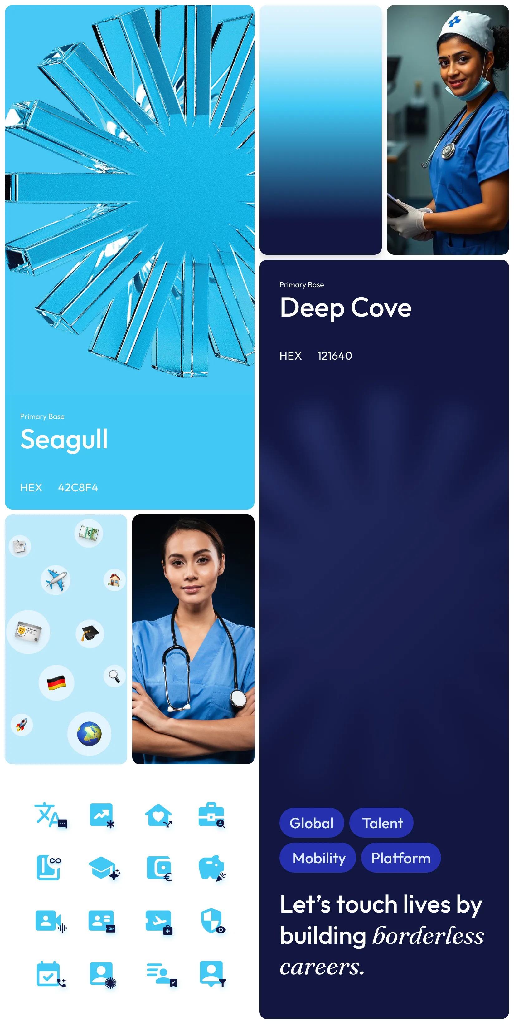
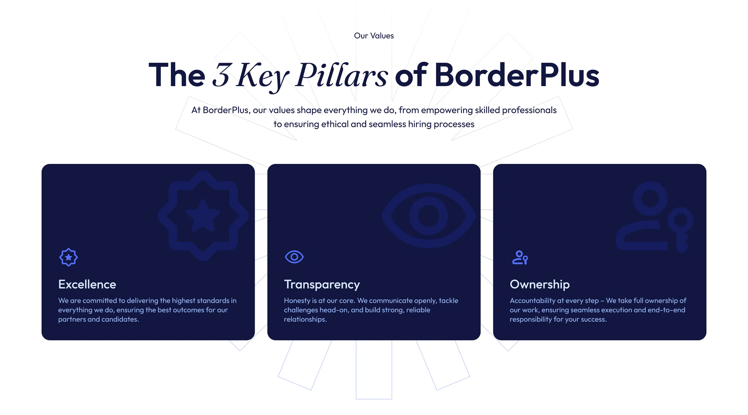
Visually, the direction was anchored in safety and credibility. I utilized a blue-first palette synonymous with healthcare and reliability, paired with clean layouts and human-centric imagery. Drawing inspiration from top-tier SaaS and HR tech platforms, the goal was to elevate the aesthetic to match the high-emotion, high-stakes nature of the decision. I also adapted the execution to real-world behaviors: tailoring a strictly mobile-first experience for candidates and a robust desktop-first flow for recruiters.
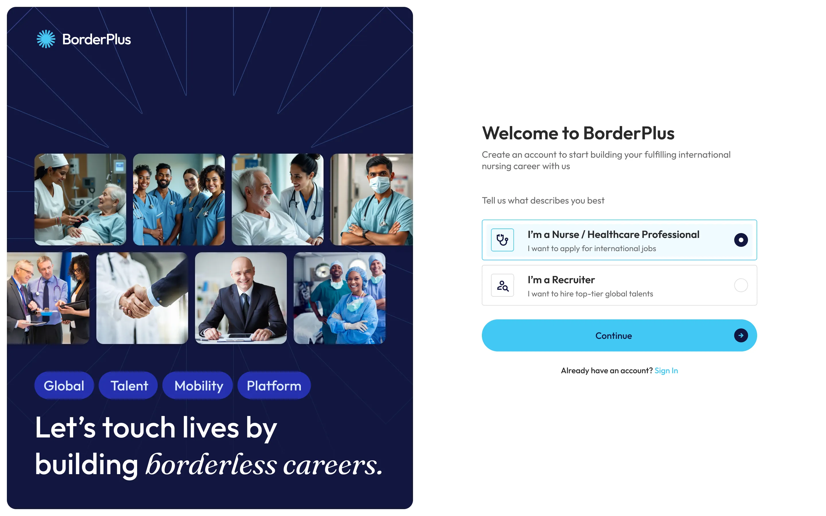
I also completely rethought our funnel. It wasn't a simple click-to-buy flow. It was a complex, multi-stage hybrid involving Meta ads, OTP-based signups, WhatsApp queries, off-site sales calls, recruiter interviews, a ₹10K commitment payment, and eventually, LMS activation.
The website's true job wasn't to close the final loop; it was to efficiently filter and qualify user intent for both sides of the marketplace before they ever reached the human stages of the funnel.
Impact & Reflections
The immediate business outcomes were exactly what we aimed for. The system generated higher-intent leads from nurses and stronger partnership inquiries from hospitals because both entered the funnel fully informed. This drastically reduced sales friction and the need for basic clarifications during screening rounds, ultimately resulting in a durable digital system that scaled alongside their expanding business partnerships.
Looking back, if I had more time and data, I would have loved to dive into behavioral optimizations—tracking scroll depths and drop-offs—and extend this design language deeper into the actual product, like the LMS experience and candidate tracking portal.
Closing Thought
In high-stakes decisions,
users don’t need persuasion,
they need certainty.
This project was about designing that certainty
and turning intent into action.