Role
Design Lead
(Strategy + UX/UI + IC)
Company
Water Robots
(CES 2026 Exhibitor)
Platform
iOS
(Primary Interface)
Overview
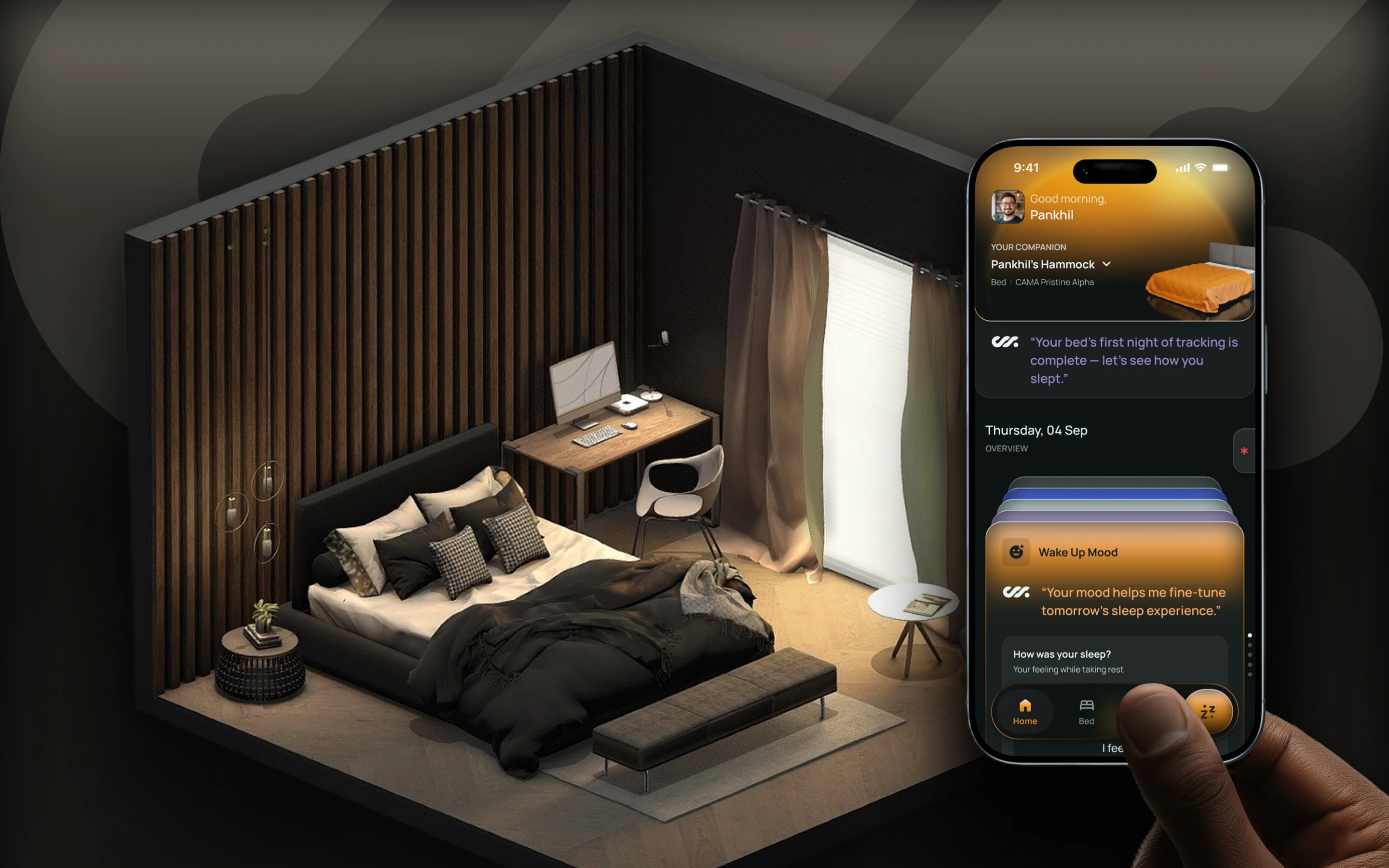
CAMA is a robotic sleep system that adapts to your body, posture, and sleep patterns over time. The iOS app is the only way users interact with this intelligence—before sleep, during the night, and after waking up.
As the sole designer on the product, I owned the end-to-end app experience, working closely with the founder and engineering team to shape not just how the product looks, but how it behaves. I defined the experience principles, structured the core systems, made scope and sequencing decisions, and executed the UX and UI myself.
The Central Challenge
designing an interface for an autonomous physical system—one that offers control when users want it, disappears when they don’t, and builds trust through clarity rather than complexity.
The Result
a companion-like experience that supports sleep without turning it into a task or a dashboard.
1. Context & Problem Framing
Designing the Only Interface to a Collaborative, Adaptive Sleep System
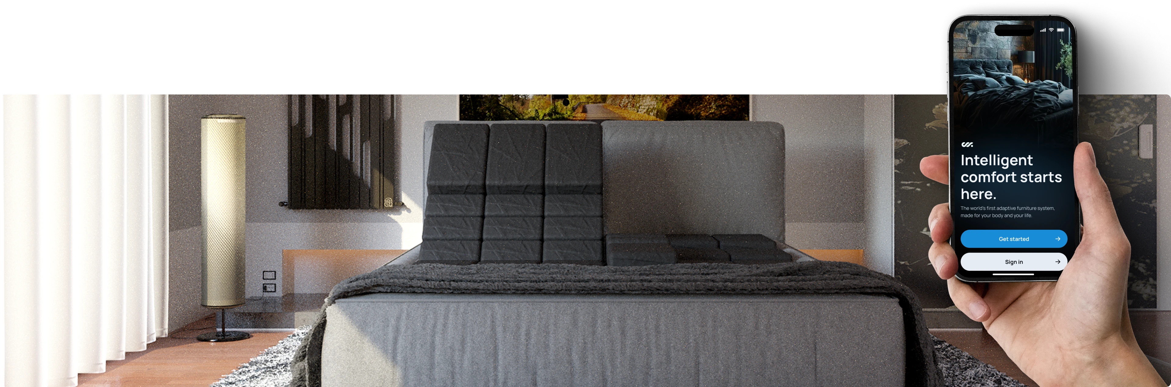
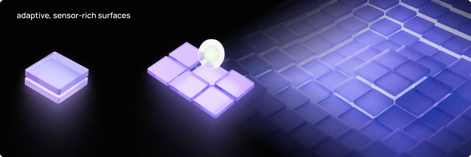
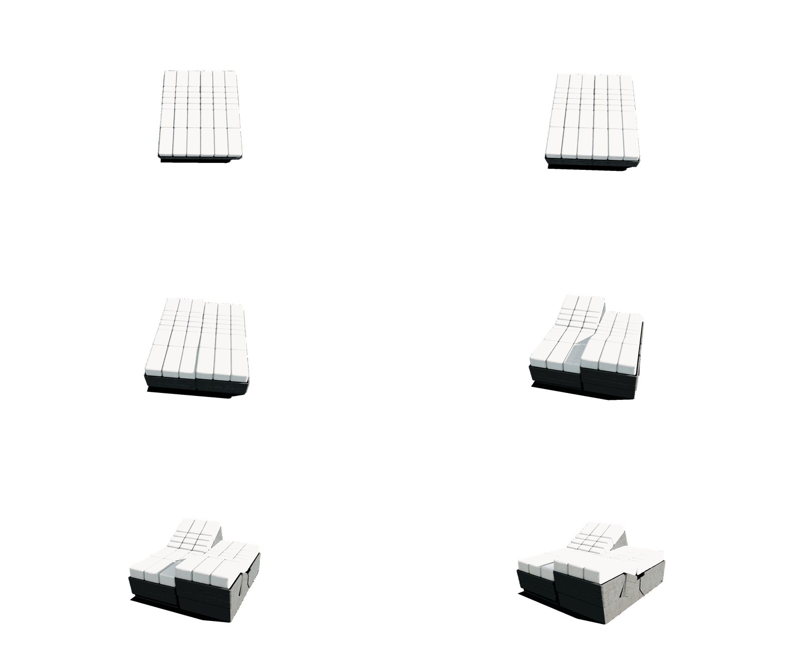
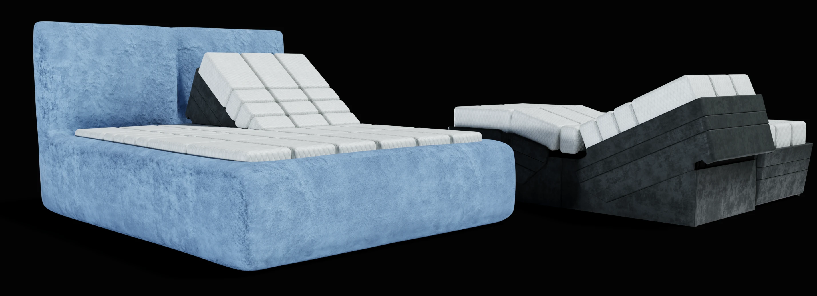
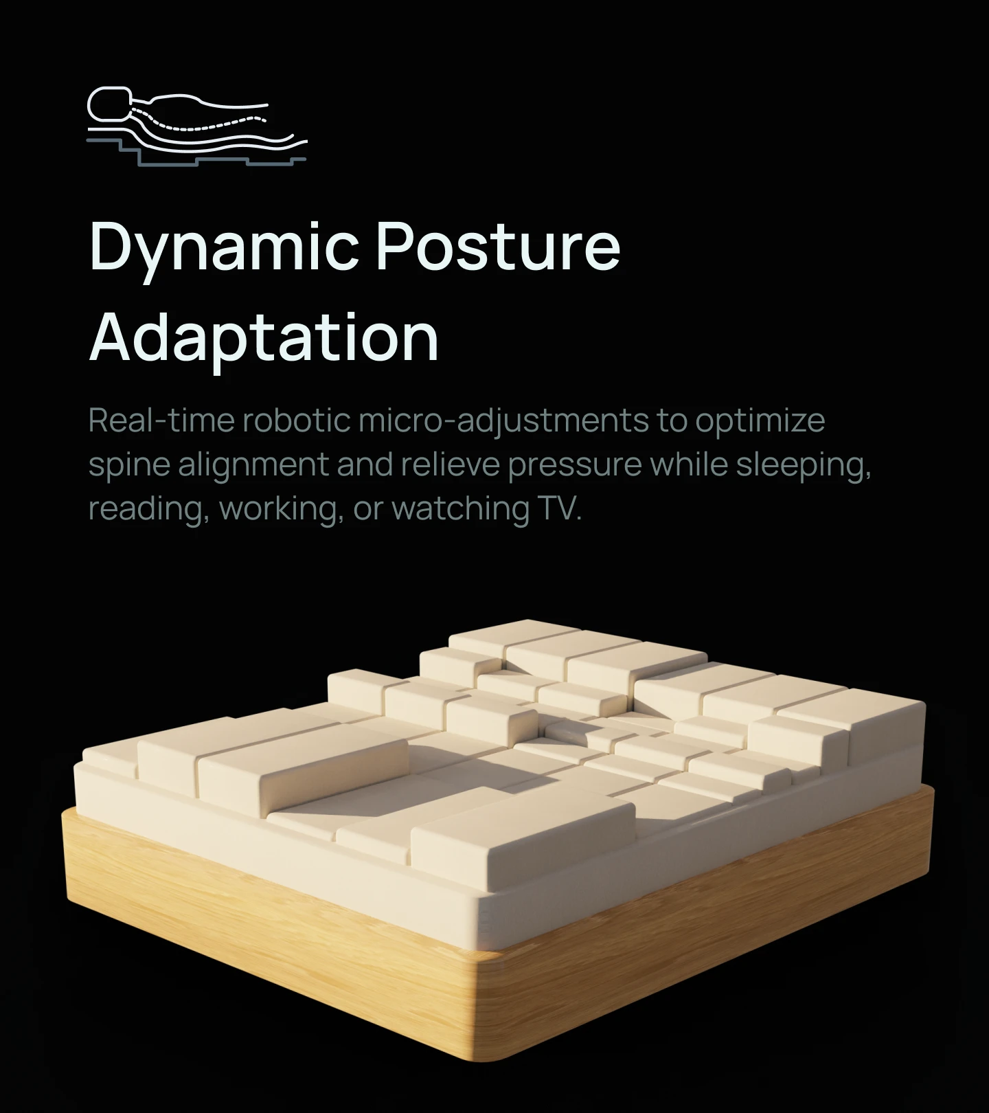
Water Robots is an early-stage startup building CAMA, a robotic sleep system designed to actively support the human body throughout rest and sleep. Unlike traditional mattresses or even conventional smart beds, CAMA is built as a modular, actuator-driven surface composed of individually controlled blocks that can change elevation and posture dynamically.
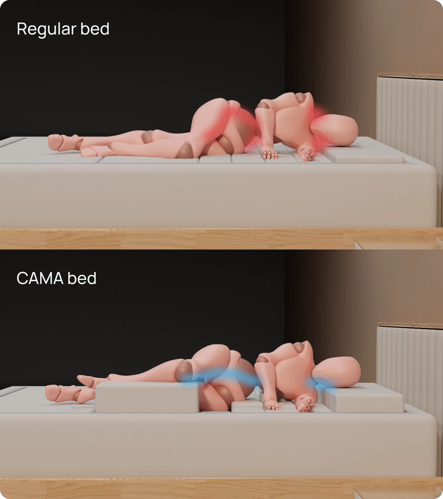
From a user’s perspective, CAMA operates through two complementary layers of intelligence:
Intent-driven control
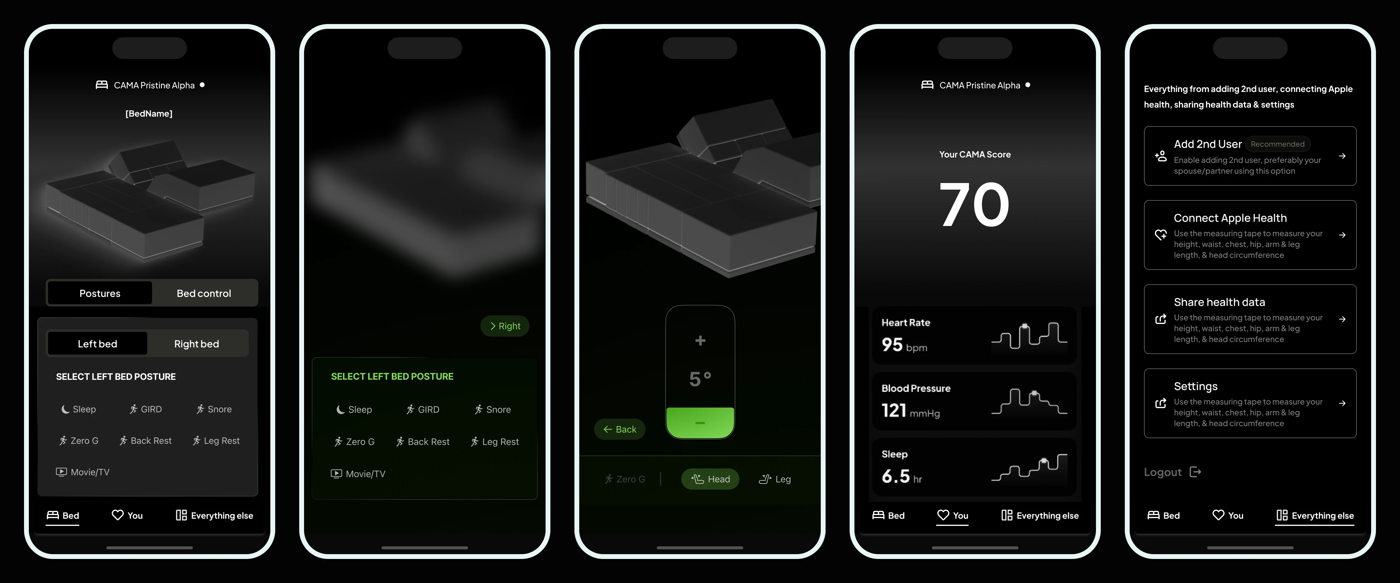
Users can explicitly choose how they want to rest or sleep using preconfigured bed modes and posture presets.
Adaptive intelligence
The bed continuously monitors posture, pressure distribution, and movement during sleep, and makes subtle, autonomous adjustments to maintain spinal alignment and improve sleep efficiency.
From the outset, one constraint defined the entire product experience:
The iOS app is the only interface that connects these two layers – between the user and the bed.
There are no physical buttons, no on-bed displays, and no secondary control surfaces. Every action—choosing a posture, understanding how the bed adapted overnight, building trust in the system—happens through the app.
This made the mobile experience not an accessory, but the primary expression of the product itself.
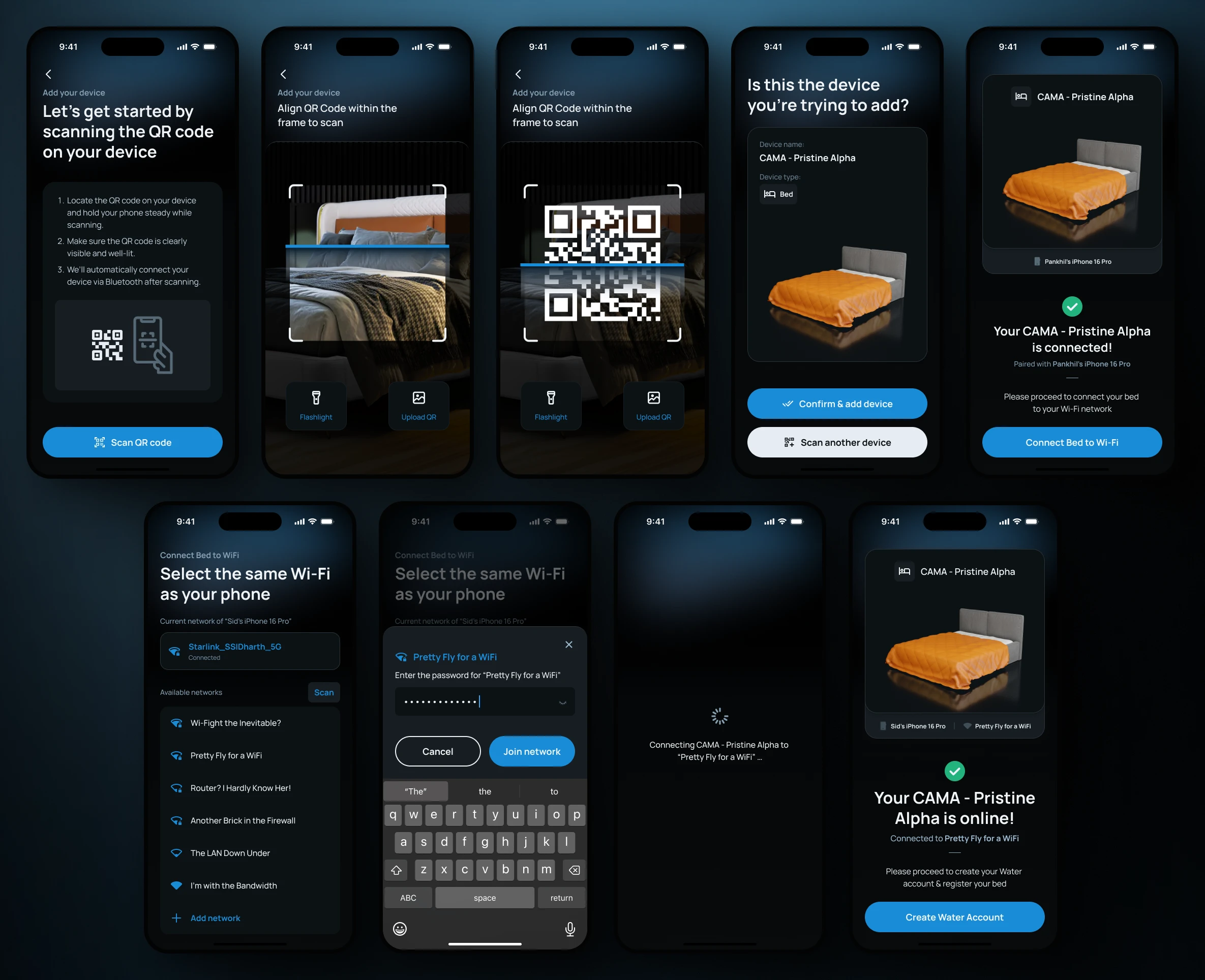
Why Existing Patterns Didn’t Apply
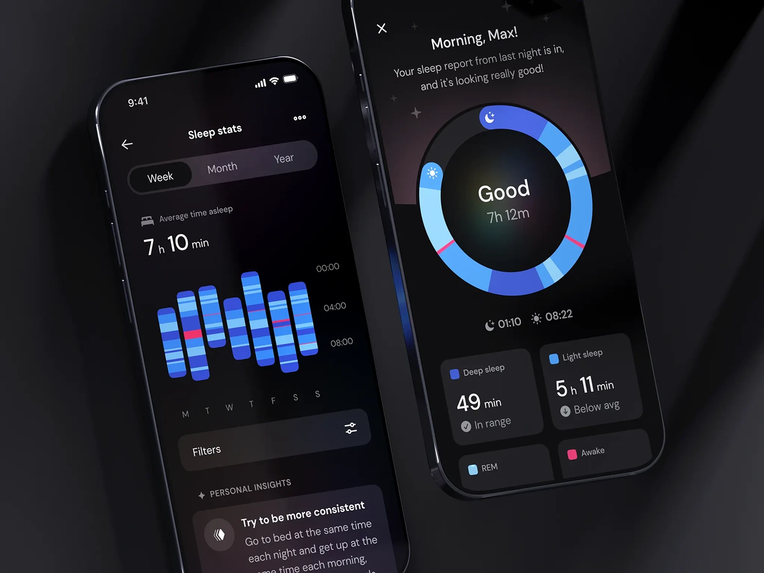
At the start of the project, it was tempting to borrow from familiar categories. On the surface, CAMA looked like it could be approached as a smart home device, an adjustable bed controller, or a sleep-tracking app. But very quickly, each of those patterns broke down.
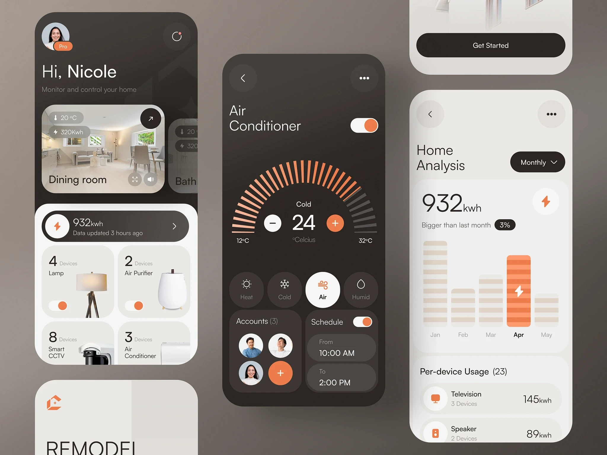
Smart home interfaces
-
Direct manipulation: Prioritizes toggles and real-time control, assuming the user wants to operate a device.
-
Reductive approach: Constant manual control reduces CAMA's sophisticated adaptive system into a mere mechanical remote.

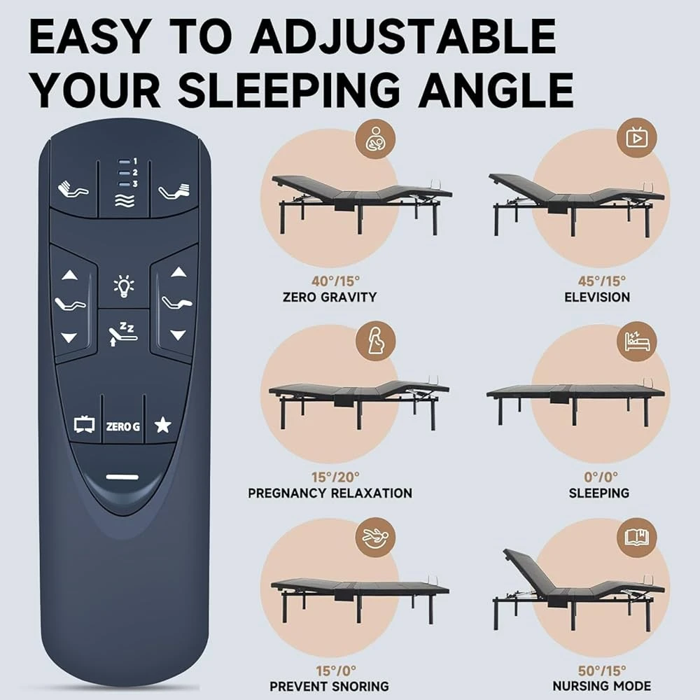
Traditional adjustable beds
-
Static presets: Focuses heavily on posture switching and isolated modes like reading or zero-G.
-
Lacks long-term support: These patterns capture user intent for a single moment, but fail to provide continuous overnight adaptation.
Sleep tracking apps
-
Data review focus: Designed around morning-after charts, trends, and detailed numerical metrics.
-
Measurement over action: Fails to recognize that CAMA’s true value lies in active intervention on the user's behalf, not just tracking.
At the same time, when the user is asleep, the bed shifts into a different role:
- Sensors continuously monitor posture and pressure
- Actuators make micro-adjustments autonomously
- The system prioritizes spinal alignment and sleep continuity
- Adjustments are intentionally subtle and non-disruptive
The product didn’t fit cleanly into any single paradigm. It sat in an uncomfortable middle ground:
Neither fully manual, nor fully autonomous – a system that offers explicit control when awake, and quiet autonomy when asleep.
It behaves as a collaborative system, where the user sets intent and the bed carries that intent forward intelligently during sleep.
Most existing UX patterns assume one dominant mode of control. CAMA required designing for both, without confusing or overwhelming the user.
The Core Problem
Once these mismatches became clear, the real problem came into focus.
The challenge wasn’t how to expose features, or how to visualize data more beautifully.
It was this:
How do you design a single interface that supports both deliberate user control and quiet, autonomous adaptation with the same product — without making either feel intrusive or opaque?
Before sleep
Users want agency. They want to choose a posture, switch to a familiar mode, or make a small adjustment that helps them relax. In these moments, the bed should feel responsive and obedient.
During sleep
Users need invisibility. No interruptions, no decisions. Any demand for attention becomes friction. The bed needs to fade into the background, making micro-adjustments without waking the user or asking for confirmation.
After sleep
Users want answers. But only the meaningful ones. They want to know whether the bed helped, whether their sleep is improving, and what—if anything—they should do differently tonight.
Balancing these moments meant walking a fine line:
Too much visibility during sleep would create anxiety.
Too little explanation afterward would erode trust.
Overemphasizing automation could make users feel disconnected.
Overemphasizing control could make the system feel dumb.
What needed to be designed wasn’t just an interface, but a relationship—one where the user feels both in control and taken care of, depending on the moment.
Defining Success Before Launch
For a 0-1, pre-GTM product tied to a physical hardware purchase, these were defined as post-launch success criteria, not measured outcomes.
CAMA was still pre-GTM when I left, so I don't claim post-launch adoption or sleep-outcome metrics that didn't exist yet.
Instead, I designed the product around a clear set of measurable
success criteria:
successful setup and personalization, reduced dependence on manual bed
control, adoption of autonomous adjustments, sleep-goal and bedtime consistency, and user
understanding of the system's interventions.
| Post-launch Success Criteria | |
|---|---|
| Product question | Leading indicators |
| Can users get the bed ready confidently? | Setup completion · Time to first sleep |
| Do users understand and control the bed intuitively? | Mode usage · Manual adjustments · Overrides |
| Does autonomy earn trust over time? | Autonomous adjustment acceptance · Manual intervention · Trust feedback |
| Is CAMA helping users build better sleep habits? | Goal adherence · Bedtime consistency · Sleep trends |
| Do users understand their sleep and the bed’s role? | Insight engagement · Trend exploration · Trust feedback |
For me, the most important signal would be whether users gradually move from operating the bed to trusting it, while still knowing they can take control whenever they need to.
My Role & Design Leadership Scope
I joined Water Robots as the sole designer during an early and formative phase of the product. There was no established design system, no finalized brand language, and no predefined UX patterns for an adaptive robotic bed.
My responsibility extended beyond interface design into defining how the product should behave and communicate.
In practice, I acted as:
Design Lead
Setting experience principles and system-level direction
Product thinker
Shaping scope, sequencing, and trade-offs with the founder
Individual contributor
Designing every flow, interaction, and microcopy detail
Many design decisions directly influenced product feasibility—especially around how much intelligence to expose, when to intervene, and when to stay invisible.
Reframing the Problem (Foundational Design Decision)
A turning point in the project came when I stopped thinking about the experience as a continuous flow and started thinking about it as a set of distinct mental states.
A key reframing early in the project was recognizing that:
People do not relate to sleep the same way throughout the night. Their expectations, attention, and tolerance for interaction change dramatically between preparing for sleep, being asleep, and waking up.
This led to a fundamental reframing:
instead of designing "the app," I began designing three experiences within one system.

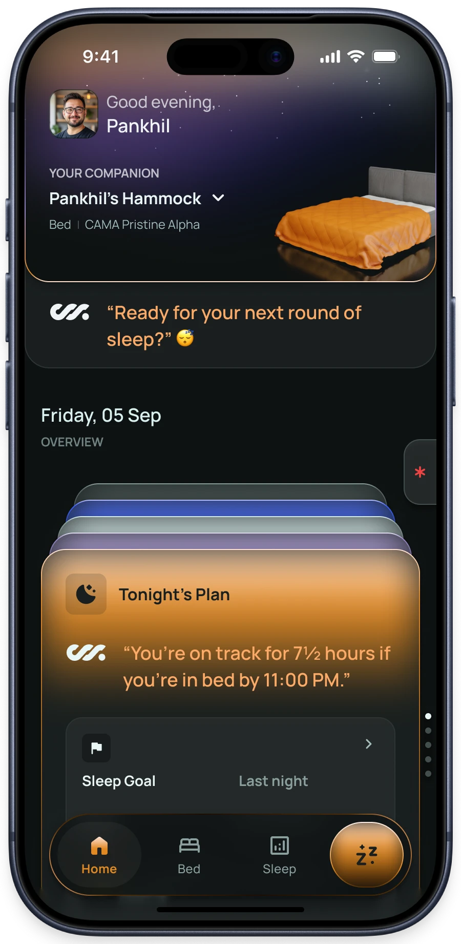
Pre-sleep
Is about intention and reassurance—choosing how you want to rest and feeling confident the bed is ready.

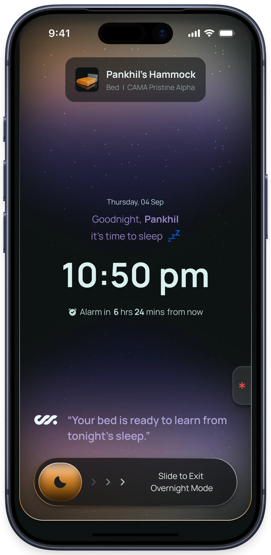
Overnight
Is about absence—minimal UI, zero cognitive load, and safety-first access if needed.

Post-sleep
Is about reflection—making sense of what happened without judgment or overload.
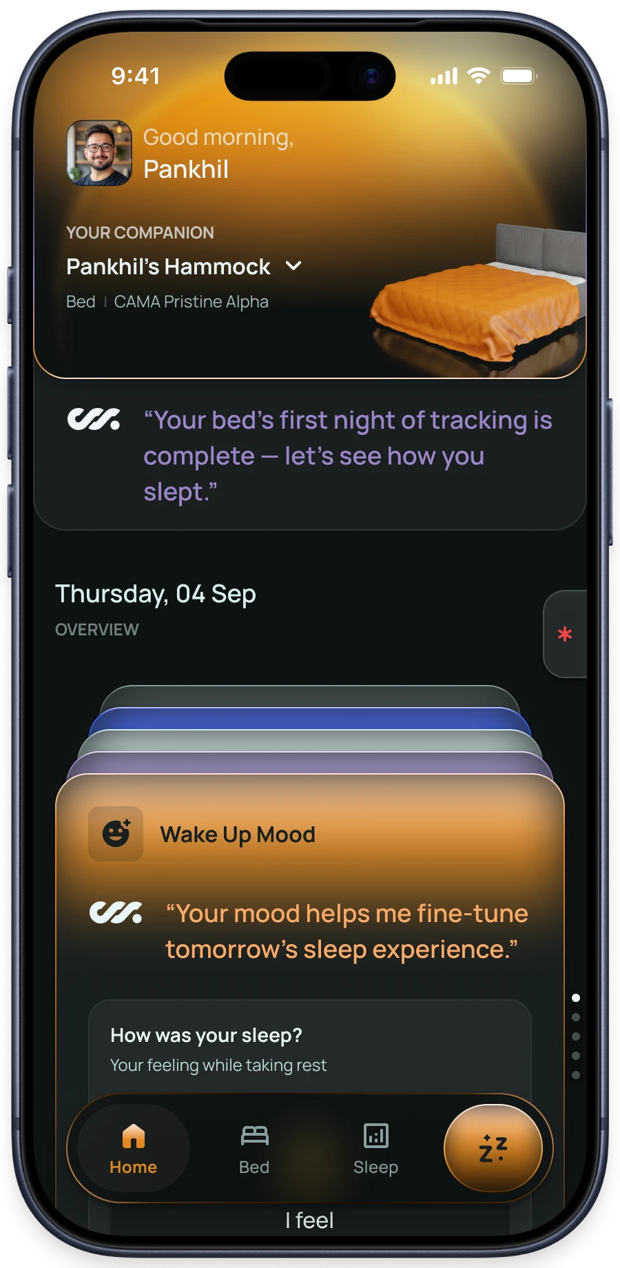
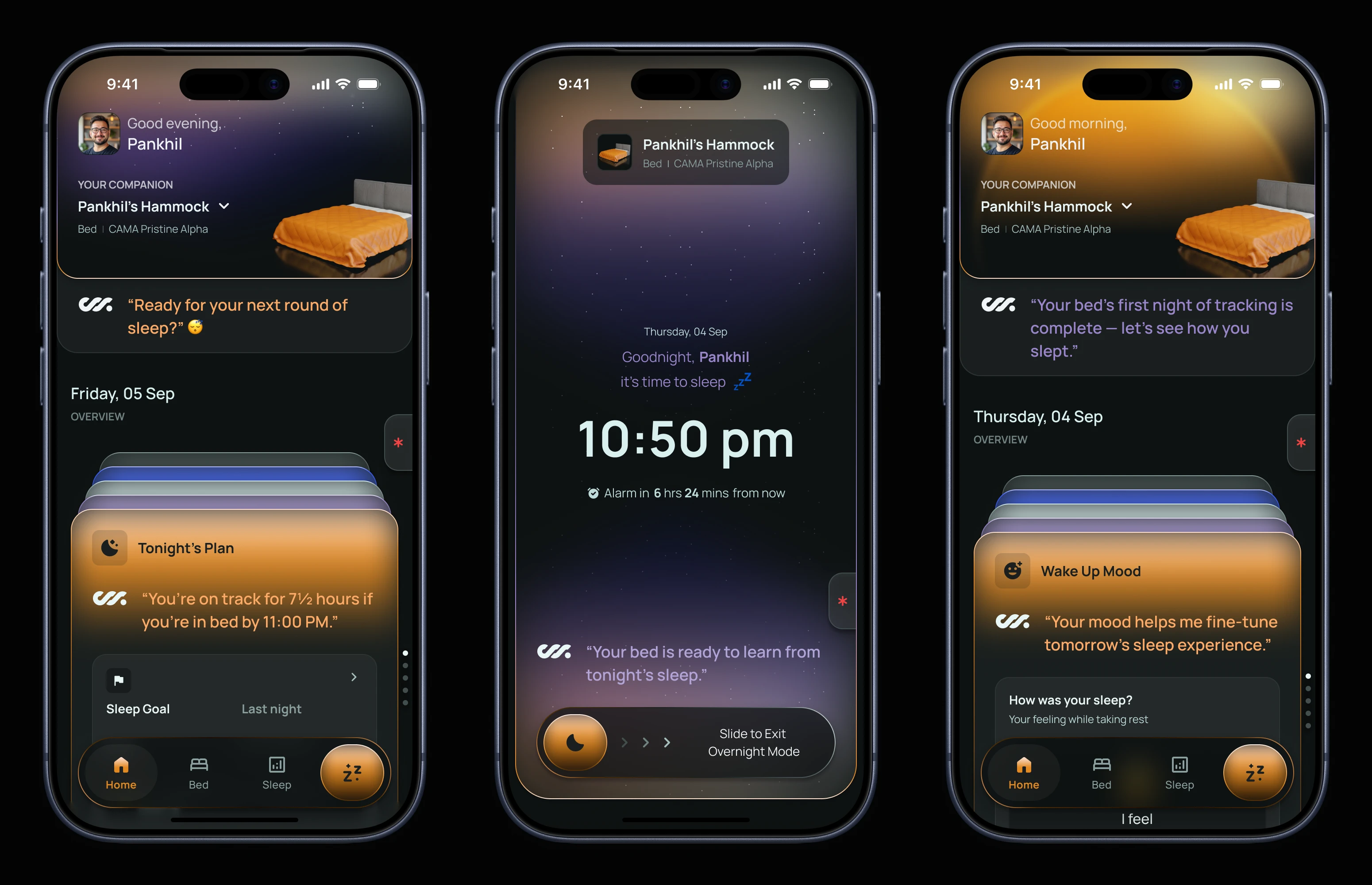
This reframing had far-reaching implications. It shaped how the Home screen behaves, how information density changes over time, and how intelligence is surfaced. Importantly, it also clarified when not to speak.
This decision allowed the bed to feel both capable and respectful—present when needed, invisible when not.
2. Design Principles
Guardrails for Designing Trust, Autonomy, and Long-Term Use
Once the problem space became clearer, it was obvious that this product could not be designed feature by feature. Too many decisions—what to show, when to speak, how much control to expose—were interconnected. Without clear guardrails, the experience risked becoming inconsistent or overly reactive as the product evolved.
I worked with the founder to align on a small set of principles that would guide every UX decision. These weren’t abstract ideals; they were practical constraints that helped answer hard questions quickly, especially in a fast-moving startup environment.
# Principle 01
Sleep Is a State, Not a Screen
One of the earliest and most important principles was recognizing that users do not experience sleep as a single continuous interaction. Their expectations, attention, and tolerance for interaction change drastically across the night.
Before sleep, users are alert and intentional. They want to choose a posture, apply a familiar mode, or make small adjustments that help them relax. During sleep, that same user has zero tolerance for friction. Any unnecessary interaction becomes disruptive. After waking up, the mindset shifts again—users are open to reflection, interpretation, and light guidance.
Designing a single, static interface for all of these moments would have failed all three.
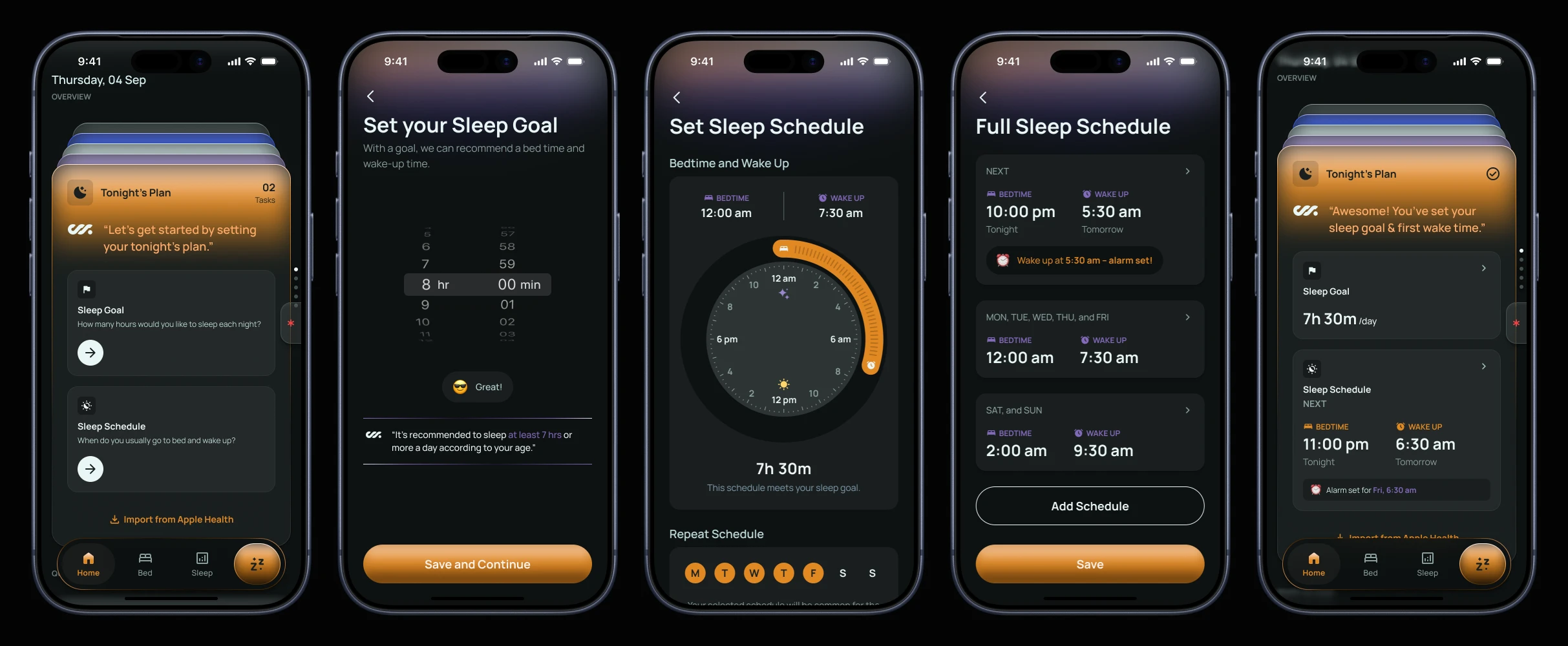
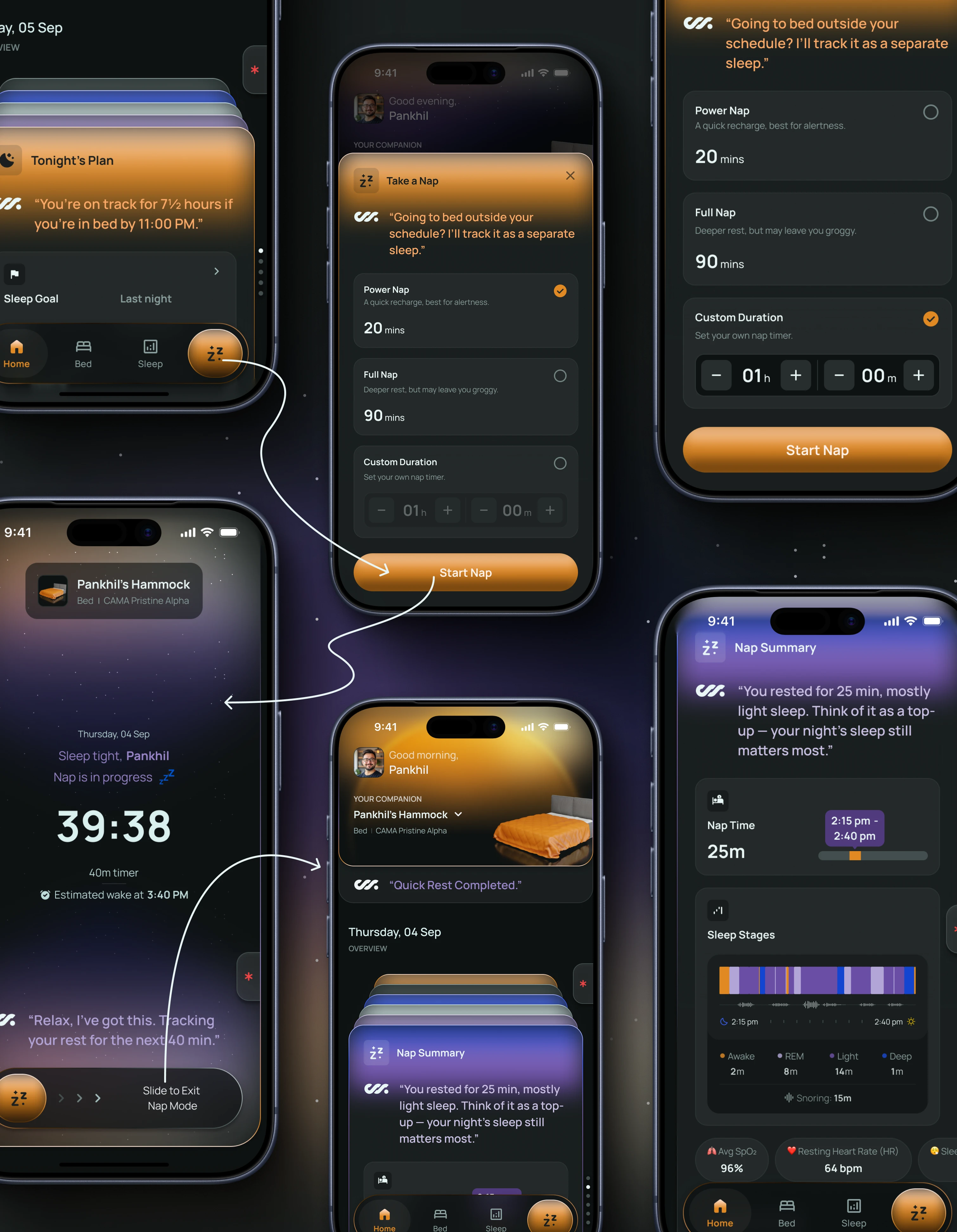
This principle pushed me to think in terms of experience states, not screens. It directly shaped:
- The separation of pre-sleep, overnight, and post-sleep behavior
- The use of Minimal UI during sleep and naps
- The decision to defer explanations and insights until after sleep
Instead of asking "what should this screen show?", I consistently asked "what does the user need right now?"
# Principle 02
Autonomy Must Feel Earned, Not Imposed
CAMA is fundamentally an intelligent system. It monitors posture, pressure, and movement, and it adjusts itself without explicit user input. While this is the bed’s greatest strength, it is also its biggest UX risk.
Autonomy without context can quickly feel unsettling — especially when it involves a physical object that moves beneath you while you sleep.
I treated autonomy as something that needed to be earned over time, not introduced all at once.
Early in the experience, the focus is on explicit user intent: choosing bed modes, applying presets, and understanding basic posture changes.
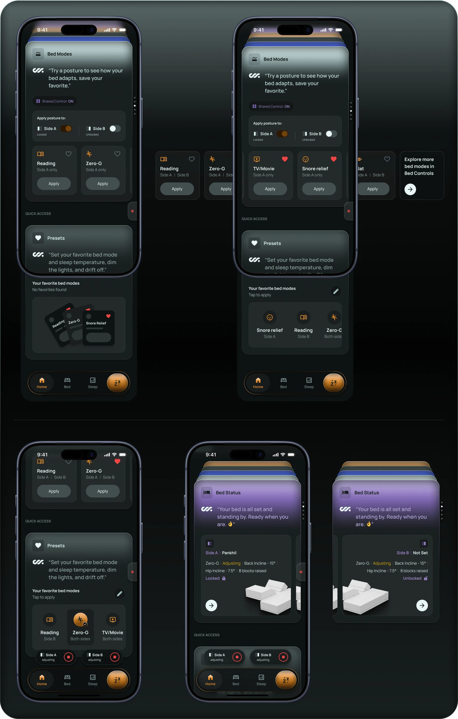
As users spend more nights with the bed, the interface gradually shifts emphasis toward outcomes and learning.
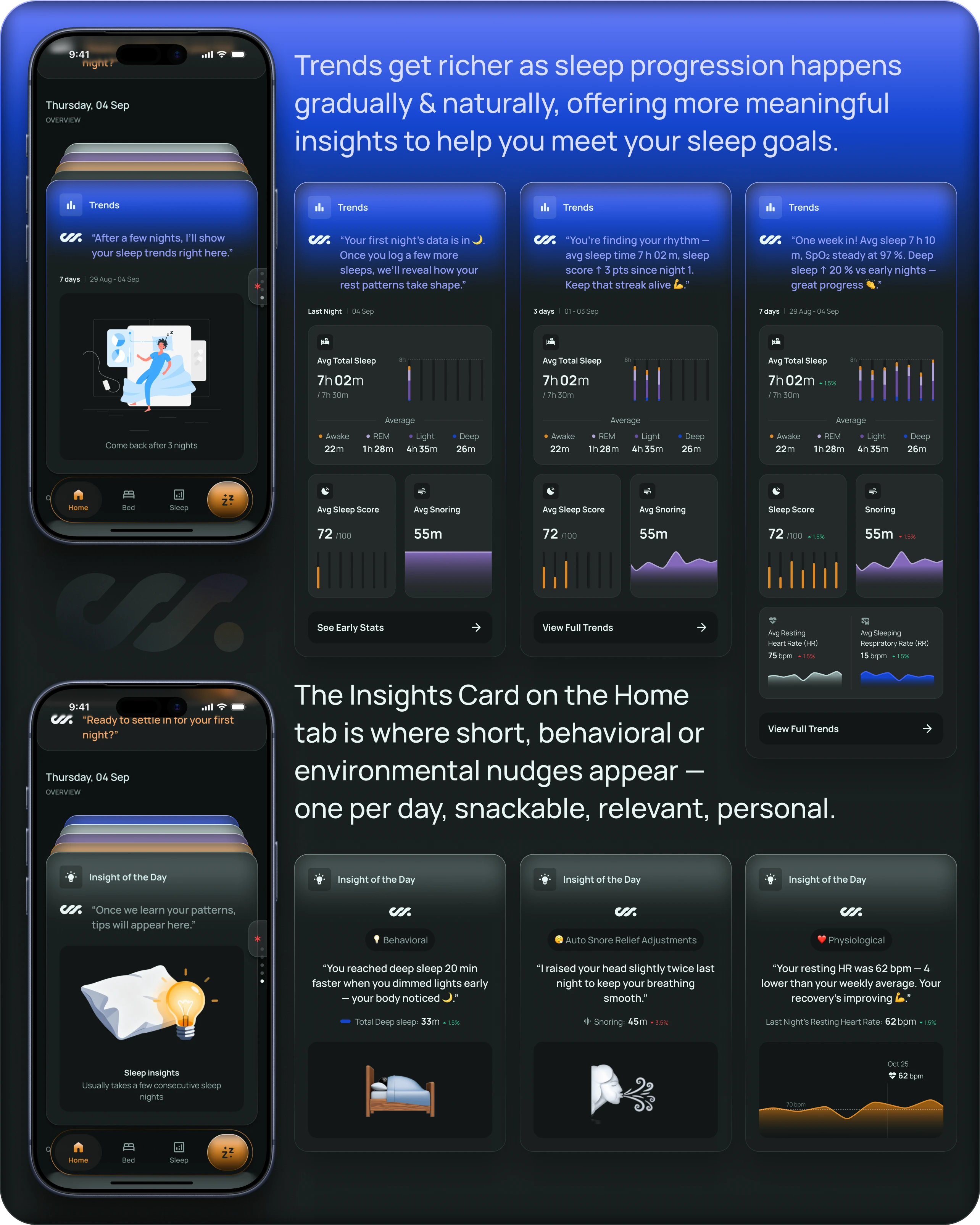
The app rarely surfaces what the bed adjusted in real time. Instead, it focuses on why it mattered afterward—connecting adaptive behavior to improvements in sleep efficiency, reduced restlessness, or better alignment.
This principle influenced:
- The structure of the Insights card
- The language used in AI-generated summaries
- The decision to avoid real-time adjustment notifications
The bed feels intelligent, but never intrusive.
# Principle 03
Show Outcomes, Not Mechanics
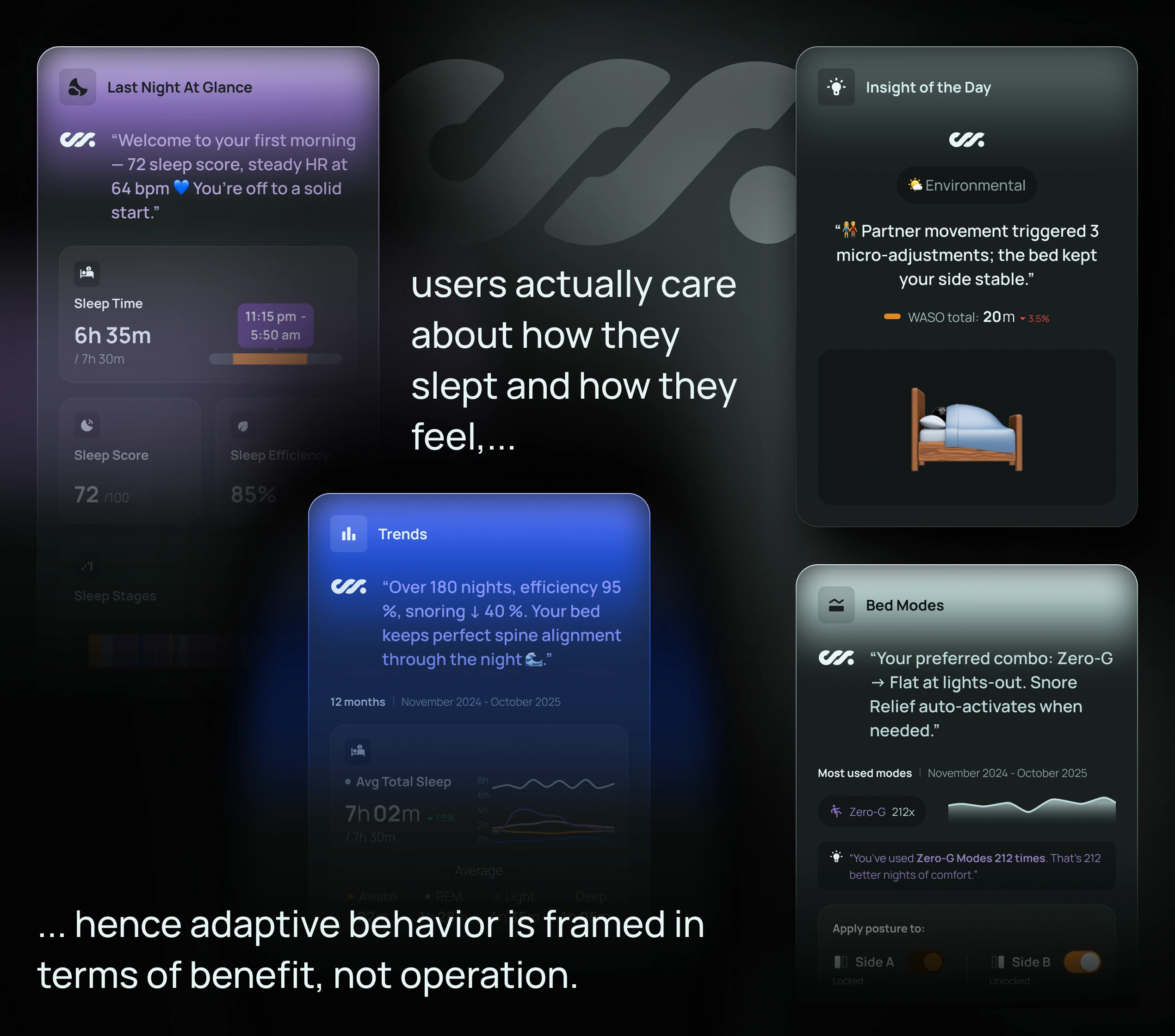
From the beginning, I made a conscious decision to avoid exposing low-level mechanics unless absolutely necessary. While the bed operates using a complex system of blocks, actuators, and sensors, surfacing this complexity would have shifted attention away from what users actually care about: how they slept and how they feel.
Rather than showing users every adjustment or sensor reading, the app focuses on outcomes — sleep duration | efficiency | consistency | comfort | recovery |
When adaptive behavior is explained, it’s framed in terms of benefit, not operation.
This principle helped avoid a common trap in smart hardware products: mistaking transparency for usefulness.
It also made the experience more inclusive:
Users didn’t need to understand biomechanics or robotics to trust the product—they only needed to feel that it was helping.
# Principle 04
Progress Over Perfection
Sleep is inherently variable. Designing the experience around nightly "scores" or pass/fail feedback would have made the app feel judgmental and discouraging over time.
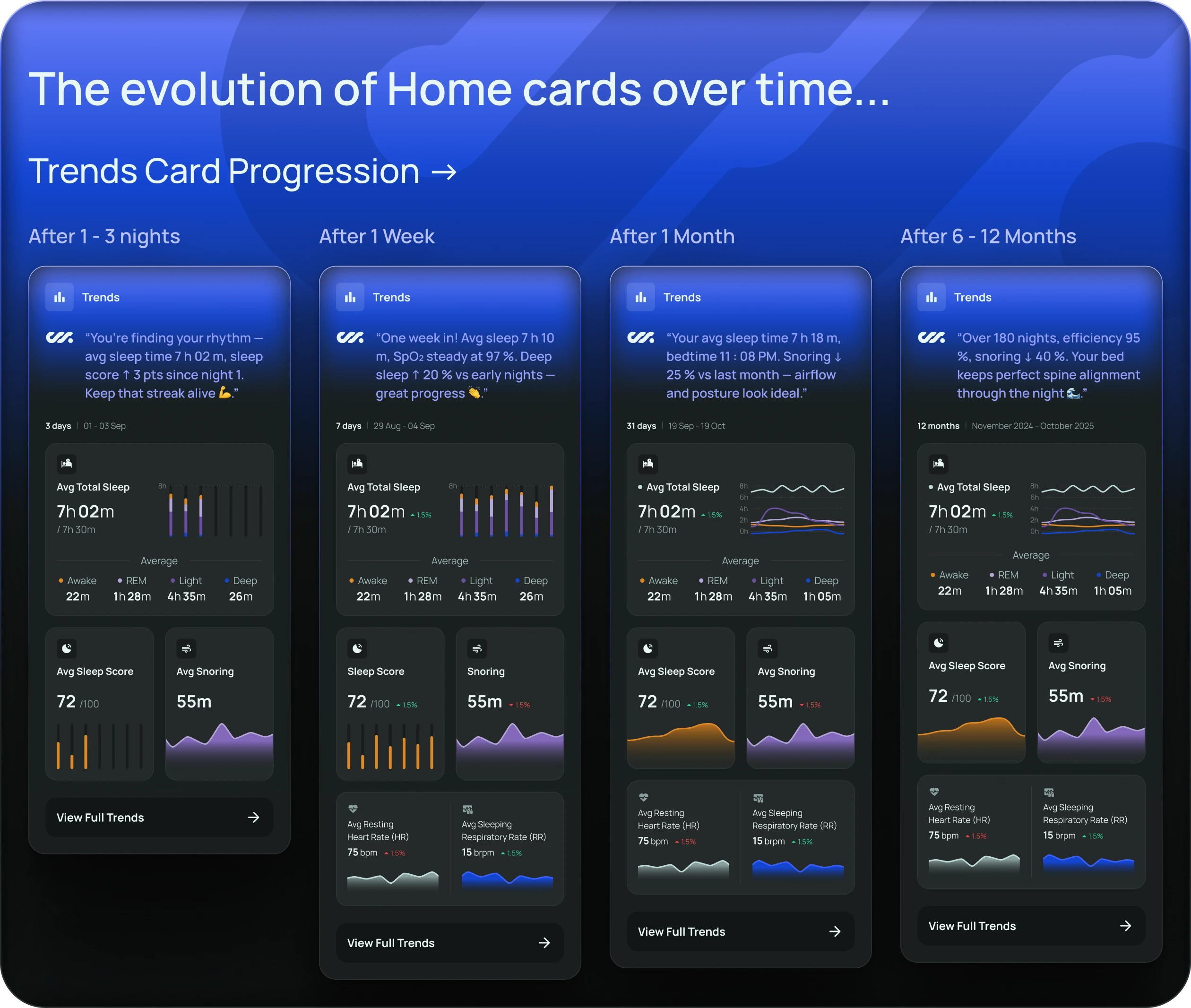
Instead, I anchored the experience around progress and consistency. A single bad night is contextualized against trends. Improvements are framed as gradual. Language remains encouraging, even when metrics dip.
This principle shaped:
- The evolution of Home cards over time
- The way trends are visualized
- The tone of feedback in both insights and summaries
The goal was not to optimize a single night, but to help users build healthier sleep patterns without guilt.
# Principle 05
Intelligence Should Speak Softly
Finally, I treated intelligence as something that should be felt more than heard.
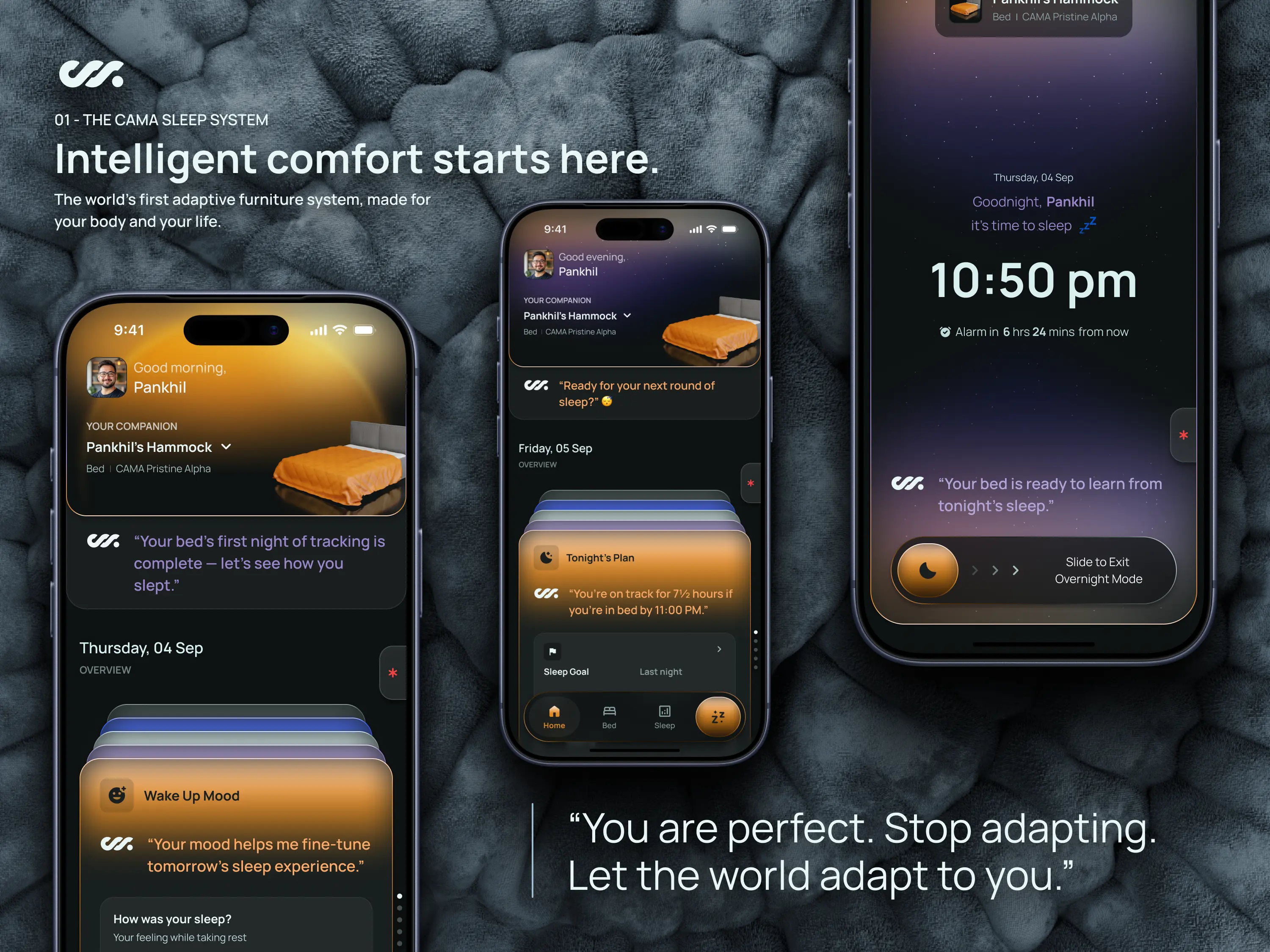
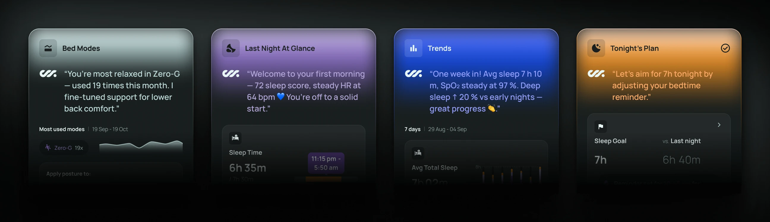
Rather than building a conversational AI chat interface, I designed intelligence to appear in short, contextual moments: a daily summary, a single insight, or a gentle nudge in cards like Tonight’s Plan, Last Night at a Glance, or Trends. This kept the experience lightweight and prevented users from feeling overwhelmed by advice.
This was a deliberate v1 trade-off. While a full AI assistant was discussed, I chose to prioritize clarity, reliability, and tone over novelty.
The result is an app that feels attentive without being demanding — a companion, not a coach shouting instructions.
3. System Design
Turning Principles into a Cohesive, Scalable Product Experience
Once the principles were set, the next challenge was turning them into something operational. The product wasn’t small, and it wasn’t static. Hardware constraints were evolving, brand direction was still forming, and I was designing the entire app end-to-end as a solo designer.
To keep the experience coherent, I stopped thinking in terms of isolated features and instead focused on a few core systems that could scale over time. Every screen, interaction, and decision needed to belong to one of these systems.
In practice, four systems carried the majority of the product’s weight.
# System 01
The Home Experience as a Living Surface
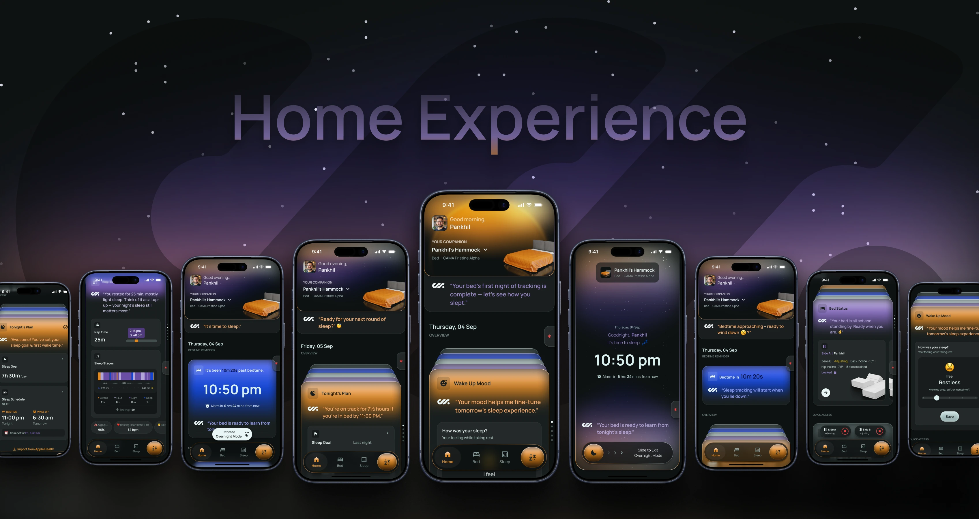
Rather than treating Home as a static dashboard, I designed it as a living surface—one that changes behavior based on the user’s sleep stage and maturity with the product.
Home is the default entry point, but it behaves very differently depending on context:
- Pre-sleep, it guides planning and reassurance.
- Overnight, it fades into a Minimal UI focused on safety.
- Post-sleep, it becomes reflective and insight-driven.
What makes this system work is that:
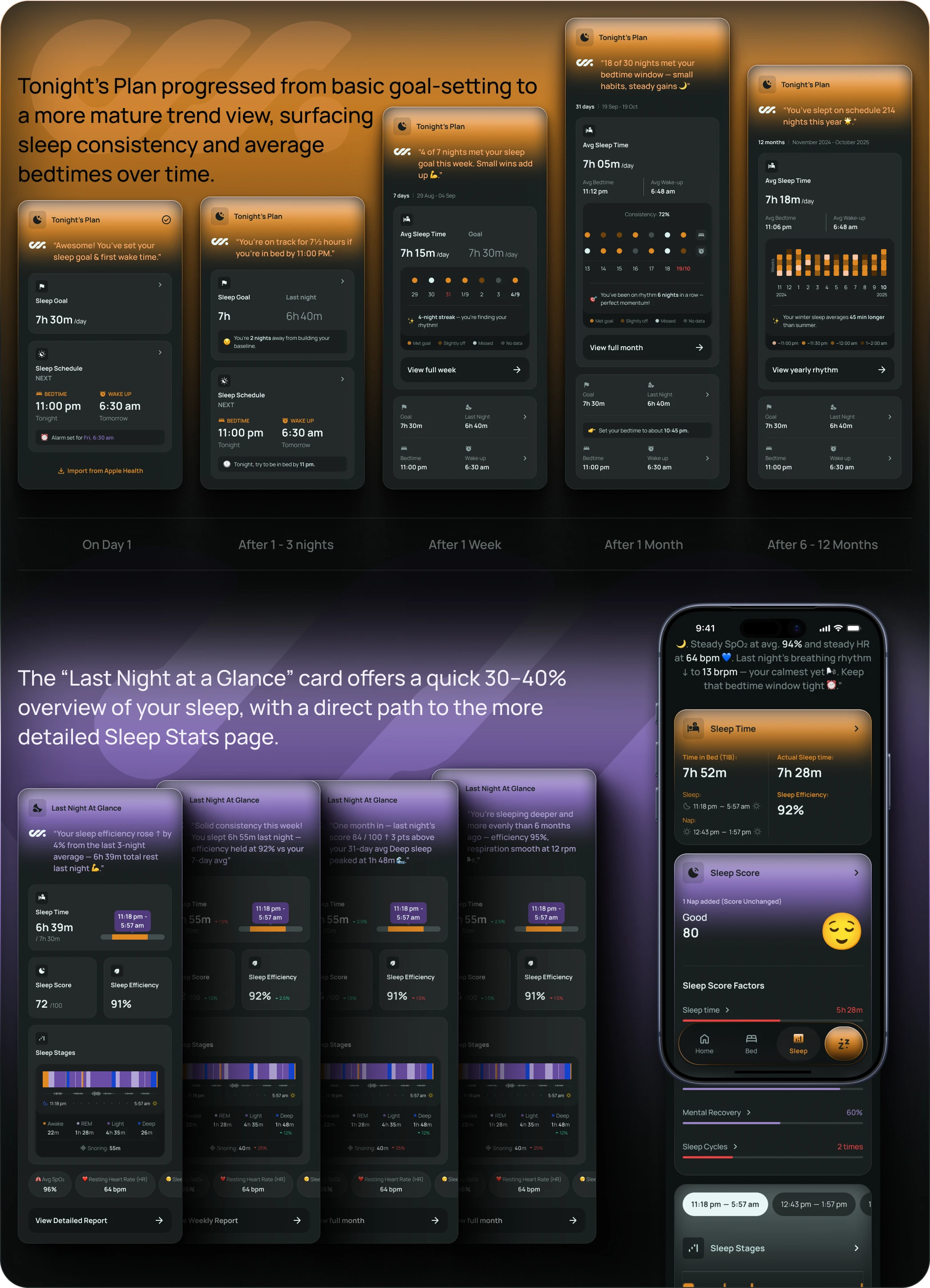
Home never tries to do everything. It operates deliberately at 30–40% depth, surfacing just enough information to inform or reassure, while pushing deeper exploration into the Bed Controls and Sleep Stats tabs.
Cards like Tonight’s Plan, Last Night at a Glance, Wake-Up Mood, Trends, and Insights aren’t standalone features. They’re contextual windows into deeper systems, each with a clear role depending on the moment.
Importantly, these cards progress over time.
- A user on their first night sees reassurance and placeholders.
- After a week, patterns emerge.
- After a month, insights become more comparative and confident.
This progression allowed the experience to feel fresh without introducing new UI paradigms every few weeks.
# System 02
Intent-Driven Bed Control, Not Manual Operation
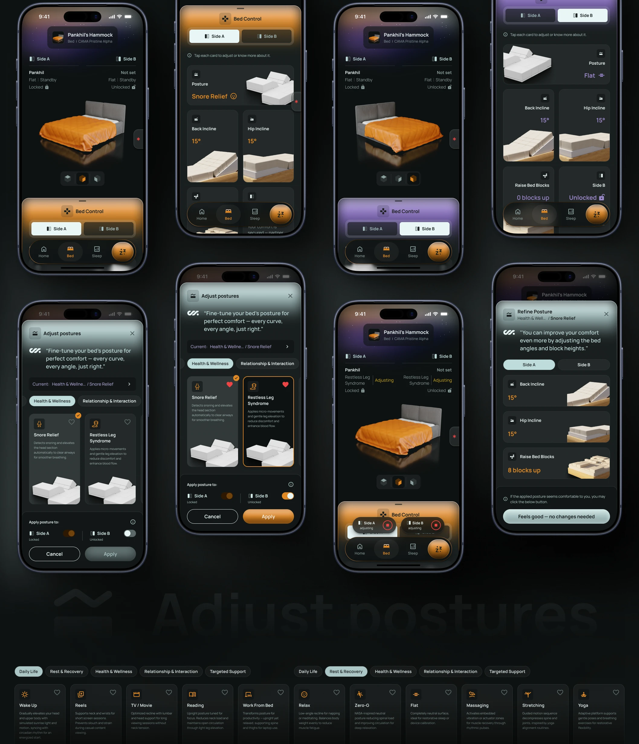
The Bed Controls tab was designed with a clear boundary: it is a place for intent, not micromanagement.
Users can choose from a rich set of preconfigured bed modes, each representing a meaningful resting or sleep context:
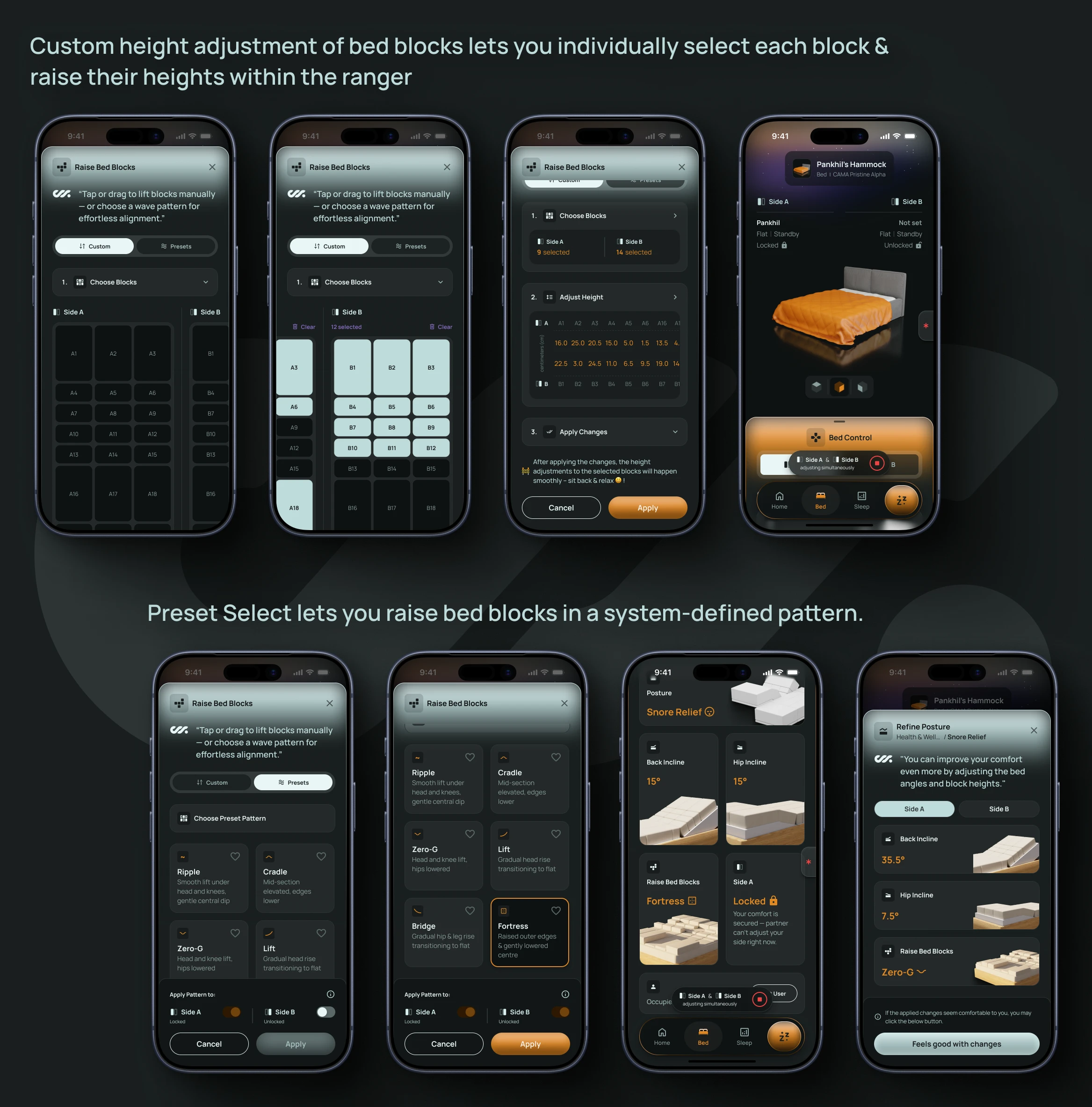
For users who want finer control – Posture Adjustments and Block Elevation – are available, including waveform-based presets like wave, cradle, bridge, or fortress.
What I deliberately avoided was turning this into a mechanical control panel. Controls are grouped by mental model, not hardware abstraction.
Users don’t think in terms of actuators or block IDs—they think in terms of comfort, posture, and use cases.
This system also had to support multi-user dynamics. Side locking, shared modes, and conflict handling were designed upfront so that the experience wouldn’t break once a partner joined.
The result is a control experience that feels powerful without being intimidating — and crucially, doesn’t compete with the bed’s autonomous behavior during sleep.
# System 03
Sleep Intelligence Without Data Overload
The Sleep Stats tab is where depth lives, but even here, restraint was critical.
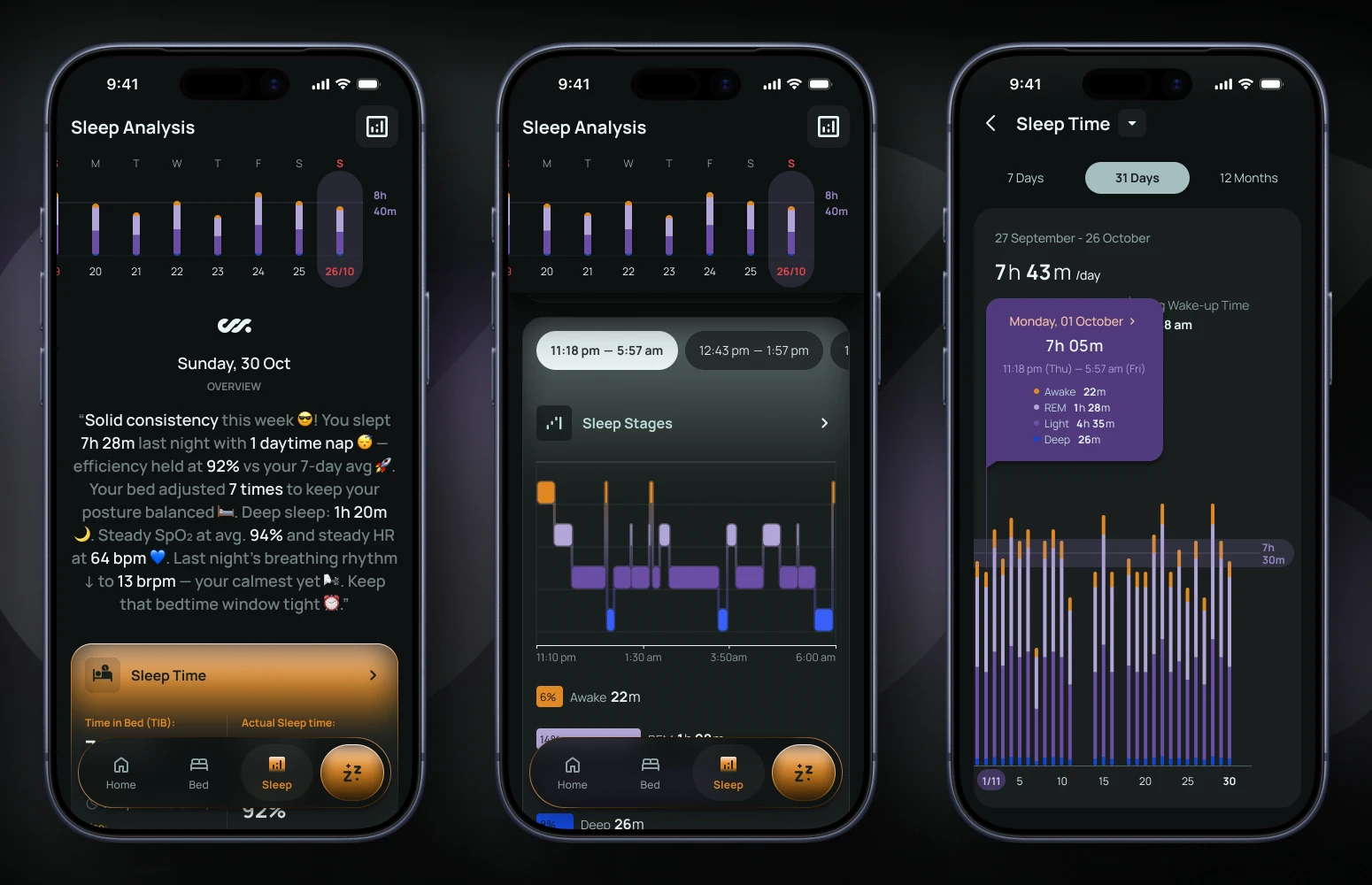
Rather than leading with charts, the daily view starts with a human-readable summary — a short, warm, GenAI-generated explanation of how the user slept, what improved, and what to focus on next.
This was a deliberate choice to reduce cognitive load and avoid turning sleep into a numbers-first experience.
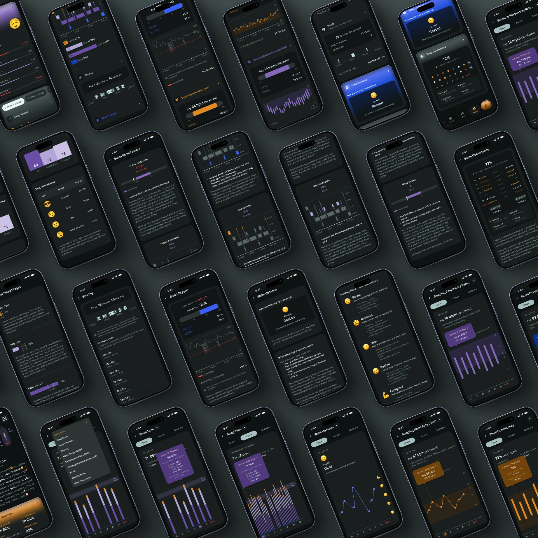
Below this summary, sleep data is organized into modular cards:
- Sleep Time card, it shows the total time in bed, actual sleep time, & sleep efficiency.
- Sleep Score card, it shows the sleep score based on various sleep factors like physical recovery, restfulness, mental recovery, and sleep cycles.
- Sleep Stages card, it shows the breakdown of time spent in light, deep, and REM sleep stages, along with a visual representation of the sleep cycle.
- Snoring card, it shows the duration, frequency, and intensity of snoring events, along with insights on potential causes and remedies.
- Blood Oxygen (SpO2) card, it shows the average, minimum, and maximum blood oxygen levels during sleep, along with a visual representation of the graph and insights on potential health implications.
- Sleeping Heart Rate (SHR) and Sleeping Respiratory Rate (SRR) cards, they show the average, minimum, and maximum heart rate & respiratory rate respectively during sleep, along with a visual representation of the graph and insights on potential cardiovascular and lung health implications.
- WASO (Wakefulness After Sleep Onset) card, it shows the total duration of wakefulness after sleep onset, along with a visual representation of the graph and insights on potential causes and remedies.
- Wake-up Mood card, it shows the user’s mood upon waking, along with insights on potential factors affecting their morning state.
- Sleep Consistency card, it shows the user’s sleep consistency over the past week, along with insights on potential factors affecting their sleep schedule.
Each card opens into a focused, night-specific deep dive, combining granular readings (where relevant), comparisons against healthy ranges for the user’s age and sex, and lightweight educational context explaining what the metric means and why it matters.
📊 Historical analysis lives one level deeper – A dedicated trends entry point allows users to explore patterns across 7 days, 31 days, or 12 months, with familiar, scrollable visualizations and the ability to switch between sleep parameters without leaving the view.
This keeps longitudinal insight accessible, without overwhelming the daily experience.
A key design decision here was separating daily meaning from long-term understanding.
Home answers: "How did I sleep?"
Sleep Stats answers: "How am I doing over time?"
This separation avoids repetition while still letting users move fluidly between reflection and analysis when they want to go deeper.
# System 04
Intelligence as a Companion, Not a Chatbot
One of the most interesting design explorations in this project was around how intelligence shouldshow up.
Early on, we explored the idea of a full AI chat interface—something users could talk to about sleep issues, pain points, or routines. After testing the idea conceptually, I made the call not to pursue it for v1. It would have added complexity, raised expectations we couldn’t yet meet, and distracted from core reliability.
Instead, I designed intelligence to manifest in small, contextual moments:
- Daily summaries written in a warm, encouraging voice
- Insight cards explaining how the bed adapted overnight
- Gentle nudges tied to bedtime consistency or environment
- A visual "personality" anchored to the CAMA app logo, rather than a human-like avatar
This approach made the product feel attentive without demanding conversation. Users aren’t asked to explain themselves; they’re supported quietly, with optional depth when they want it.

4. Outcomes & Impact
Shipping a Coherent v1 Under Ambiguity
The goal of this project was not to ship a feature-complete app, but to deliver a coherent, trustworthy v1 that users could rely on night after night—and that the team could confidently evolve.
Success, at this stage, was less about the number of features shipped and more about alignment: between user intent and system intelligence, between hardware capability and software expression, and between long-term vision and short-term delivery.
Clear Mental Model
Users understand what the bed does, when they are in control, and when the system takes over quietly. By structuring around sleep stages and progressive disclosure, the app avoided common smart-hardware pitfalls like complexity and data overload.
Trust in Autonomy
Control is always available, but intelligence stays deliberately invisible during sleep. The system explains itself afterward through outcomes rather than mechanics, allowing user confidence to grow naturally over time.
Scalable Foundation
The Home experience proved scalable. The same surface supports first-night reassurance, short-term learning, and long-term reflection without fragmenting into new dashboards, giving the team a durable foundation for future features.
Deliberate Trade-offs
AI chat, deep integrations, and 3D visualizations were intentionally sequenced out of v1. Onboarding was stabilized rather than reinvented during rebrands. These decisions ensured what shipped felt complete, calm, and reliable.
Designing with Delivery in Mind
Throughout this system design, I had to make several trade-offs typical of an early-stage startup.
Brand direction evolved mid-project, requiring me to rework large portions of the Home and Sleep experiences with a new color system and tone, while intentionally leaving onboarding largely intact to avoid unnecessary churn.
Platform integrations like Apple HealthKit and HomeKit were consciously deferred to focus on reliability and core value. AI chat and motion-heavy 3D bed visualizations were scoped out for a future phase, despite their desirability.
These decisions weren’t about compromise—they were about sequencing. My role was to ensure that what shipped felt complete, trustworthy, and coherent, even if not everything was built yet.
Operating as a Design Lead in Practice
While my title on paper was that of a designer, the nature of the work required Design Lead ownership throughout.
I defined experience principles, aligned them with the founder’s evolving vision, translated hardware constraints into human-friendly interfaces, and made calls on scope, sequencing, and tone. I operated without a separate PM or design team, but with constant collaboration across engineering and leadership.
Most importantly, I treated the app not as a static artifact, but as a system that would evolve — and designed it to do so gracefully.
What I’d Do With More Time
If given additional runway, the next phase of work is clear:
- Introduce motion-rich 3D bed visualizations to deepen spatial understanding
- Fully redesign onboarding using the evolved design system and personality
- Expand adaptive insights into more predictive, proactive guidance
- Integrate with broader health and home ecosystems once core trust is established
These aren’t corrections — they’re natural extensions of a solid foundation.
Why This Case Study Matters
This project wasn’t about designing screens. It was about designing confidence — for users, for the founder, and for a product that lives in the most intimate part of people’s lives.
It demonstrates how I approach ambiguous problem spaces, balance vision with constraints, and lead design through systems rather than surface-level polish.
And it reflects the kind of work I want to continue doing: building thoughtful, human-centered products where intelligence supports people quietly, over time.