Why This Problem Mattered
For CAMA, the Home screen wasn’t just another tab. It immediately ruled out a conventional dashboard approach because sleep is not a static activity, and neither is the user's mindset.
The Primary Surface
It’s the first screen users land on, the one they return to every morning and night, and the primary way they interact with both the bed and their sleep data.
A Shifting Mindset
The same user needs guidance before sleep, invisibility during rest, and reflection after waking up. A fixed layout would force the user to adapt to the interface.
The challenge was to design a Home experience that adapts its behavior over time and context, while still feeling familiar and grounded.
What Made It Hard
There were three overlapping tensions to resolve.
Control vs. Reflection
Home had to serve as both a control surface for quick bed actions and a calming reflection space without becoming cluttered or mechanical.
Day One vs. Long-Term Use
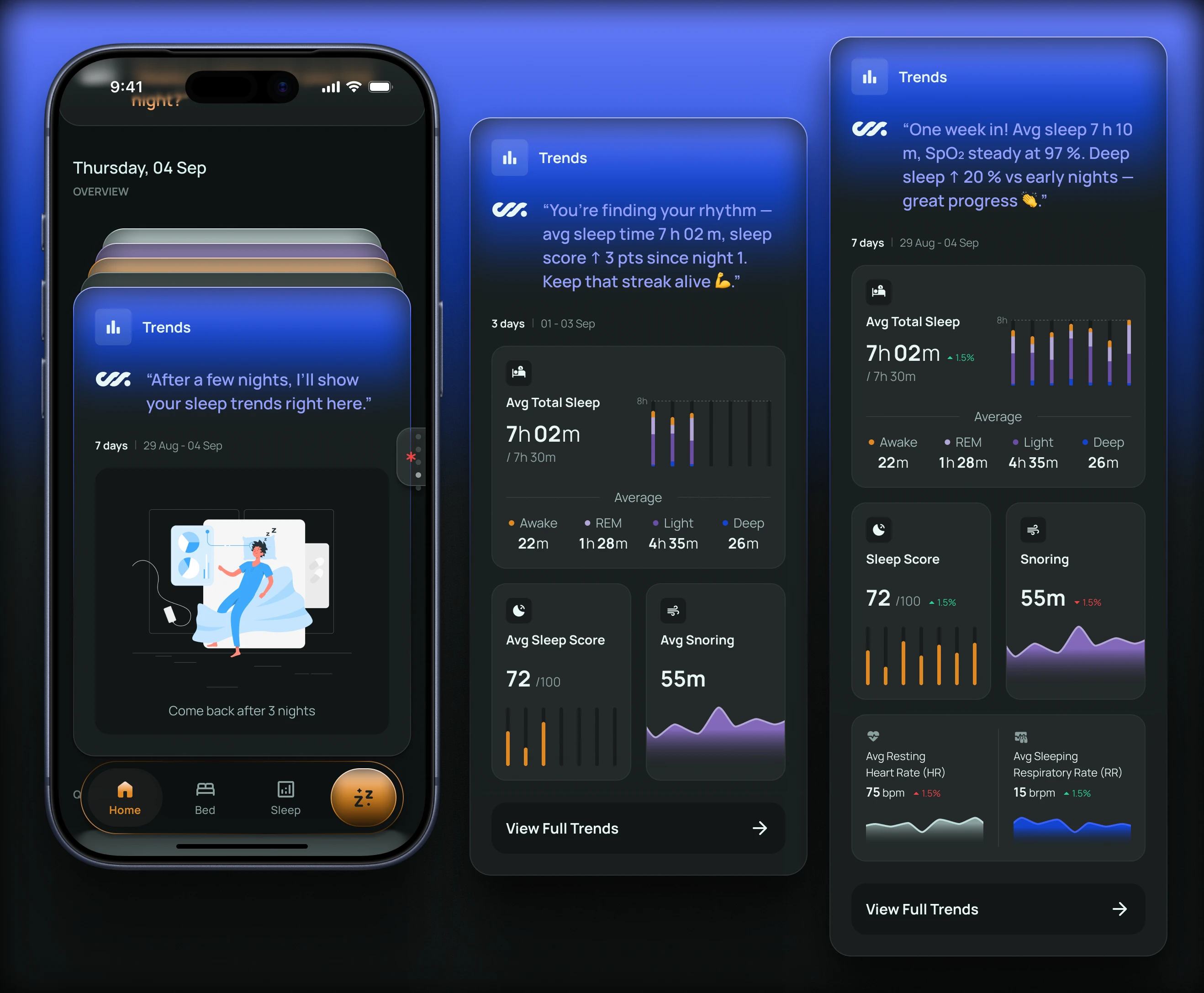
Early on, there’s little data and high uncertainty. Weeks later, macro patterns matter more than individual nights. The experience needed to evolve naturally without feeling disorienting.
The Challenge of Tone
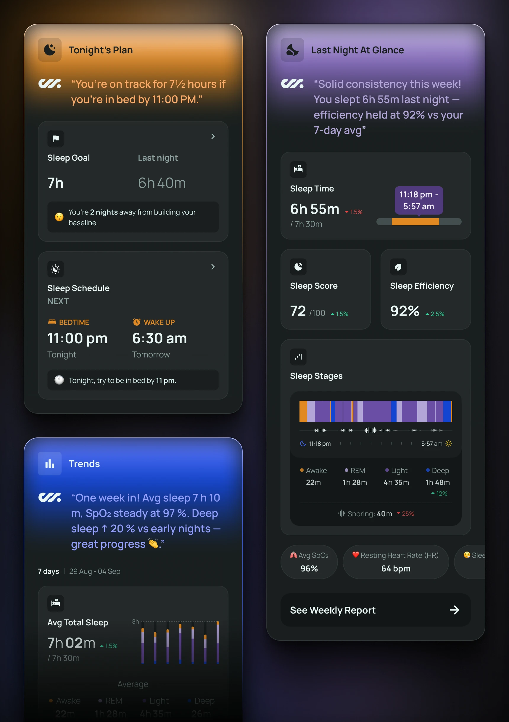
Sleep is personal and vulnerable. Any nudging—especially when metrics aren’t going well—had to feel encouraging, not corrective.
Key Design Decisions
Designing Home Around Time and State, Not Features
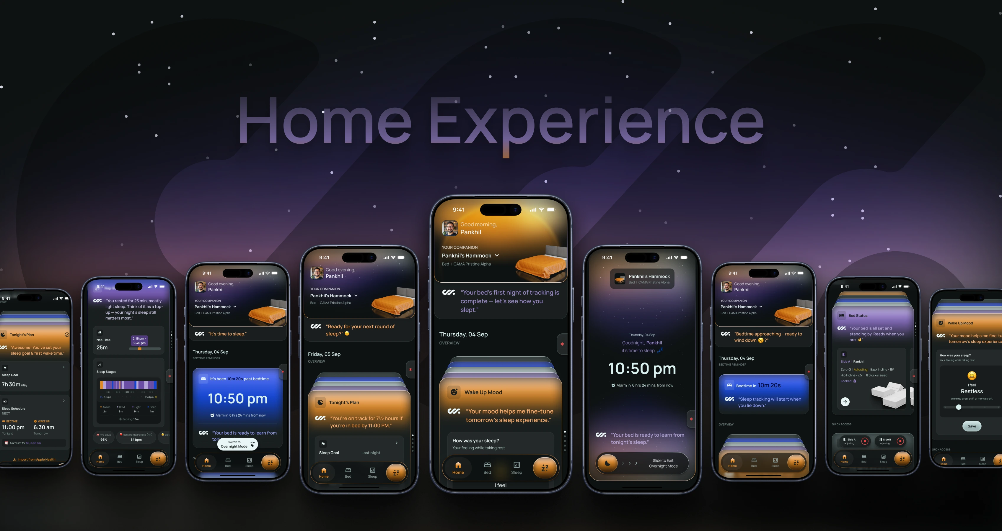
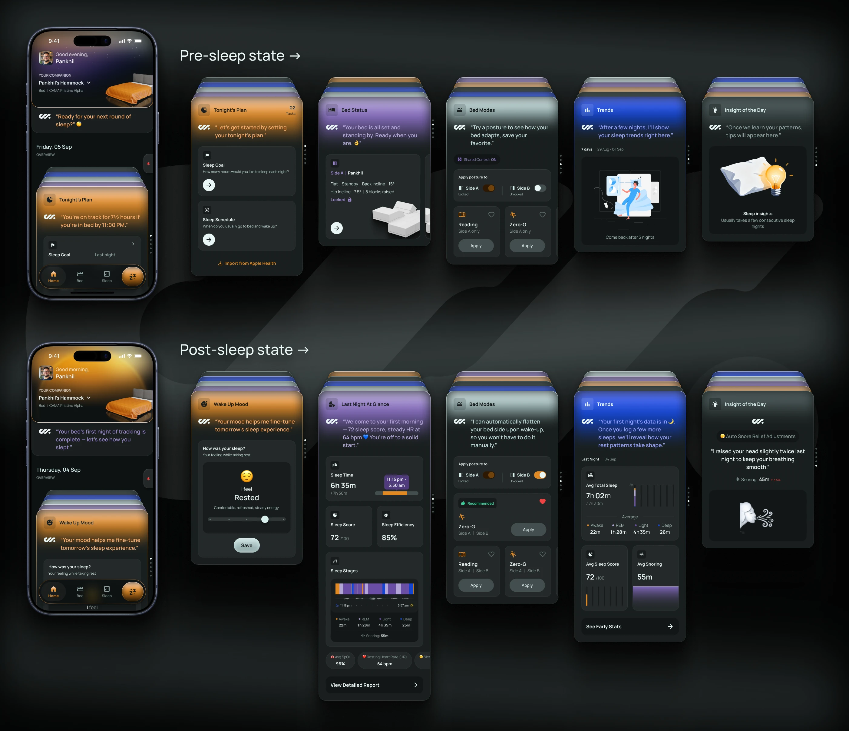
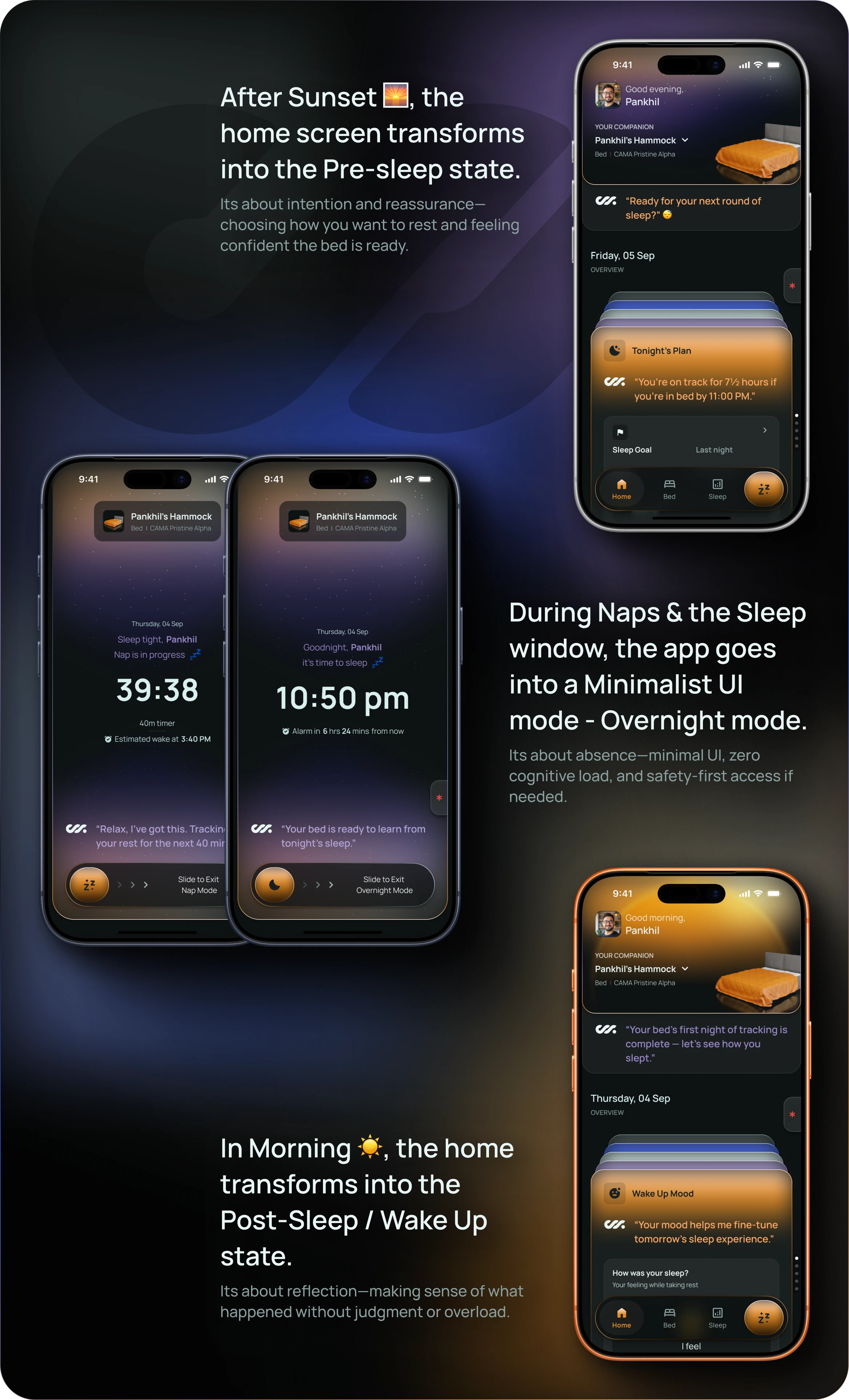
Instead of organizing Home by functionality, I designed it around sleep states. The structure remains consistent, but content, tone, and visual weight shift—without introducing new navigation modes the user has to learn.

Pre-sleep
When users are intentional and planning.

Overnight
When users should not be disturbed.

Post-sleep
When they’re open to reflection and insight.
The structure of Home remains consistent, but its content, tone, and visual weight shift based on time of day and sleep state. This allowed the same surface to feel calm, present, or minimal—without introducing new navigation or modes the user had to learn.
Using Cards as Conversations, Not Containers
Single Intent Roles
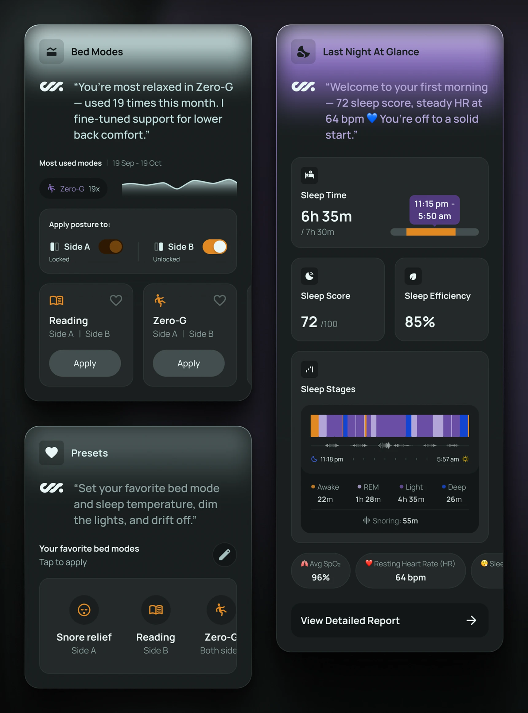
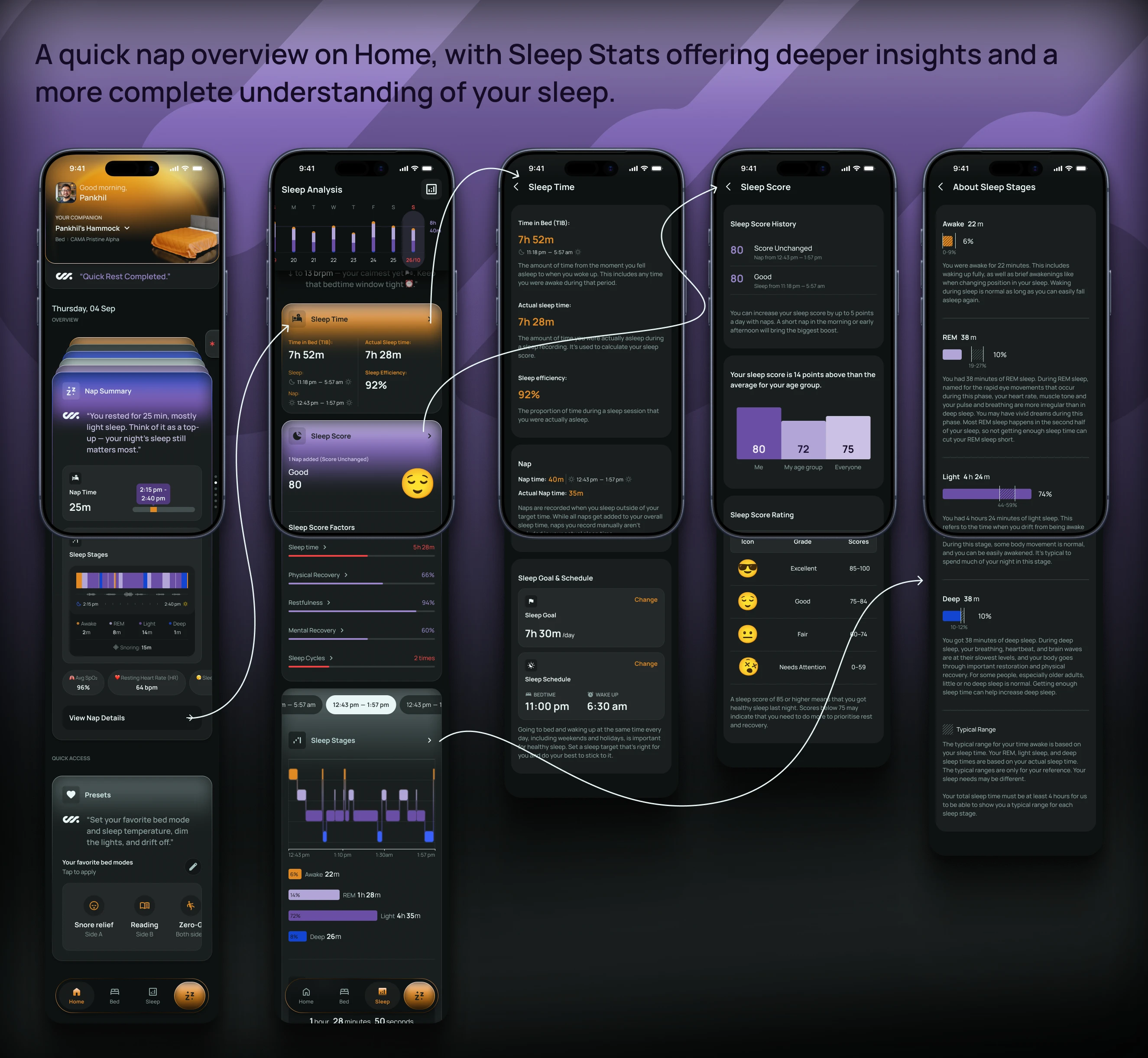
Home is composed of cards like Tonight’s Plan, Last Night at a Glance, Trends, and Wake-Up Mood. Each has a clearly defined emotional role, rather than acting as a data container.
Progressive Depth
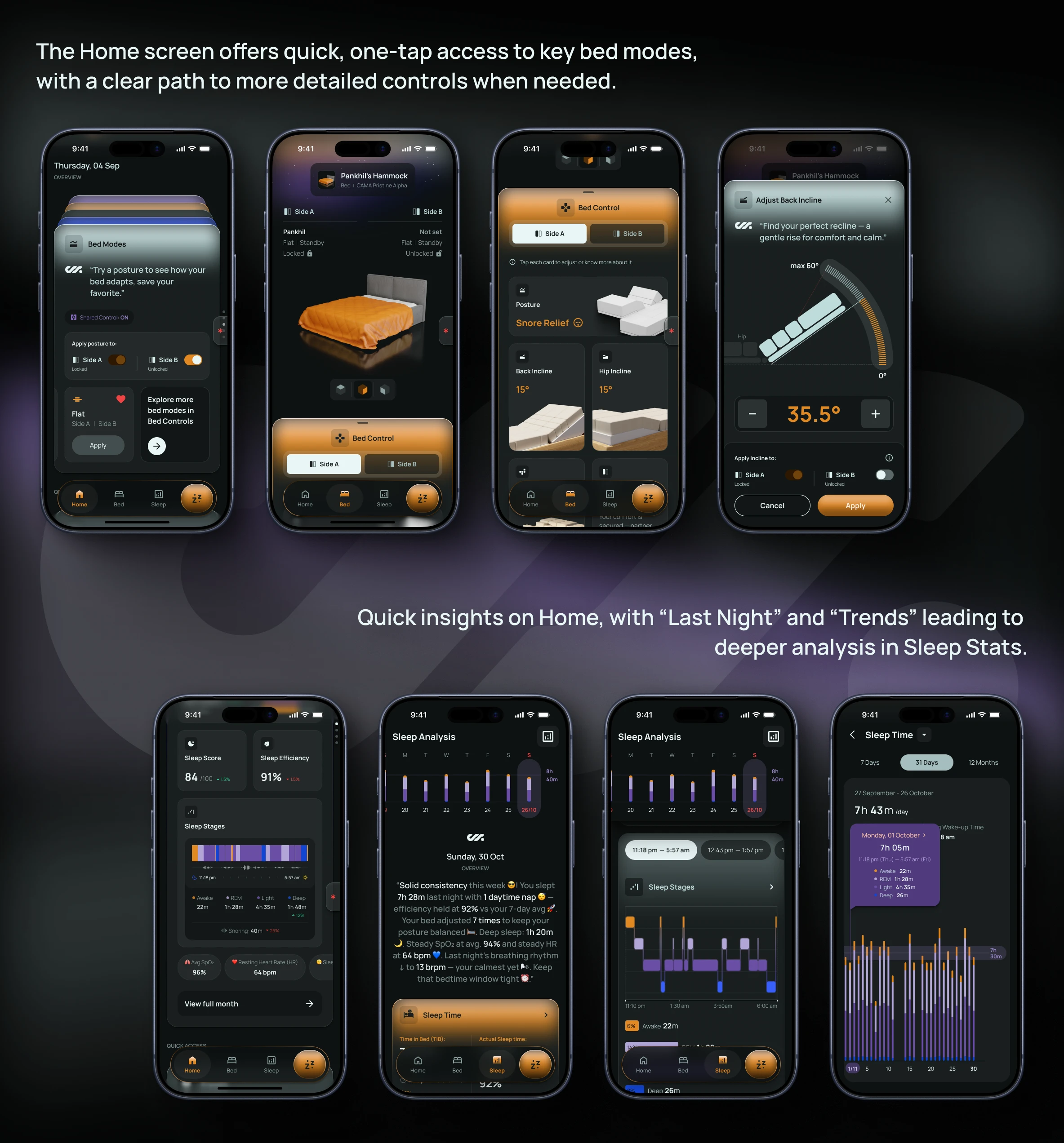
We surface small, meaningful snippets to keep Home at roughly 30–40% depth. Users only move into Bed Controls or Sleep Stats when they explicitly want detail.
GenAI as a Tone Layer, Not a Feature
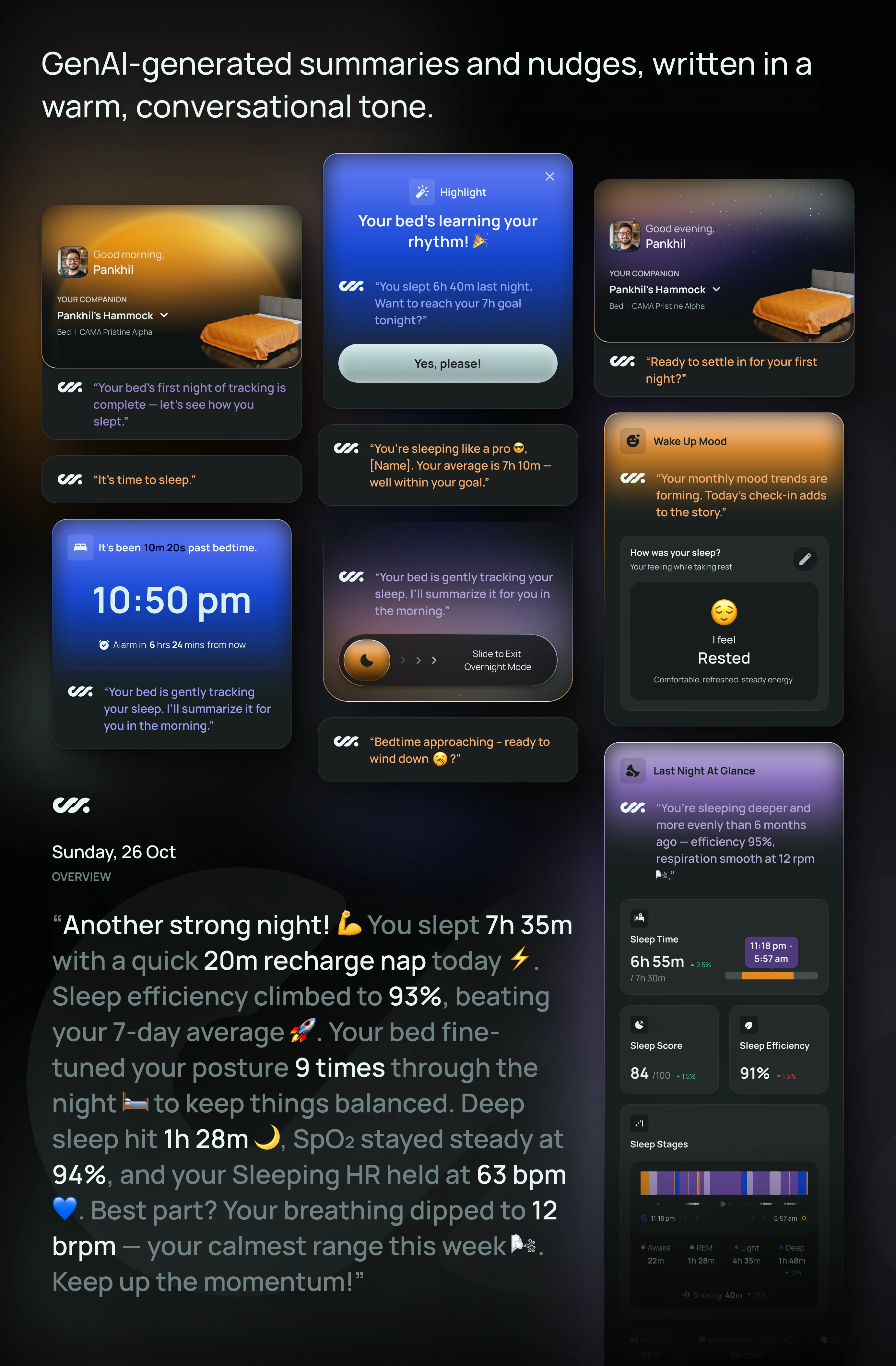
A key enhancement to Home was the introduction of GenAI-generated summaries and nudges, written in a warm, conversational tone. These appear as short greetings or reflections embedded directly within cards—never as a separate interface.
Using the app logo as a subtle AI avatar, the system greets users, reflects on trends, and offers gentle suggestions, much like a supportive coach. The intent wasn’t to explain data, but to humanize it—helping users feel understood rather than evaluated.
Visual Cues That Reinforce the Sleep State
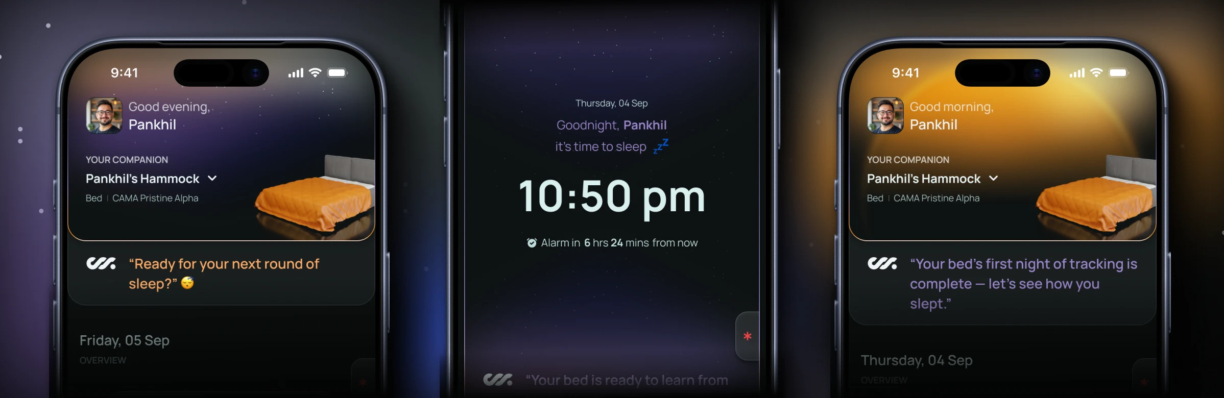
Visual design played a quiet but important role in reinforcing context.
Pre-sleep
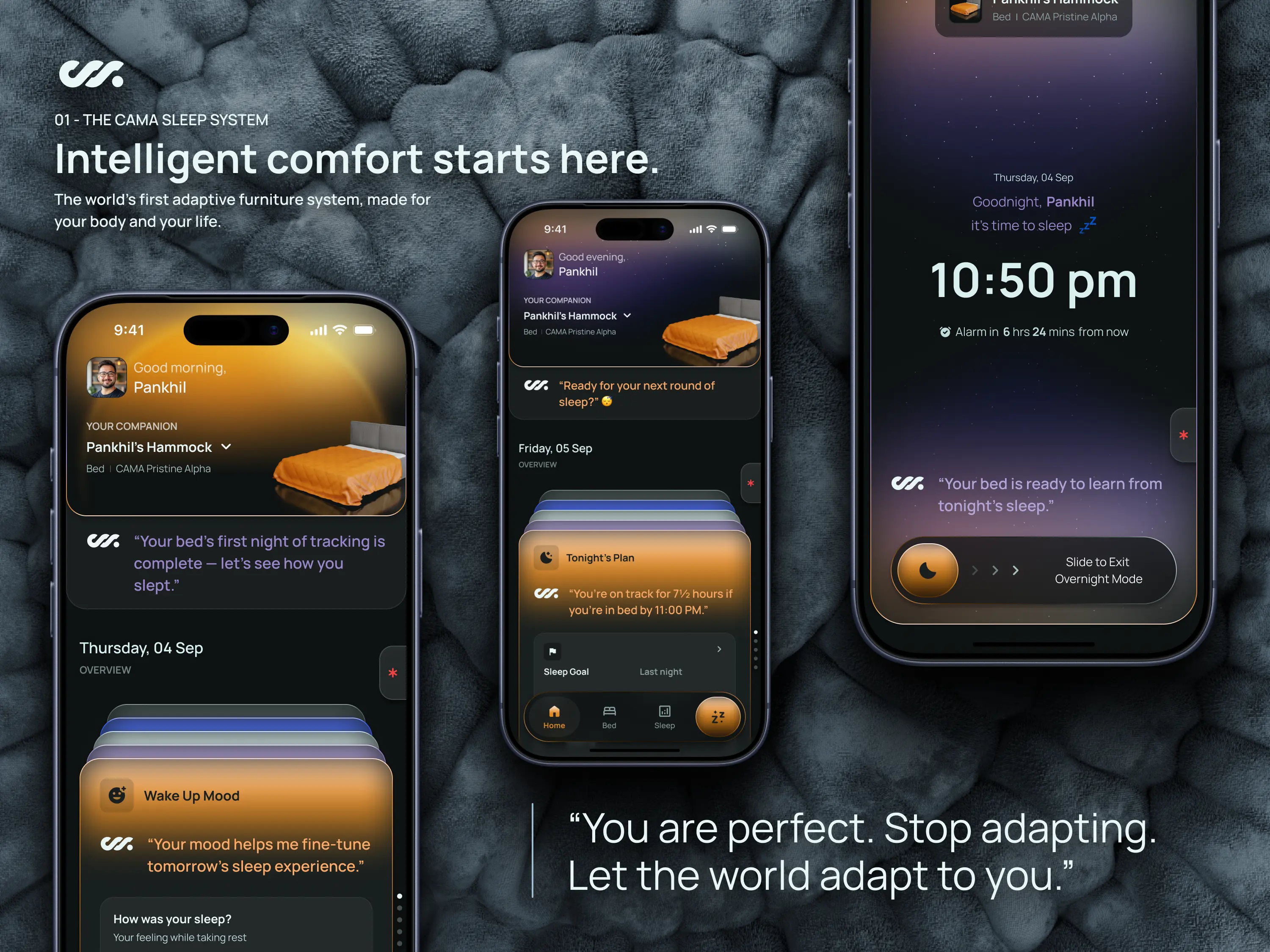
Uses a starry night backdrop behind the top card, signaling calm and readiness
Overnight
Collapses into a deep-space minimal UI, reducing stimulation to near zero
Post-sleep
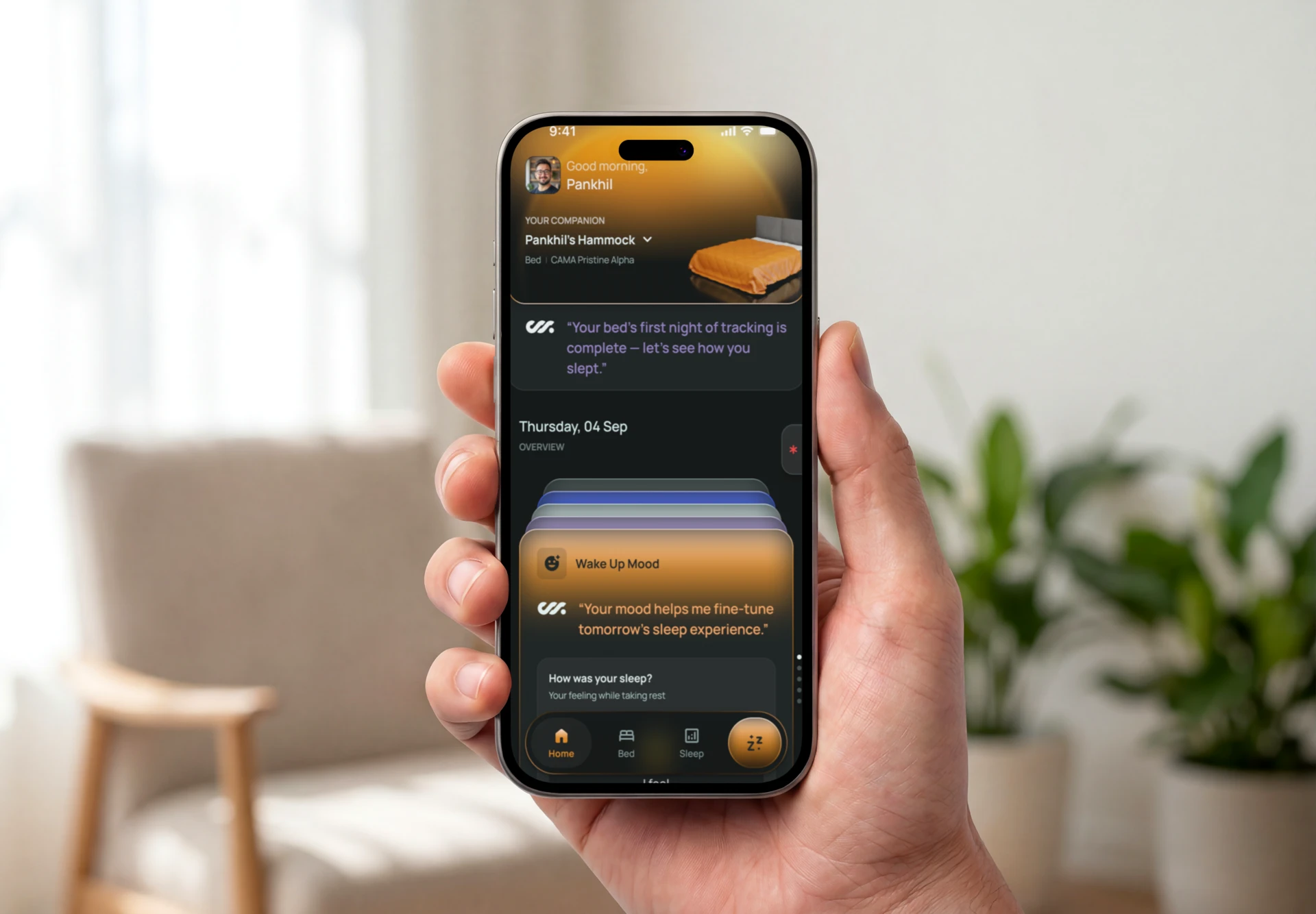
Introduces brighter, sunlit visuals in the top card, subtly marking the transition into day
These shifts are never announced; they’re felt. Over time, users begin to associate the visual language with how the system behaves.
On-Demand Sleep Without Breaking the Model
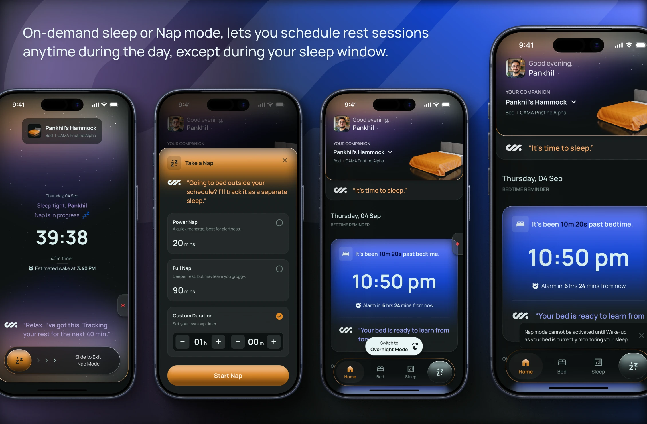
Sleep doesn’t always follow a schedule. To support real life, I introduced an on-demand sleep action in the primary navigation, allowing users to start naps or off-schedule rest sessions.
When active, the experience mirrors overnight mode—minimal UI, large clock, safety always accessible. To avoid confusion or overlap, this option is disabled during the user’s defined sleep window. This preserved the integrity of the nightly model while still giving users flexibility.
How This Shows Up in the Product
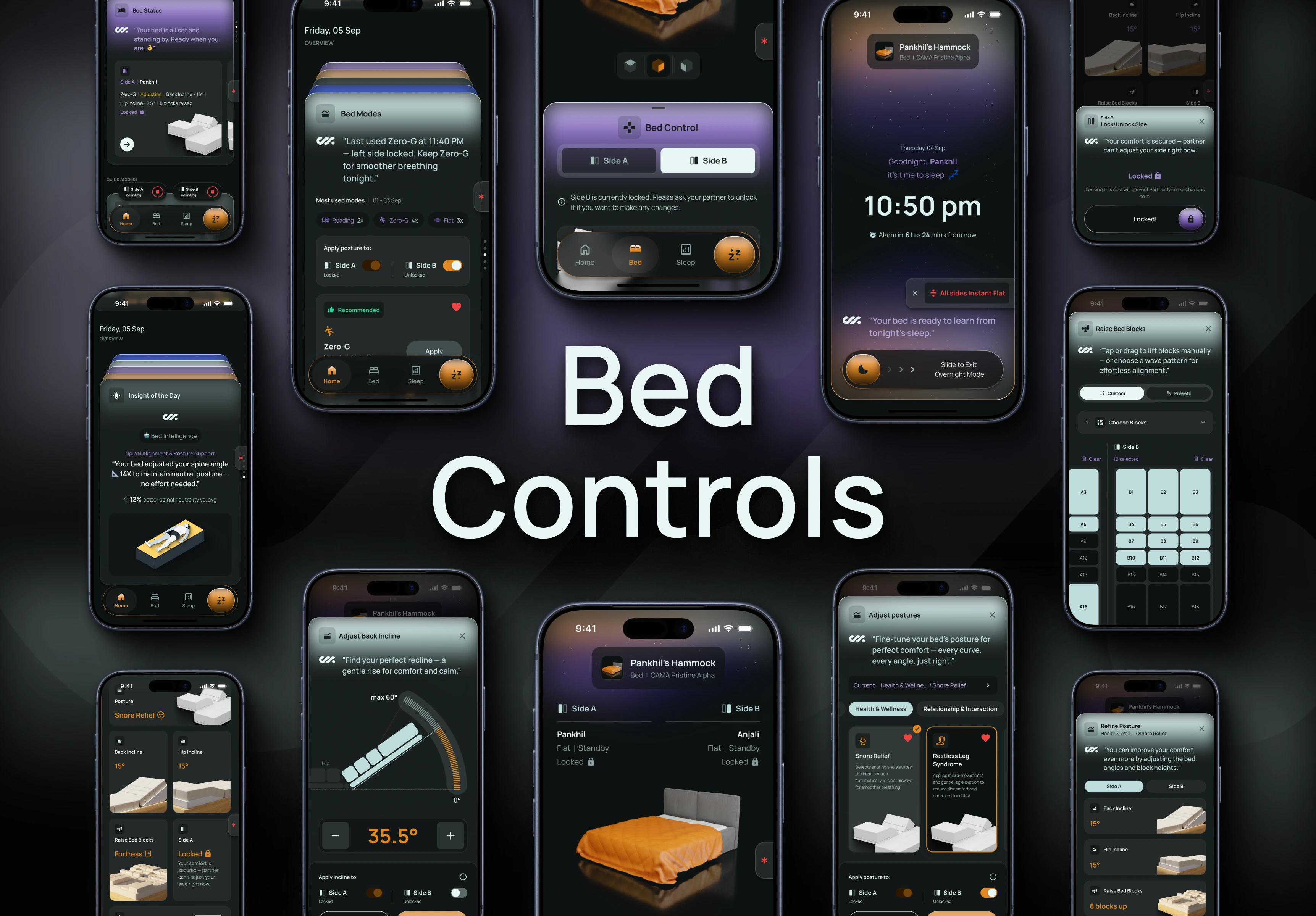
- Home is the default entry point for both bed interaction and sleep reflection
- Content adapts by time of day, not by manual mode switching
- AI summaries and insights appear inline, never demanding attention
- Nap and overnight experiences share the same calm, minimal language
Why This Matters Beyond This Product
This approach turns Home into a behavioral surface, not a dashboard. It demonstrates how design can support habit formation, reflection, and trust by respecting user context rather than competing for attention.
The same model can extend to other smart furniture, health systems, or any product where time, emotion, and restraint matter as much as functionality.