Timeline
Q2 2023 (4 Weeks)
My Role
Sr. Product Designer
(Design Owner)
Platform
Web Dashboard
Stakeholders
Design Manager
Principal PM
Executive Summary
I led the redesign of Multiplier’s insurance experience across employers, employees, and internal operations teams within a heavily constrained 3–4 week window. While the system functionally worked, it was incredibly difficult to navigate. Information was scattered, workflows were ambiguous, and operations teams were constantly stepping in to manually resolve avoidable issues.
This was starting to show up in the business:
- Support tickets were increasing (with 20%+ tied to information that already existed)
- NPS was dropping
- Operational overhead was rising
Given the tight timeline, completely rebuilding the platform was off the table. My focus was purely structural: introducing clarity and visibility into what already existed.
The Result
- Insurance attachment rate improved from 59% to 85%
- Operational effort reduced by 45%
- Support tickets related to insurance dropped by ~30%
Business Context & Urgency
The Market Reality
Insurance is a cornerstone of Multiplier’s global employment platform. It’s more than a perk; it directly influences employee retention and drives platform revenue. To scale, the system needed to seamlessly handle a matrix of complexities: multiple countries, various insurance partners, differing compliance laws, and both individual and family plans.
The Project Constraints
Operationally, things were breaking down. Users were frustrated, and internal teams were overwhelmed. The catch? I had exactly 3–4 weeks to fix the friction without destabilizing the live system. The goal wasn't a ground-up redesign; it was a rapid, high-impact structural intervention.
The Problem
When I investigated the system, it became obvious that the issues weren’t isolated to a single user type or workflow. The friction manifested differently across all stakeholders:
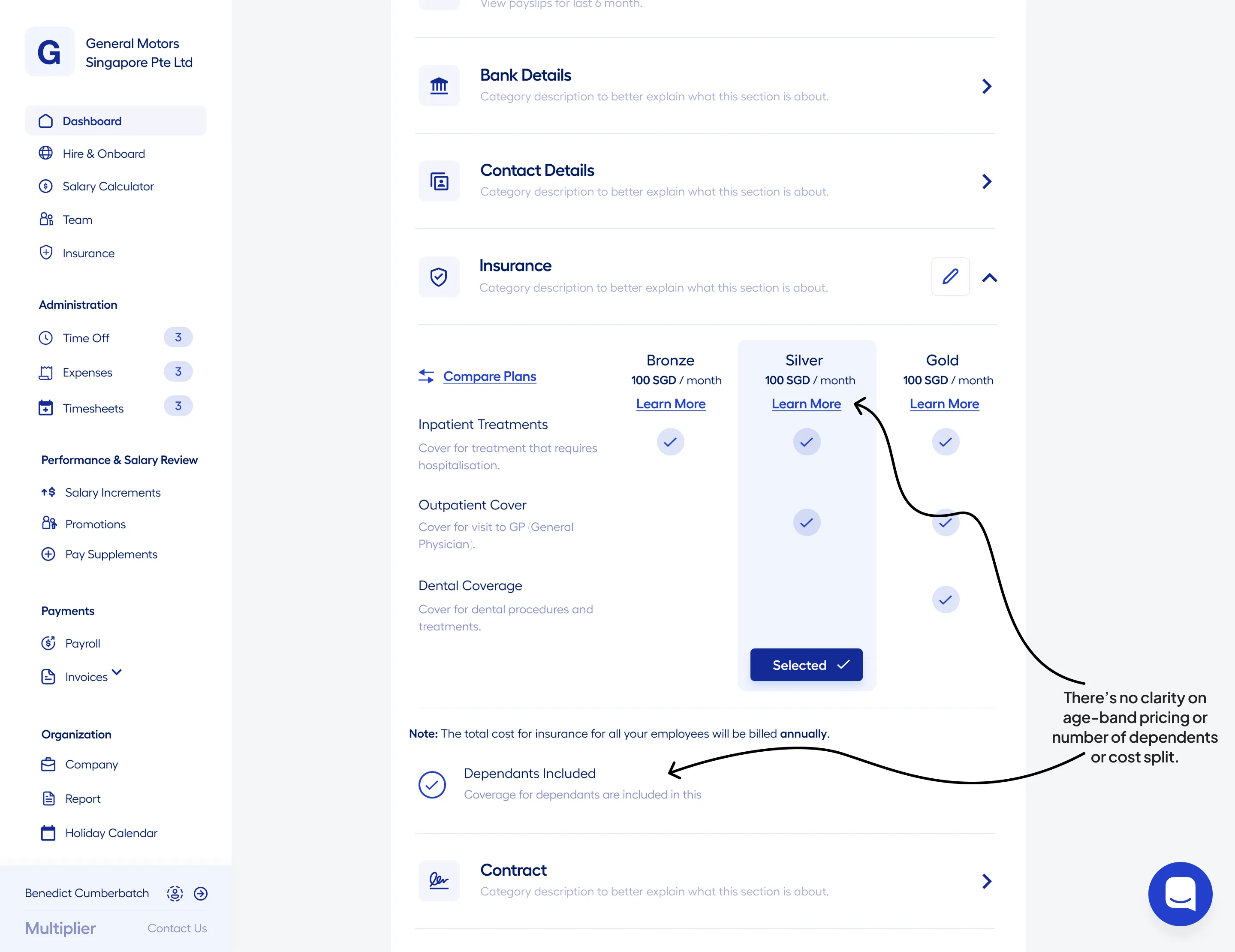
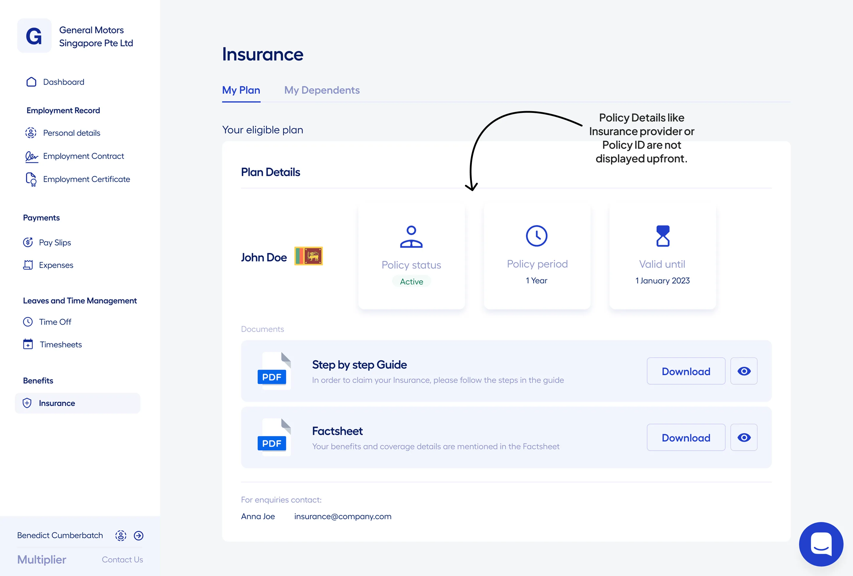
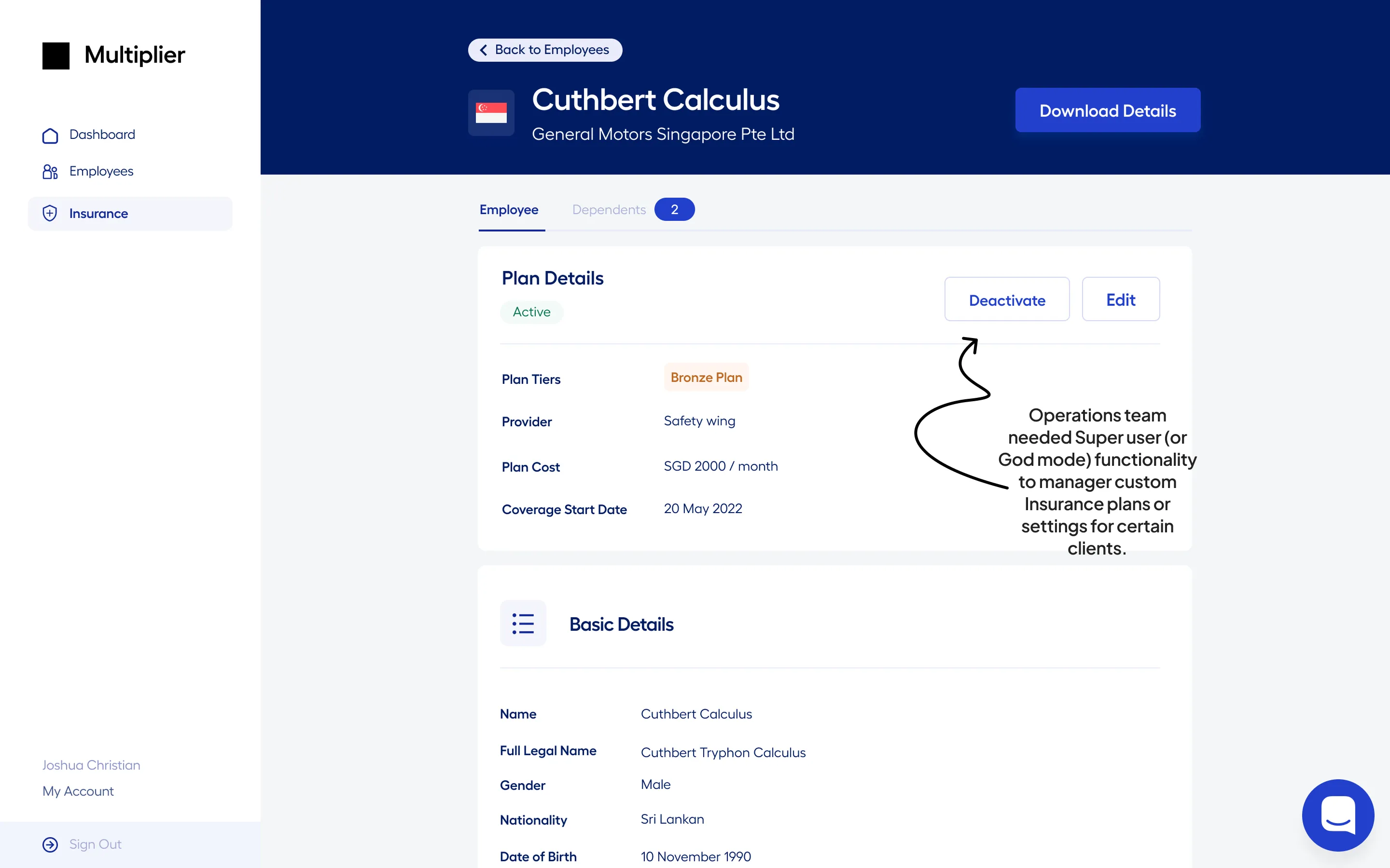
Over 20% of support tickets were about information that already existed in the system. It wasn't a feature gap—it was a visibility and structure problem.
Reframing the Architecture
As I dug deeper, I realized I wasn’t dealing with a single product experience. It was actually three interconnected layers:
Employers
Configuring plans and pricing structures.
Employees
Trying to understand their individual coverage.
Operations
Managing execution and handling edge cases.
Each of these depended on the others, but they weren’t connected through a shared structure. This created a recurring pattern of failure:
Employers made decisions without knowing downstream implications.
Employees received incomplete or delayed information.
Ops teams stepped in to manually fix gaps in the flow.
The system felt like three separate products stitched together.
That reframing changed how I approached the solution—I needed to design around system states rather than individual screens.
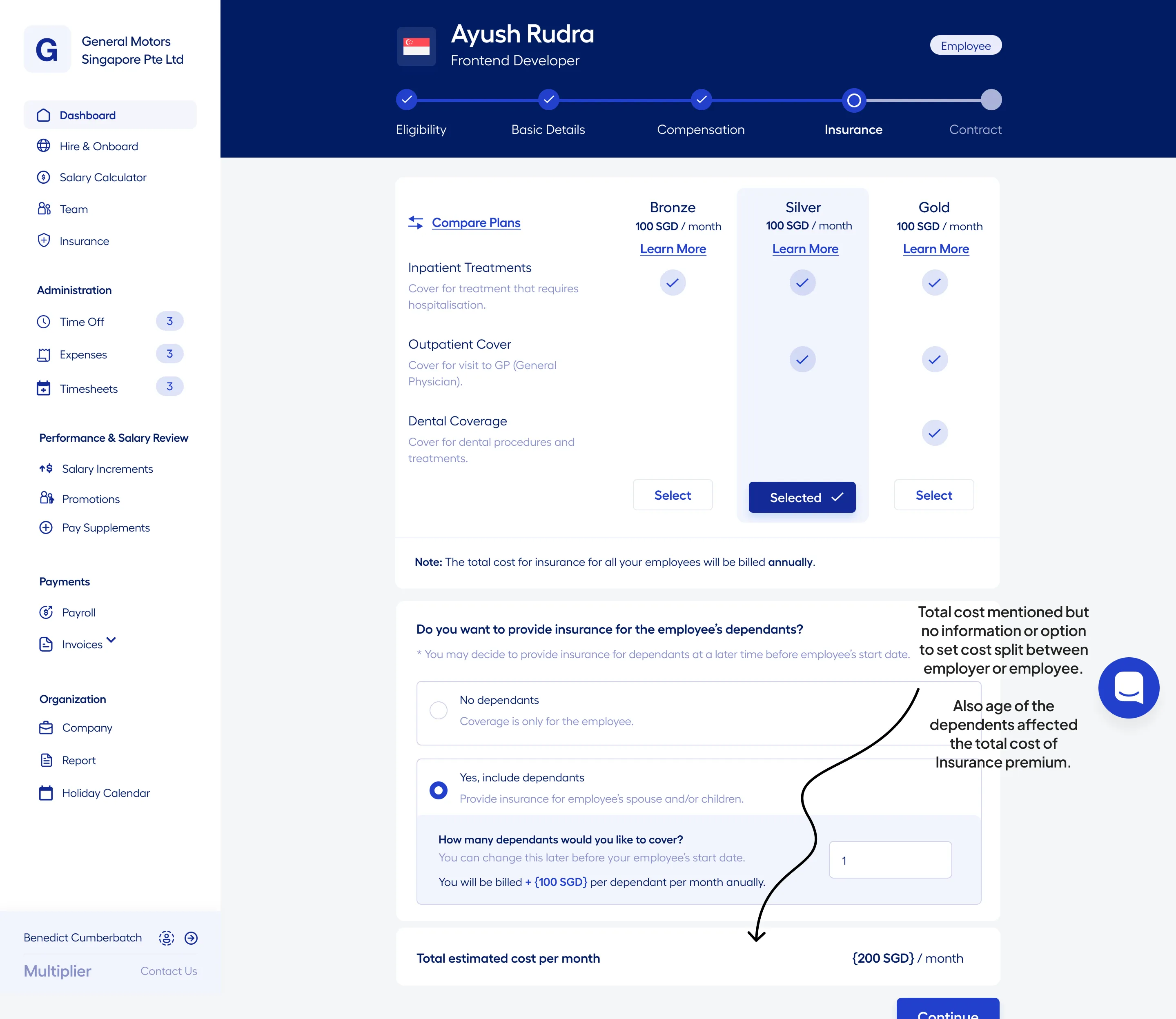
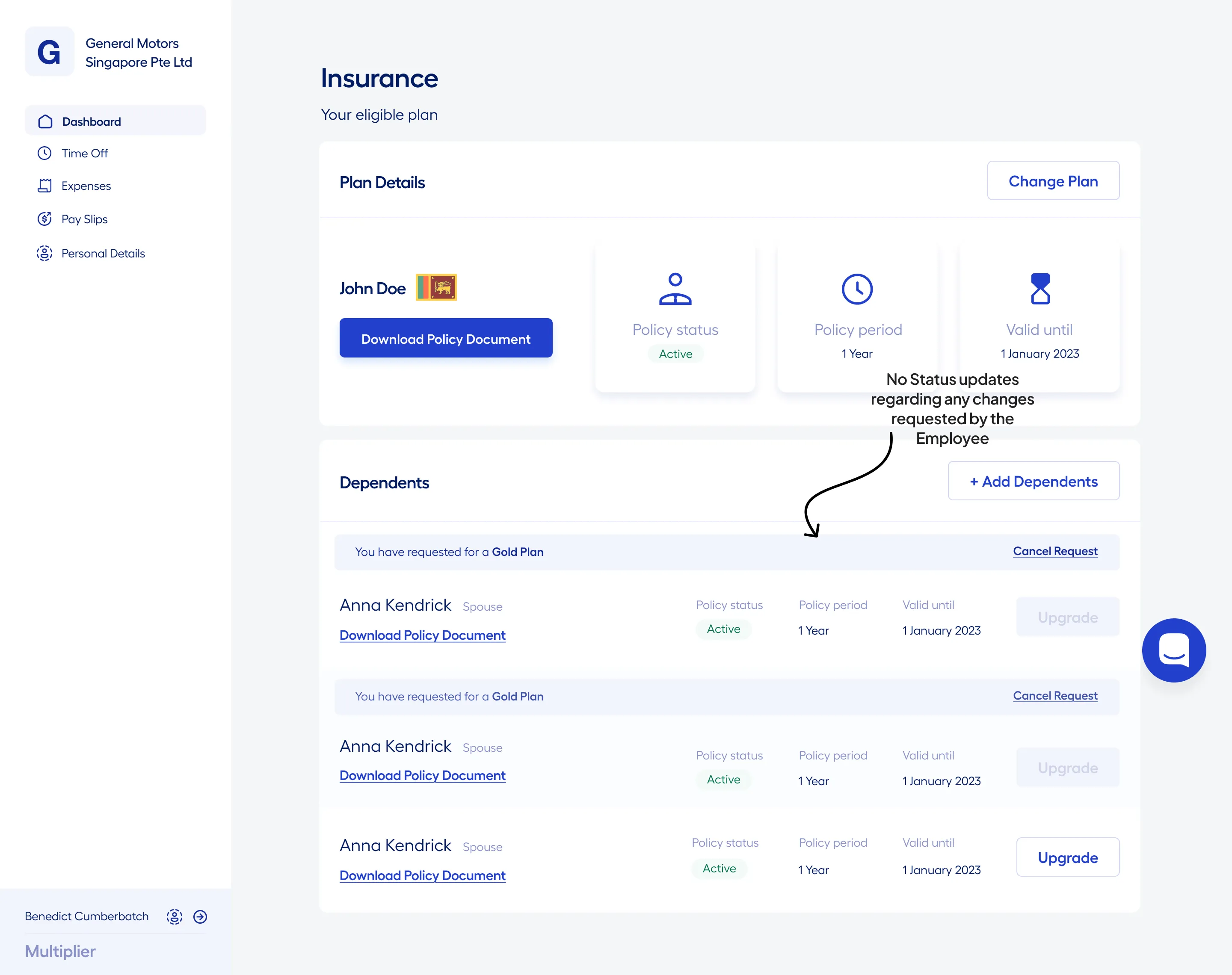
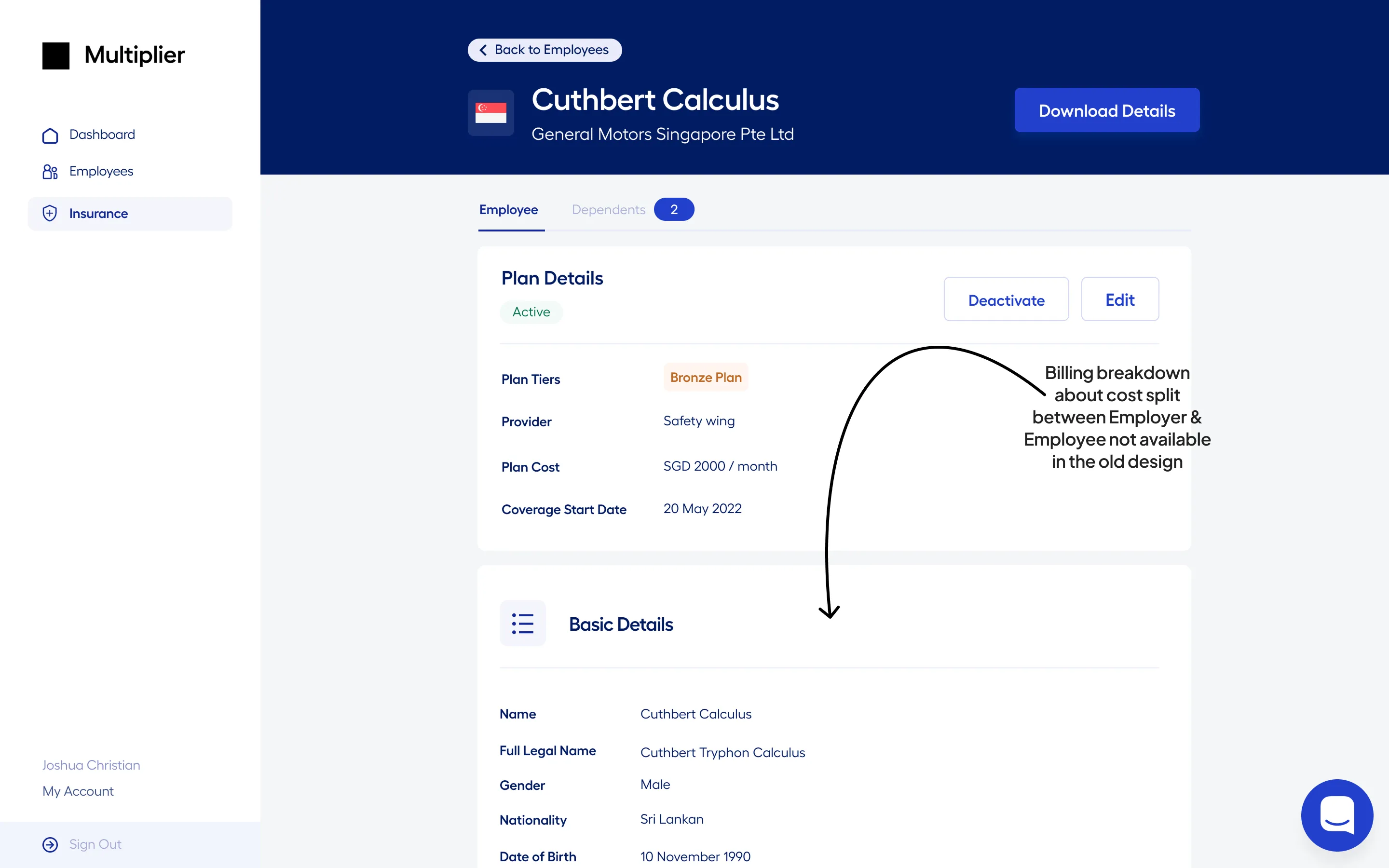
Role & Scope
I led the design of the insurance experience across all three stakeholder workflows. My role was centered on strategic prioritization—ensuring that every design intervention directly addressed the most critical friction points in the system.
The Focus
- Identifying high-impact problem areas
- Introducing clarity without reworking the entire system
- Rapid alignment with product, engineering, and operations
"A lot of the work here was about making good trade-offs under pressure."
The Approach
I didn’t start by designing screens. I started by uncovering where the communication was failing—where information was breaking down and where ownership was unclear. This systems-first approach allowed me to focus on:
Workflow Mapping: Analyzing the journey across stakeholders to find the invisible friction points.
Visibility Audit: Identifying gaps in state clarity and data accessibility.
Systemic Restructuring: Reorganizing how information was served based on intent rather than architecture.
The goal was simple: Make the system easier to understand — not more powerful.
Key Decisions
To address the fragmentation across stakeholders, I focused on introducing structure into how insurance was represented, accessed, and managed across the system.
Each decision was aimed at reducing ambiguity while making the system more predictable and scalable.
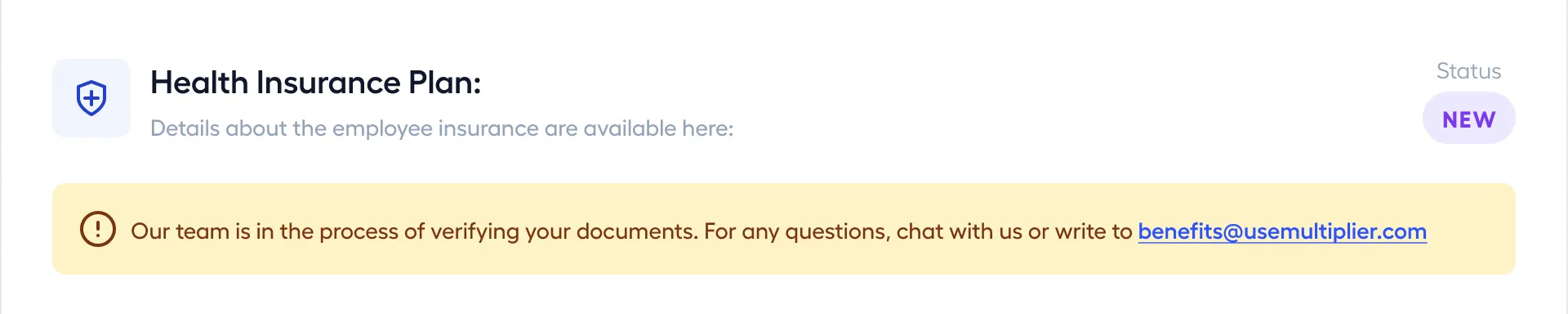
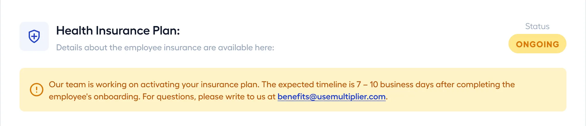
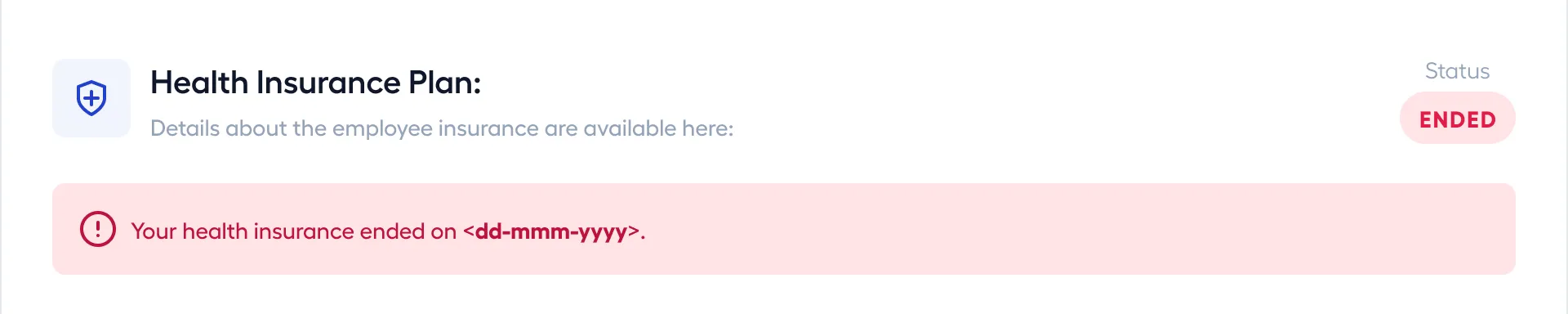
1. Introduced a shared state model across the system
One of the biggest issues was that users didn’t know where they stood in the insurance lifecycle.
I introduced a clear, system-wide state model:
Not Applied
No insurance selected
New
Insurance selected, pending processing
Ongoing
Under processing with insurance partner (typically 7–10 days)
Active
Coverage in effect
Ended
Coverage terminated
Each state defined:
- what information is visible
- what actions are available
- how it appears across employers, employees, and operations
This became a shared language across the system, aligning all stakeholders on status and reducing confusion.


2. Designed stakeholder-specific views instead of a shared interface
The earlier system attempted to serve all stakeholders through a single structure, which diluted clarity.
I separated the experience based on intent:
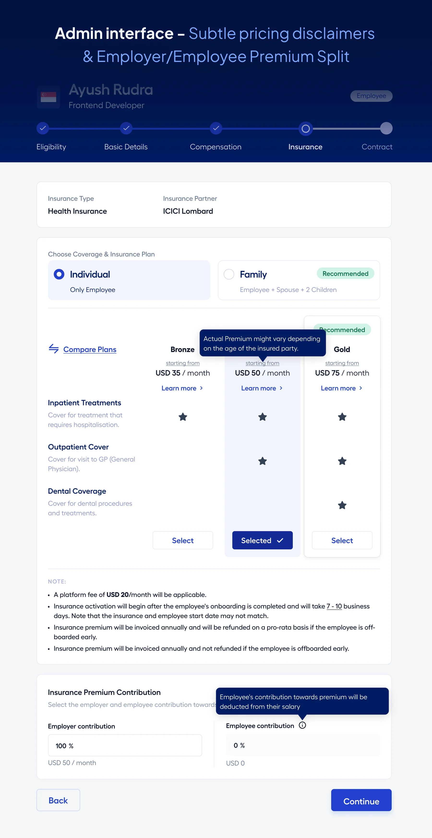
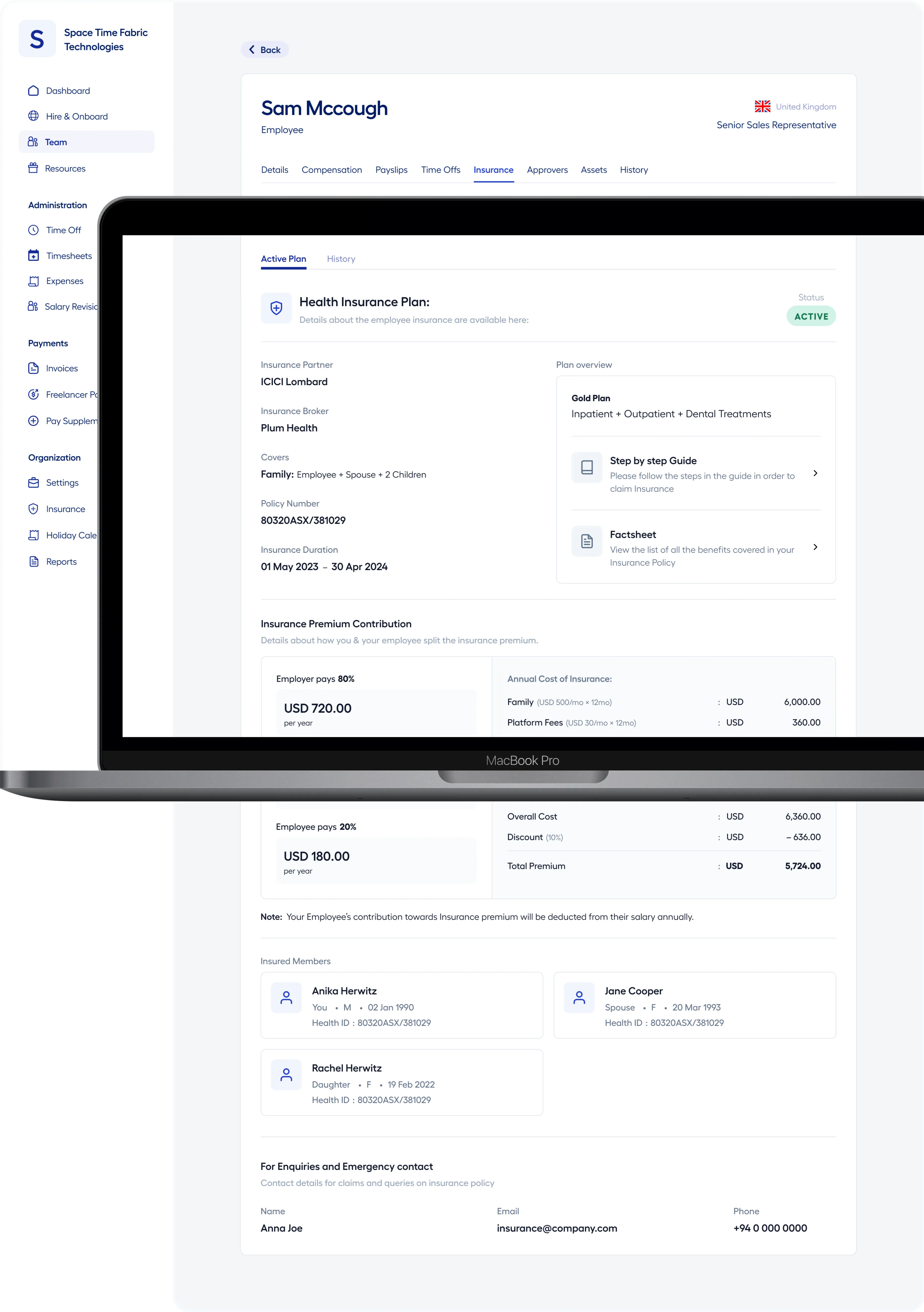
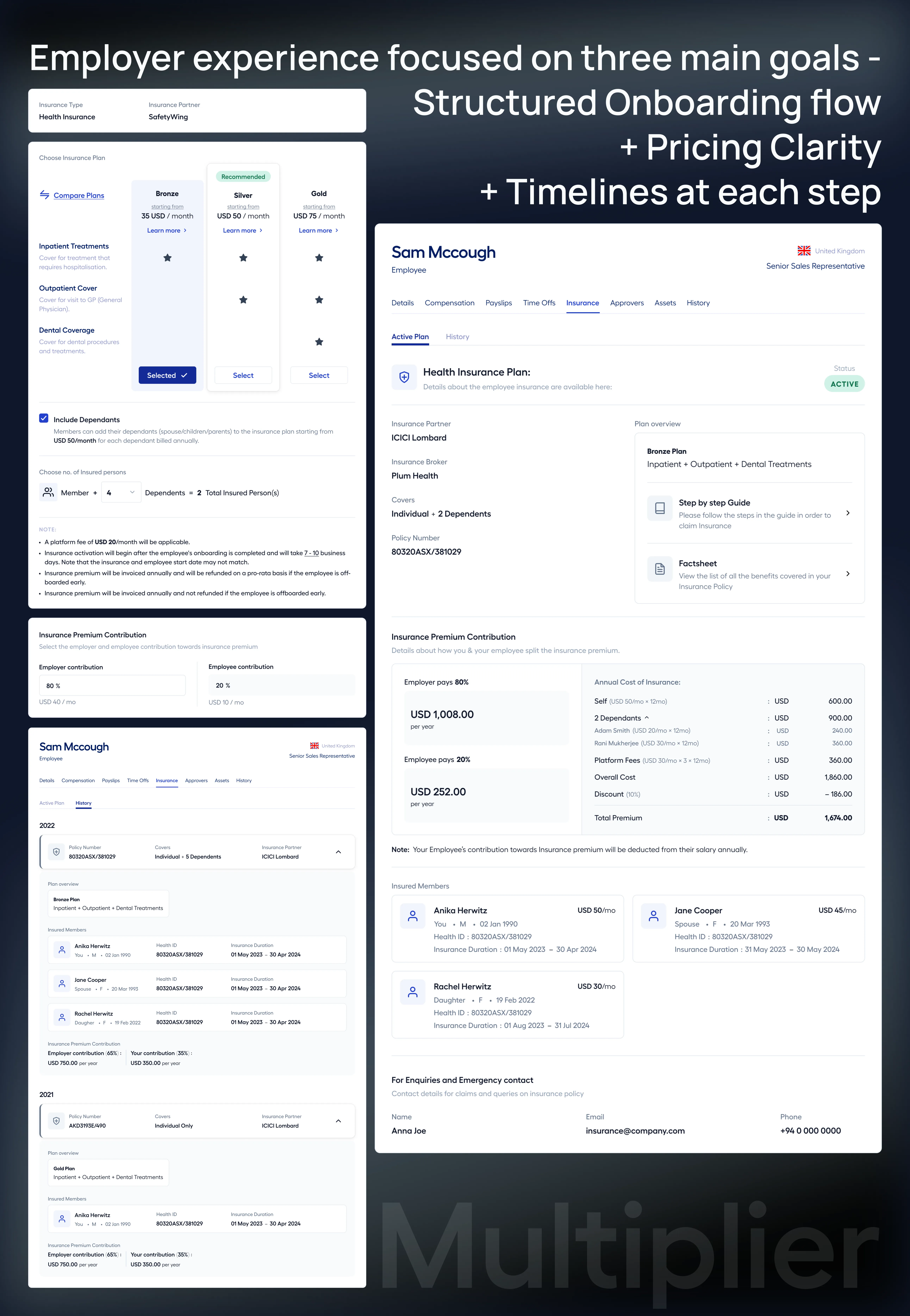
Employers (Client Platform)
- clear visibility into insurance type and partner
- transparent pricing structure (including platform fees, age-band logic, and refund policies)
- employer vs employee contribution split
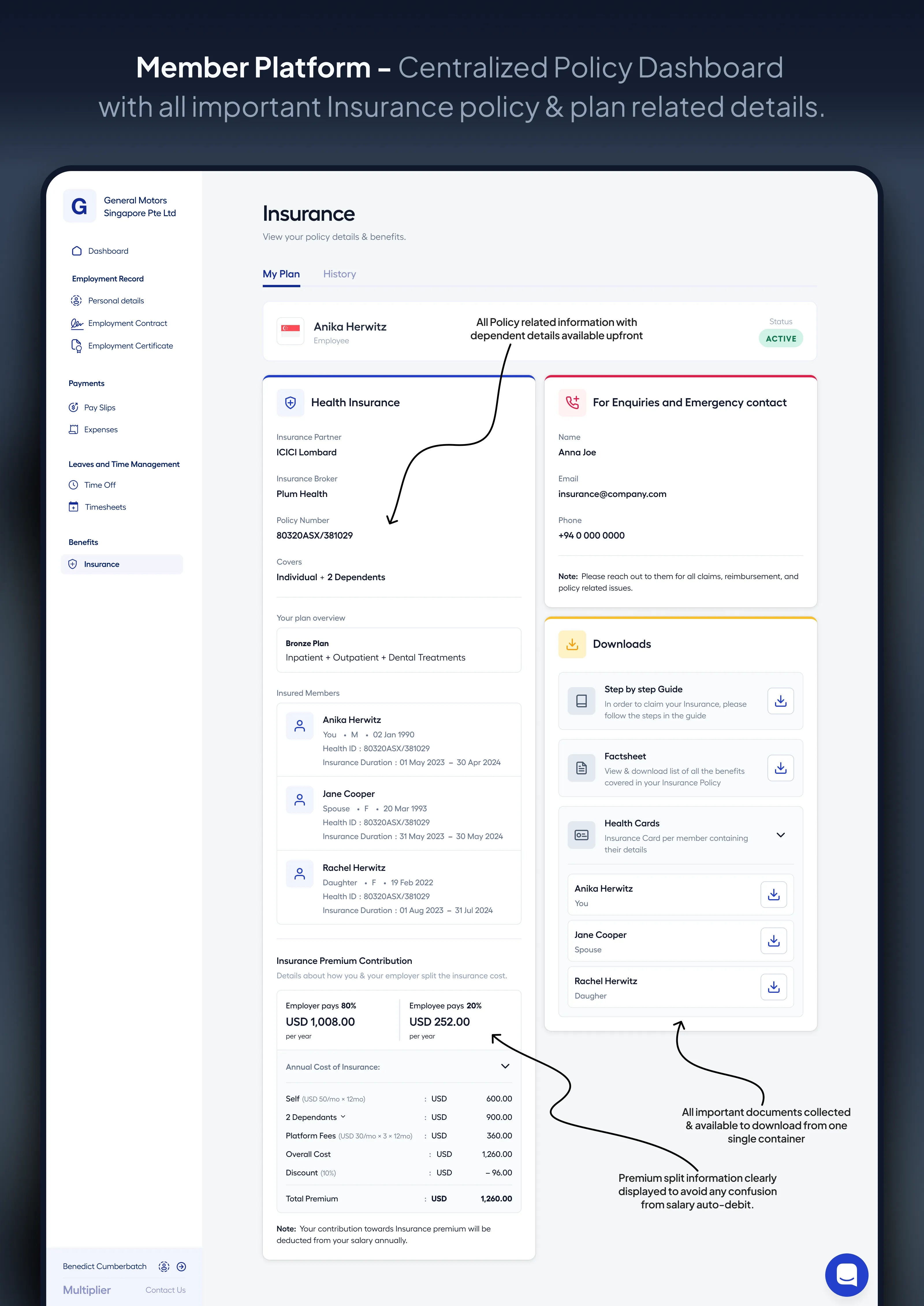
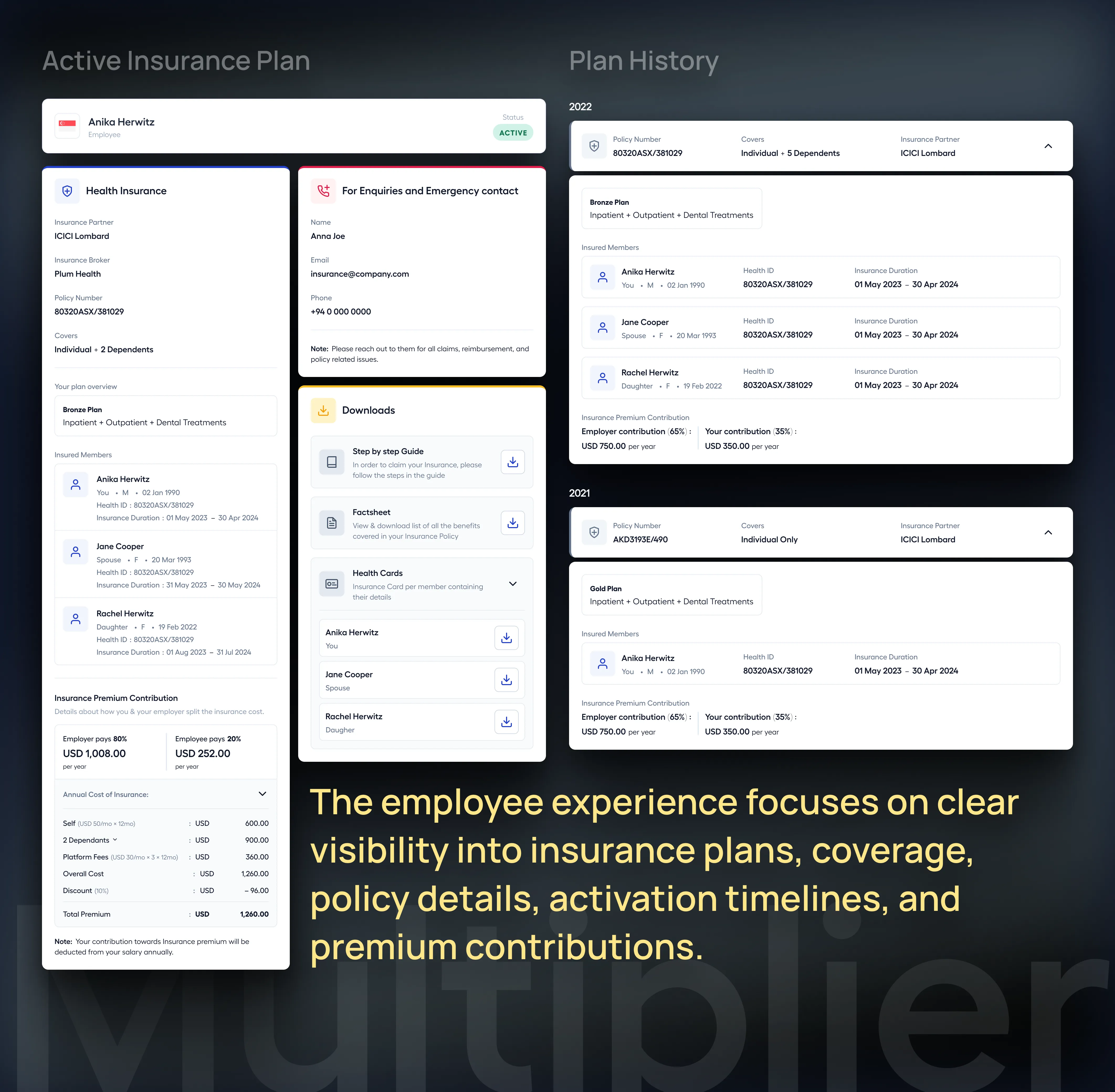
Employees (Member Platform)
-
centralized policy dashboard with:
- partner details and contact information
- coverage and benefit breakdown
- insurance ID and documentation
- clear status tracking aligned with lifecycle states
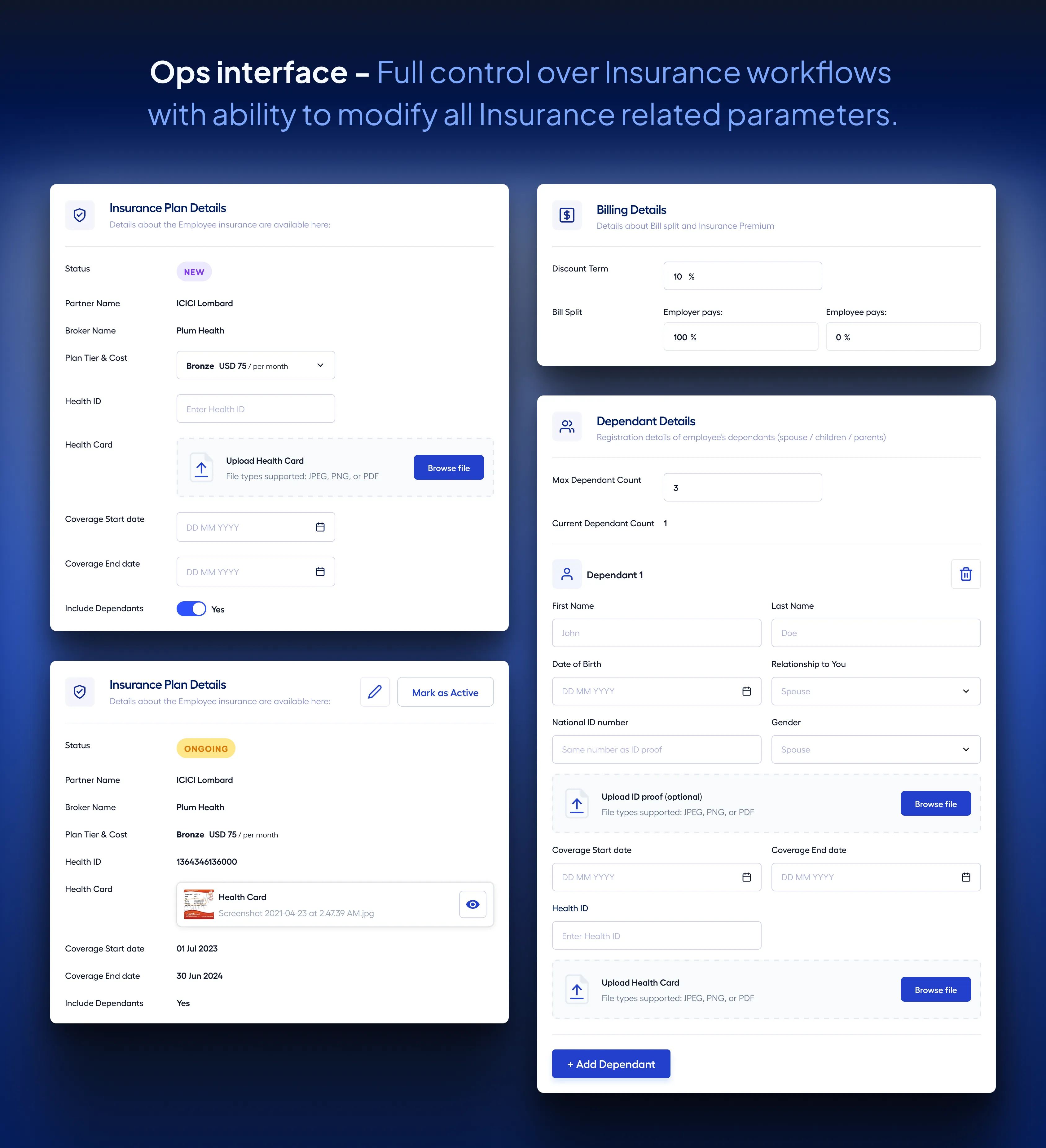
Operations (Ops Interface)
- full control over insurance workflows
- ability to modify plans and dependent details
- status transitions and billing management
This made each interface more focused and aligned with what each stakeholder actually needed to do.
3. Centralized policy and coverage information
Insurance data was previously scattered across different parts of the system, making it hard to access and interpret.
I consolidated this into a structured, single-point view across platforms, which included:
- policy details and coverage information
- insurance partner and contact details
- plan features and benefits
- insurance ID and documents
- premium breakdown and contribution split
This allowed both employers and employees to:
- understand their coverage clearly
- access critical information without support dependency
This was a key step in shifting the system toward self-serve.
4. Made pricing transparent and predictable
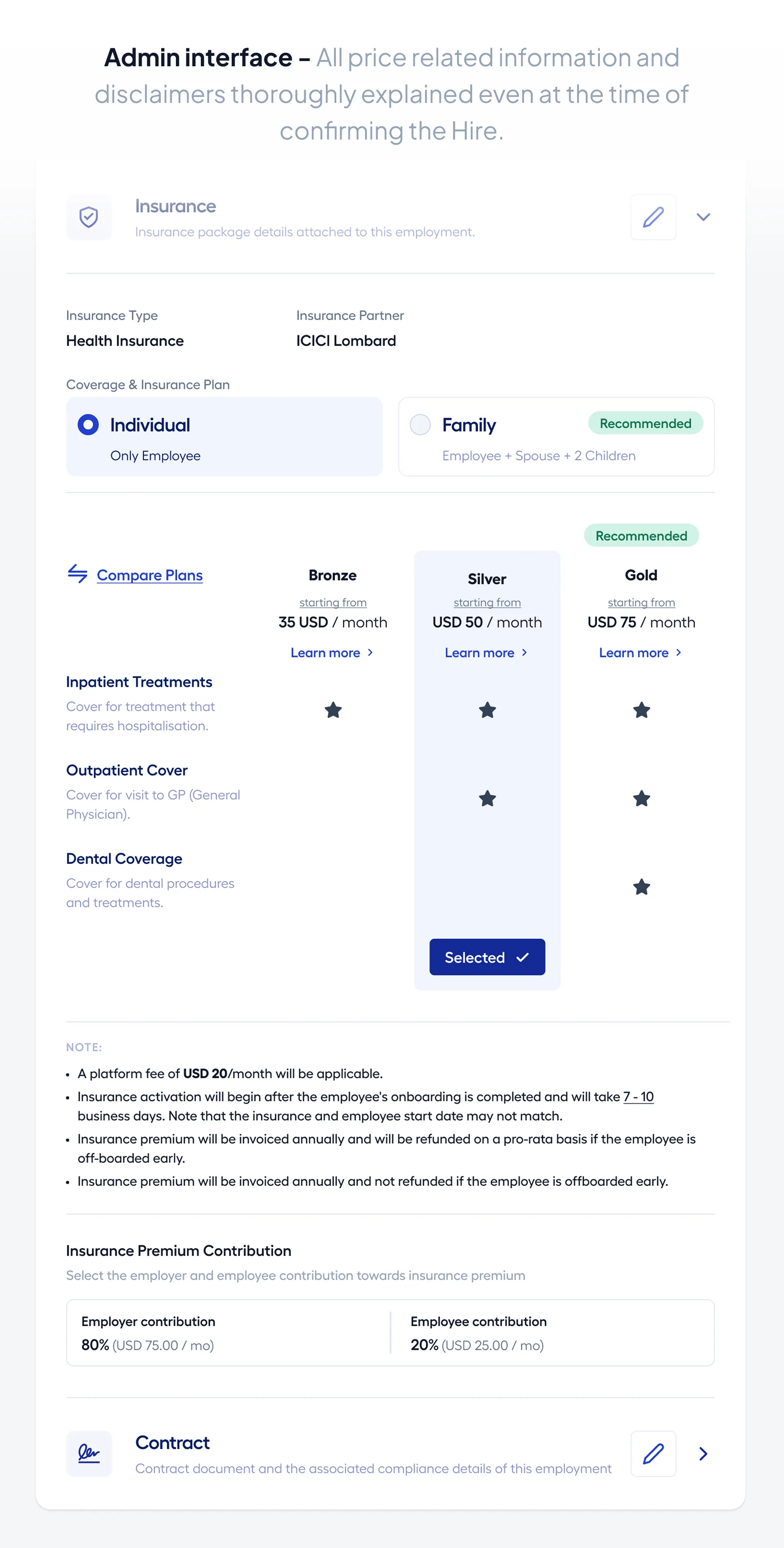
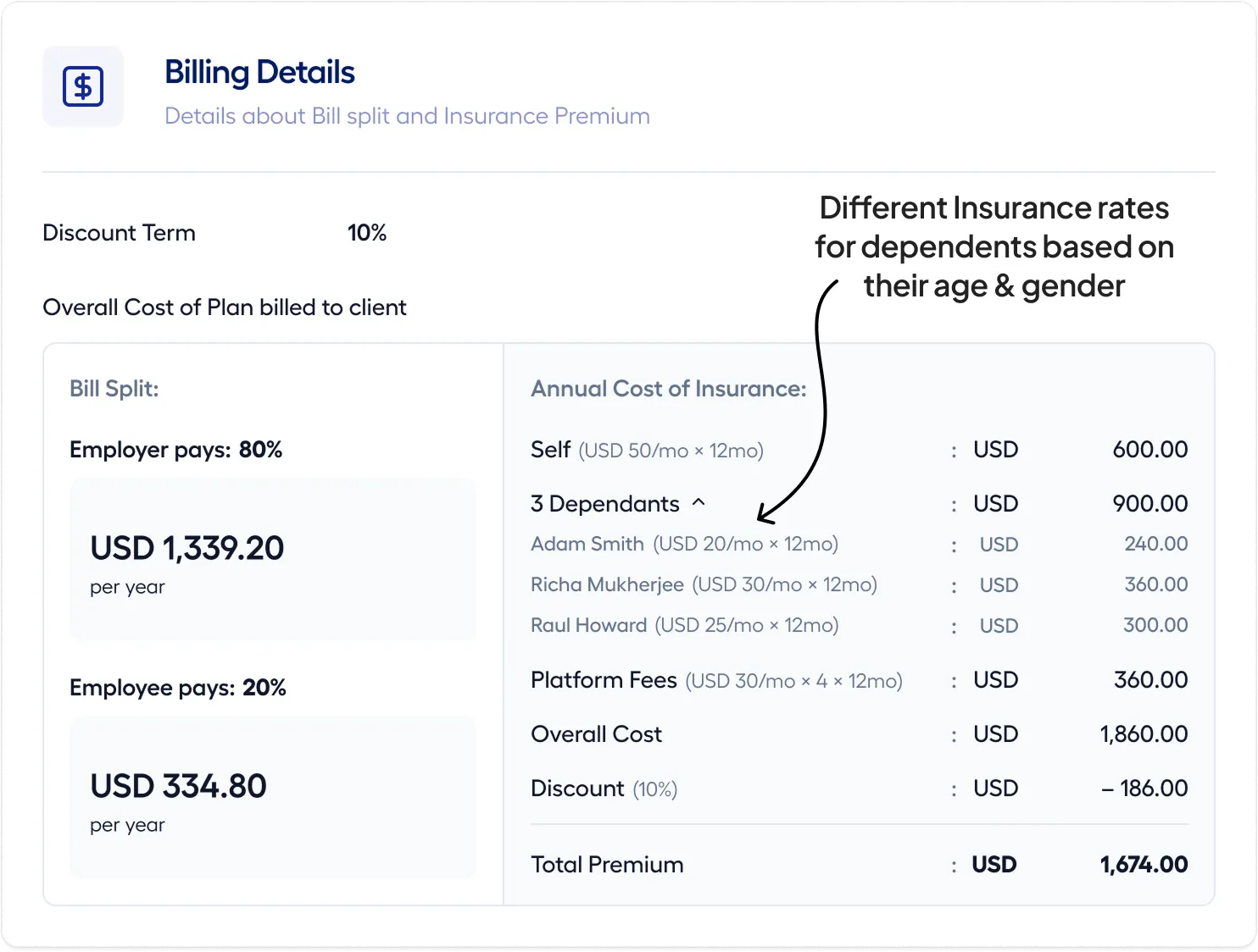
Pricing — especially with age-band variations — was a major source of confusion and friction.
I focused on:
- making the pricing structure visible upfront
- clearly breaking down employer vs employee contributions
- introducing predictable recalculation logic based on dependent data
- surfacing additional factors like platform fees and billing rules
This ensured:
- better expectation setting during onboarding
- fewer disputes post-enrollment
- improved trust in the system
5. Enabled operational flexibility without breaking system integrity
Operations teams were heavily relied upon to manage edge cases and manual interventions.
Instead of removing them entirely, I designed systems that gave them structured control:
- ability to update insurance post-onboarding
- manage dependent additions and changes
- move users across lifecycle states
- handle billing updates and corrections
- support exception handling without engineering dependency
This improved:
- turnaround time
- consistency in execution
- system reliability across workflows
The goal wasn’t just automation — it was controlled flexibility.
Final Solution
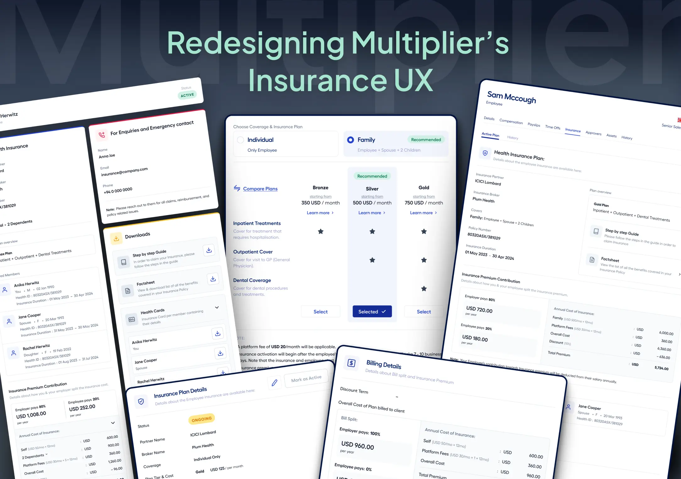
The final solution translated into a set of improvements across employer workflows, employee experience, and operations tooling.
Instead of solving these in isolation, I designed the system so that changes across coverage, pricing, visibility, and workflows worked cohesively across all three platforms.
| Key Solution Areas Overview | ||
|---|---|---|
| Solution Area | What Changed | Outcome |
| Coverage & Visibility | Centralized policy information with clear lifecycle states and structured status tracking | Easier access to insurance details and reduced confusion across stakeholders |
| Pricing & Transparency | Upfront pricing breakdown with age-band logic and contribution visibility | Fewer pricing disputes and clearer expectations during onboarding |
| Onboarding & Activation | Structured onboarding flows with insurance details, timelines, and activation logic | Faster onboarding with fewer errors and support queries |
| Employee Self-Service | Unified policy dashboard with coverage details, documents, and status tracking | Reduced support dependency and improved clarity for employees |
| Operational Efficiency | Streamlined ops workflows with status controls, updates, and bulk actions | Reduced manual effort and improved turnaround time |
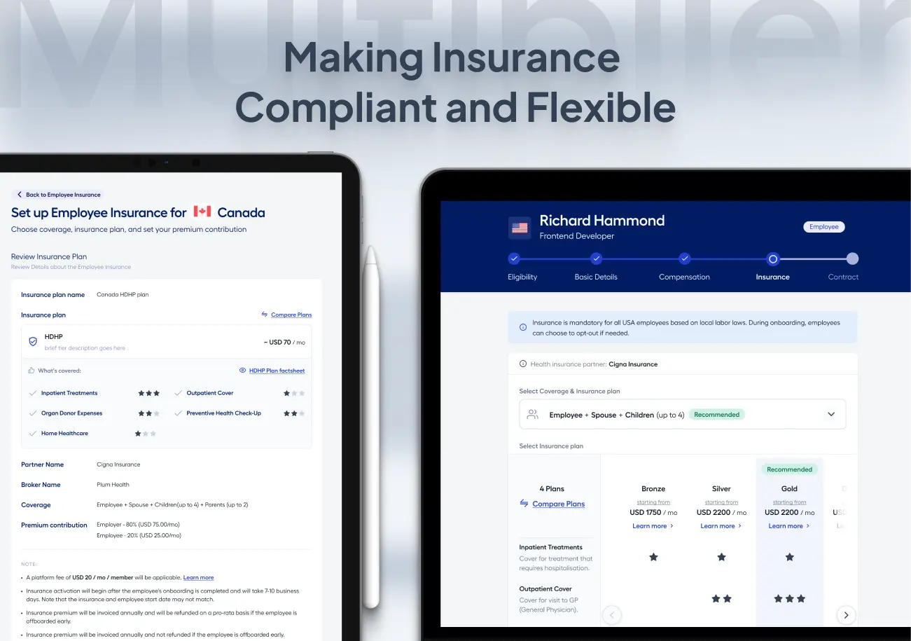
Employer Experience
I focused on helping employers make informed decisions during onboarding and policy setup, with clear visibility into cost, coverage, and timelines.
What changed
Insurance details are surfaced upfront, including:
- insurance type and partner
- platform fees, invoicing, and refund policies
Pricing is structured and transparent:
- age-band logic explained clearly
- estimated premiums shown early
- employer vs employee contribution split visible
Activation timelines are explicitly communicated:
- clear indication of the 7–10 day processing window
- distinction between joining date and coverage start
How it shows up
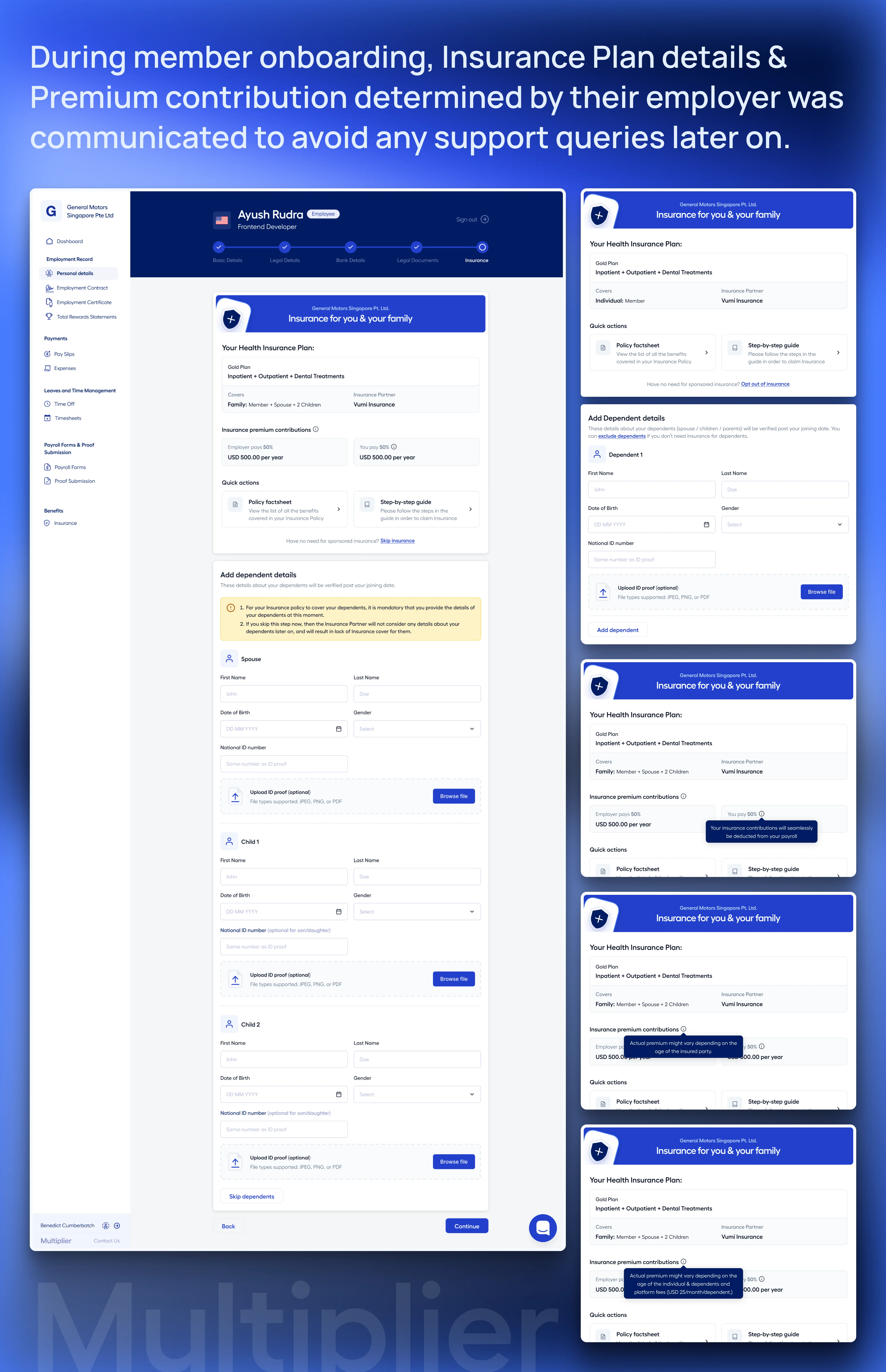
- A structured onboarding flow with embedded pricing, policy details, and contextual tooltips
- Clear communication of financial implications and timelines at each step
- Reduced ambiguity during setup, leading to more confident decision-making
Employee Experience
For employees, the focus was on making insurance understandable, accessible, and self-serve.
What changed
A centralized policy dashboard provides:
- partner details and emergency contacts
- coverage and benefit breakdown
- insurance ID, policy cards, and documents
Insurance status is visible and consistent across lifecycle states:
- Not Applied → Ongoing → Active → Ended
Dependent onboarding supports:
- country-specific requirements (e.g., SSN, UAE documentation)
- structured handling of family coverage types
Pricing and contribution details are clearly surfaced within the experience
How it shows up
- A single, consistent view for all insurance-related information
- Dynamic updates based on lifecycle state
- Easy access to documents and coverage details without relying on support
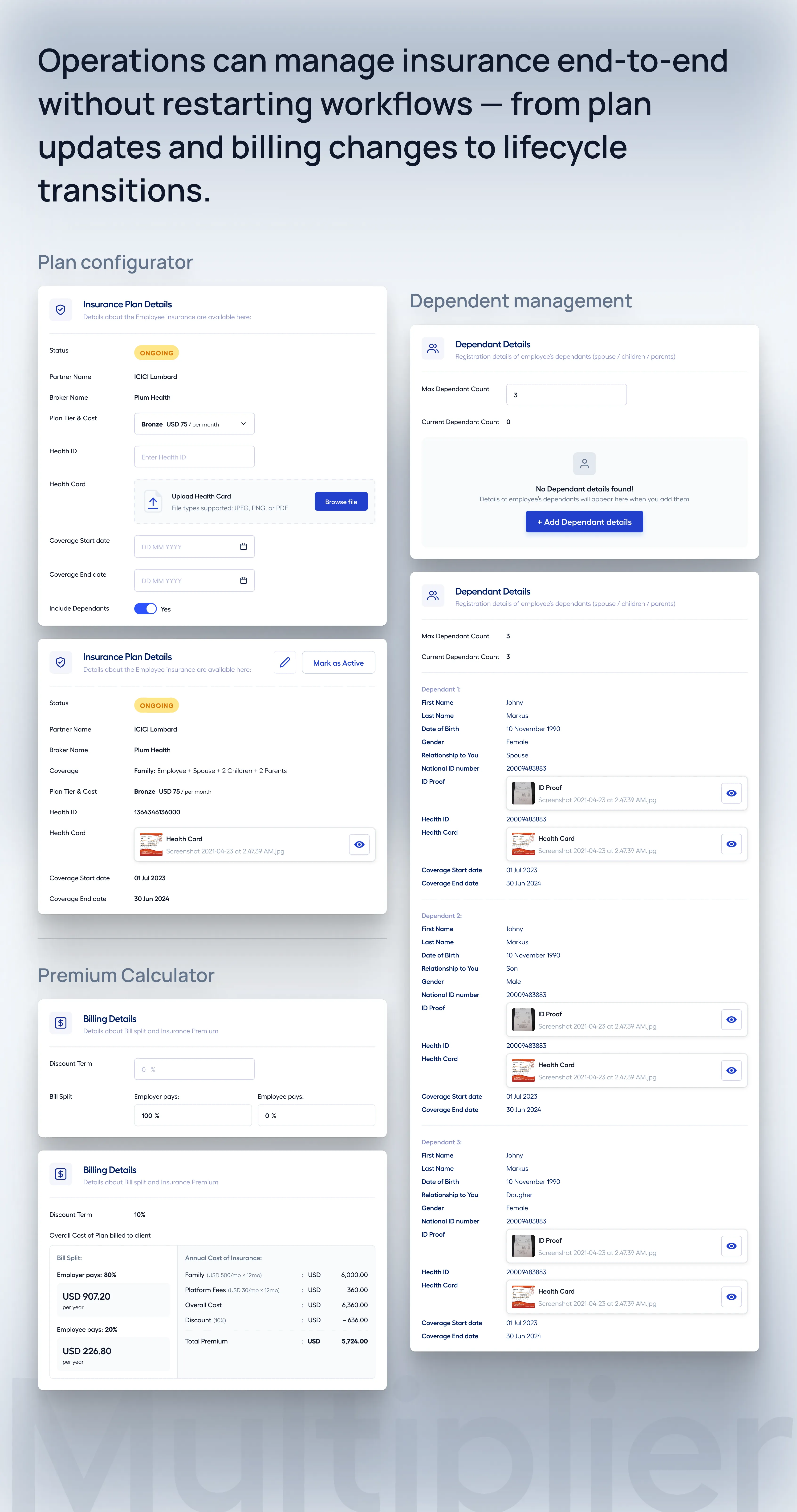
Operations Experience
Operations workflows were designed to support flexibility and control while maintaining system consistency.
What changed
Insurance can be added or modified post-onboarding without restarting workflows
Dependent details can be updated independently
Lifecycle states can be managed through structured transitions
Billing updates and contribution recalculations are handled within the system
Offboarding flows retain historical policy and coverage data
How it shows up
-
Structured workflows for:
- plan assignment and updates
- billing management
- status transitions
-
Real-time visibility into:
- selected plans
- contribution splits
- lifecycle state changes
- Ability to handle exceptions without engineering dependency
Measurable Outcomes
Immediate Impact
- ~30% reduction in support tickets
- Noticeable improvement in NPS within weeks
- Reduced operational overhead
Operational Efficiency
- ~50% reduction in manual intervention
- Faster dependent management
- More reliable pricing calculations
Reflection
This project reinforced something I’ve seen repeatedly throughout my career:
When systems become complex, the problem is rarely lack of features — it’s lack of structure.
By focusing strictly on shared system states, establishing a clearer information hierarchy, and designing stakeholder-specific views, we were able to meaningfully improve the experience by resolving the underlying structural confusion rather than just treating the surface-level symptoms.