BACK
Growth & Revenue / Offboarding
📝 MINI CASE STUDY

Redesigning the Exit: Turning upGrad’s Offboarding into a Retention Engine

Most companies treat offboarding as a purely transactional dead end. In reality, it is a high-stakes touchpoint that directly impacts revenue, brand perception, and lifetime value.

Project hero image
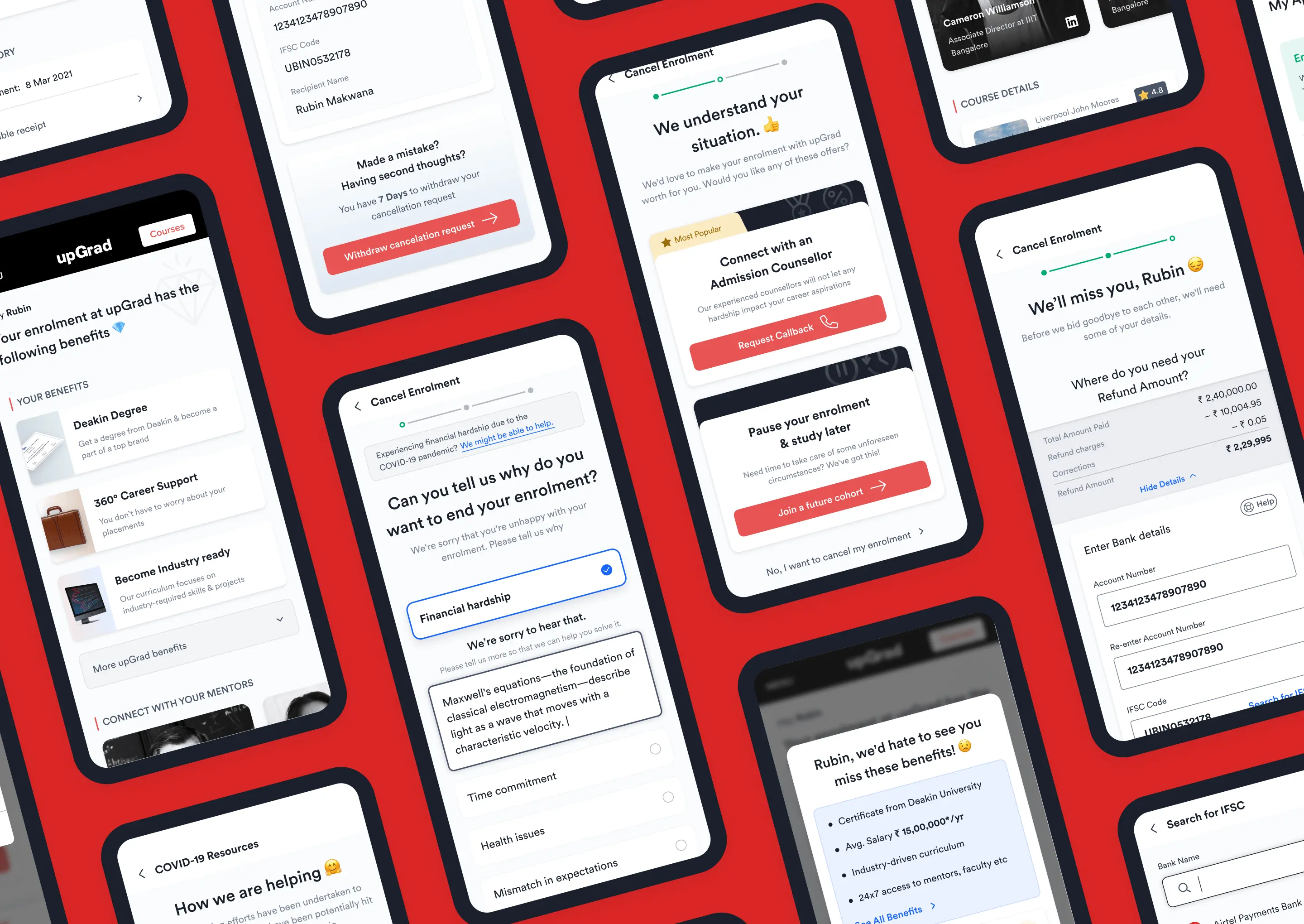
The offboarding experience 2.0, redesigned to be a strategic retention lever rather than a revenue leak.

I redesigned upGrad’s cancellation and refund experience to transform a tactless, frustrating exit into a strategic "considered exit ramp" — mitigating churn while operationalizing trust.

The Business Reality: High CAC, High Churn

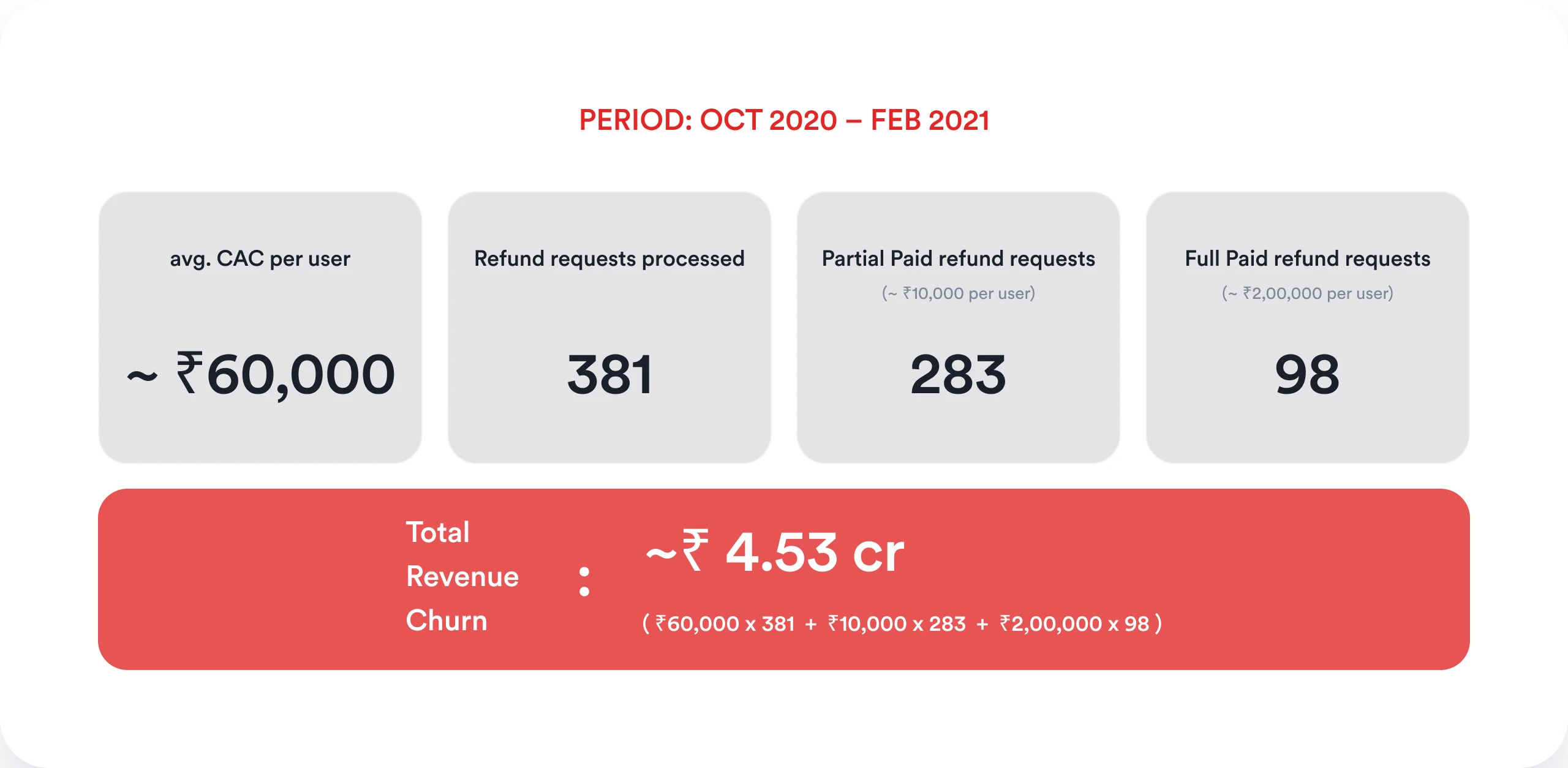
Between Oct 2020 and Feb 2021, upGrad’s offboarding experience was leaking revenue. The numbers told a stark story:

~₹60,000 Average Customer Acquisition Cost (CAC)
381 Refund requests processed in 5 months
~₹4.53 Cr Total revenue churned

The existing UX was contributing to this bleed. It suffered from a fatal duality: it was too easy to quit impulsively, but incredibly painful to actually process the exit.
Revenue lost to refunds
Revenue lost to refunds between Oct 2020 and Feb 2021, visualized as a blood-red river flowing out of upGrad’s coffers.

Flaws in the Legacy System

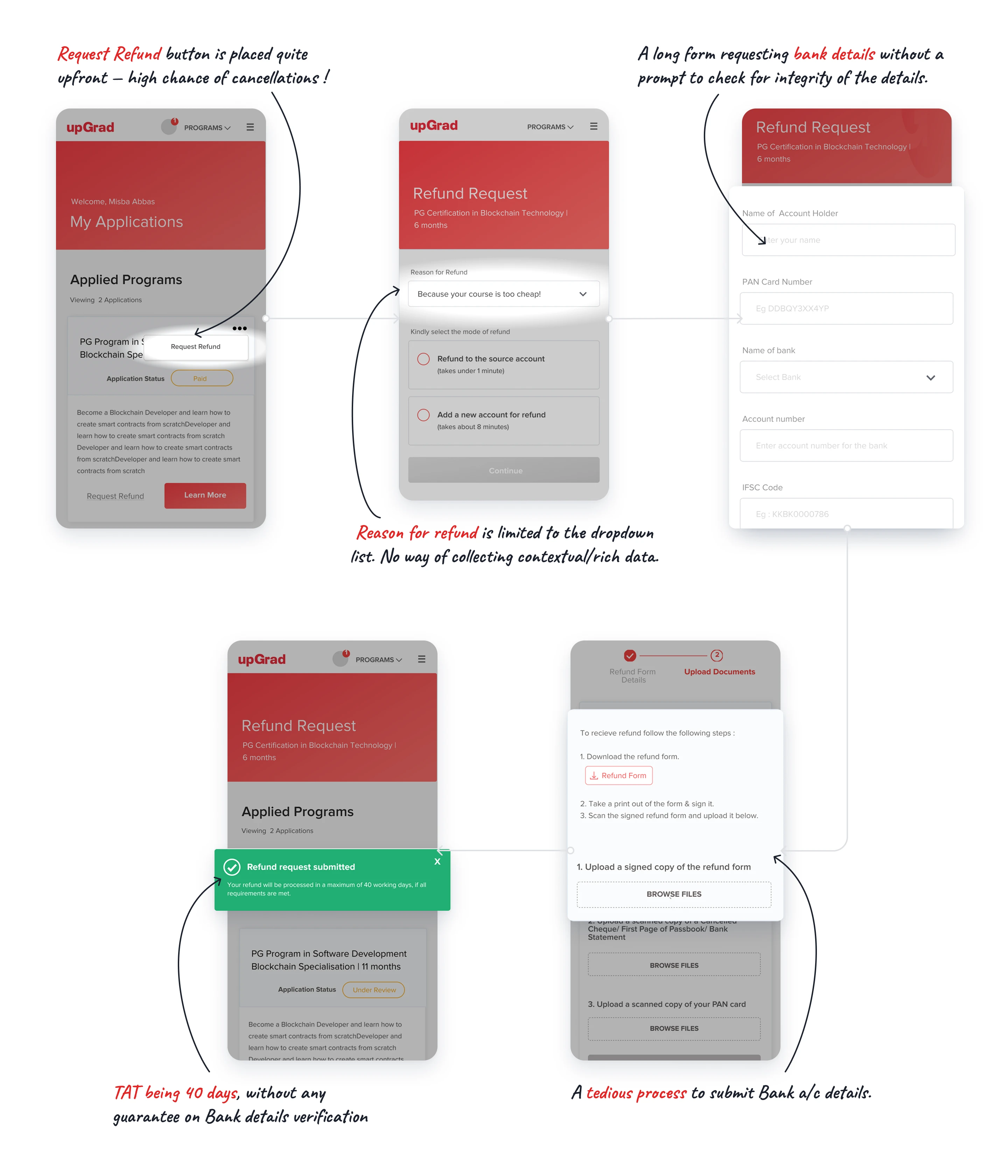
Premature Exits The "Request Refund" button was placed prominently upfront, encouraging snap decisions without friction.
Blind Churn Reasons for leaving were limited to a basic dropdown, offering zero qualitative data for the business to act on.
Operational Nightmare Users had to print, sign, scan, and upload a physical refund form alongside their PAN card.
Anxiety-Inducing TAT The process took up to 40 days, with long, unvalidated bank detail forms that frequently led to failed transactions.
Legacy offboarding flow
The legacy offboarding flow, a labyrinthine gauntlet that churned customers faster than it processed refunds.

Reframing the Strategy: The Considered Exit Ramp

Instead of asking, “How do we process refunds faster?” I reframed the objective:

“How do we reduce uncertainty, capture intent, and leave the door open?

I structured the new experience around three core pillars: Emotional Interception, Strategic Friction, and Operational Trust.
Reveal image 1 Default image 1
Reveal image 2 Default image 2
Reveal image 3 Default image 3
Reveal image 4 Default image 4
Reveal image 5 Default image 5
Reveal image 6 Default image 6

1.Emotional Interception (The FOMO Hook)

Before a user could initiate a cancellation, the system gently reminded them of the exact value they were walking away from.
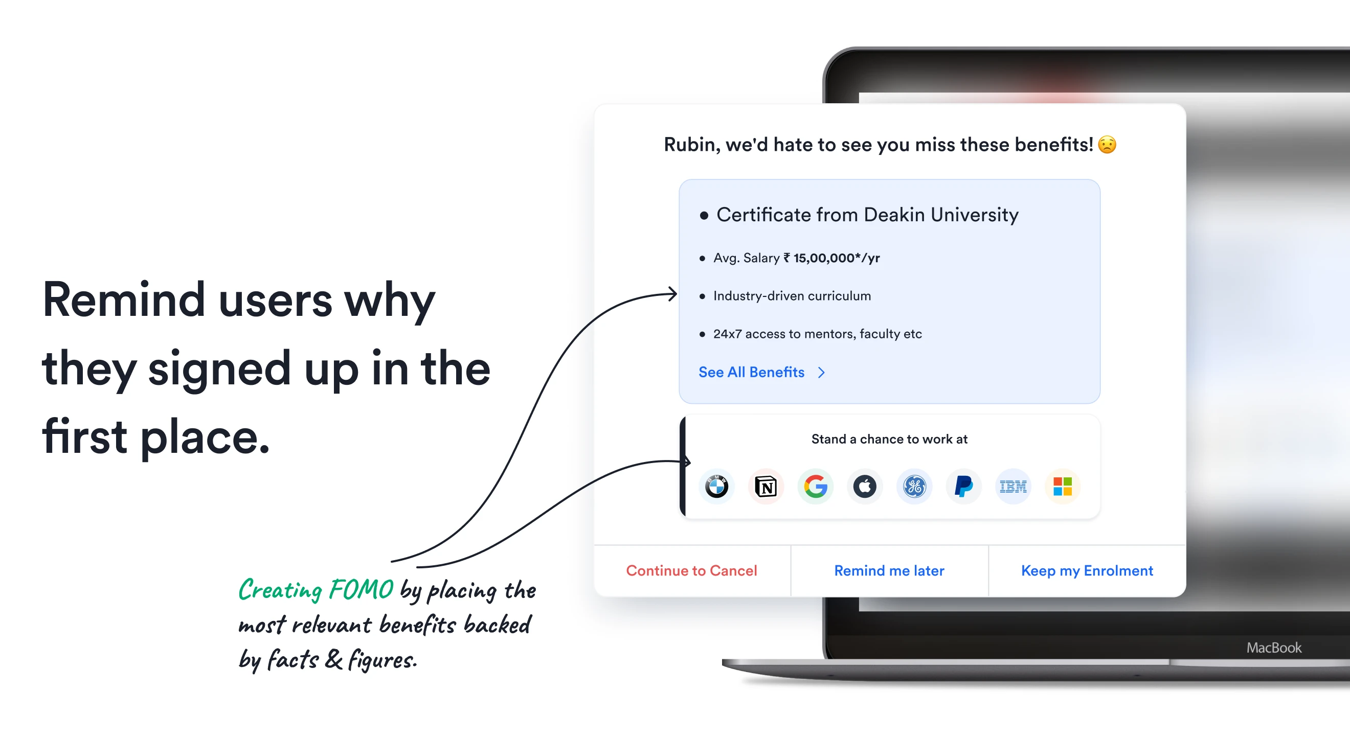
Visualizing ROI Displaying hard facts—like the ₹15,00,000 avg. salary, Deakin University certification, and hiring partners (IBM, Microsoft).
Early Mentorship Integration Connecting users with mentors and cohorts before classes began to build personal investment and credibility.
Subtle Repositioning Demoting the visual hierarchy of the "Cancel" link so it was accessible but not actively promoted.
Remind them of the value they're leaving behind
pain point image 2
Show them what they will miss, not just what they will lose.

2.Strategic Friction & Empathetic Alternatives

If a user proceeded with cancellation, the flow shifted from "blocking" them to "understanding" them. By capturing rich, contextual data, the system could offer tailored counter-offers:
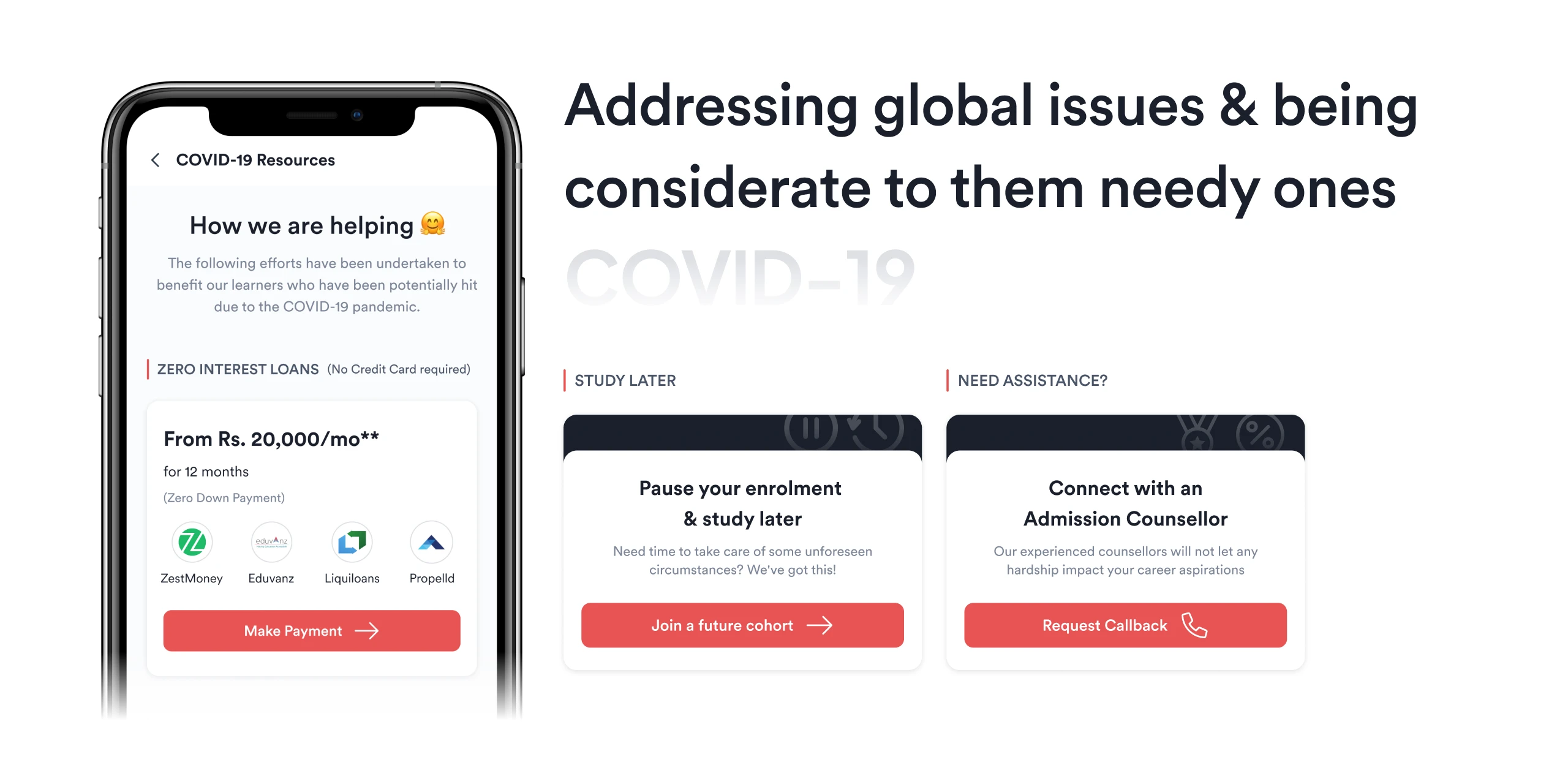
The "Study Later" Option Allowing users to simply pause their enrollment and join a future cohort rather than breaking ties entirely.
📞
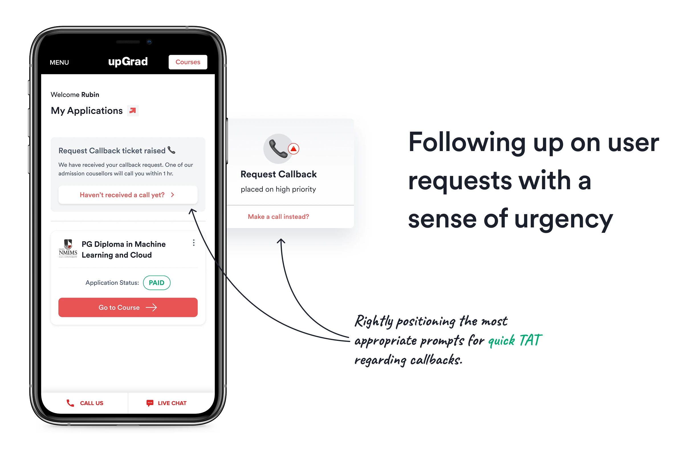
Human Intervention Offering immediate, high-priority callback requests to speak with an Admission Counselor.
🤝
Addressing Global Hardship Recognizing real-world context (like the COVID-19 pandemic) by offering zero-interest loan alternatives for those facing sudden financial strain.
By understanding why users want to leave, we can offer empathetic alternatives that keep them in the fold.
quick TAT image
Follow up with quick, personalized solutions that address their specific pain points, showing we care about more than just the transaction.
pain point image 2
COVID-19-specific messaging that acknowledges external hardships rather than treating cancellations as purely transactional.

3.The 7-Day Safety Net (Buyer’s Remorse)

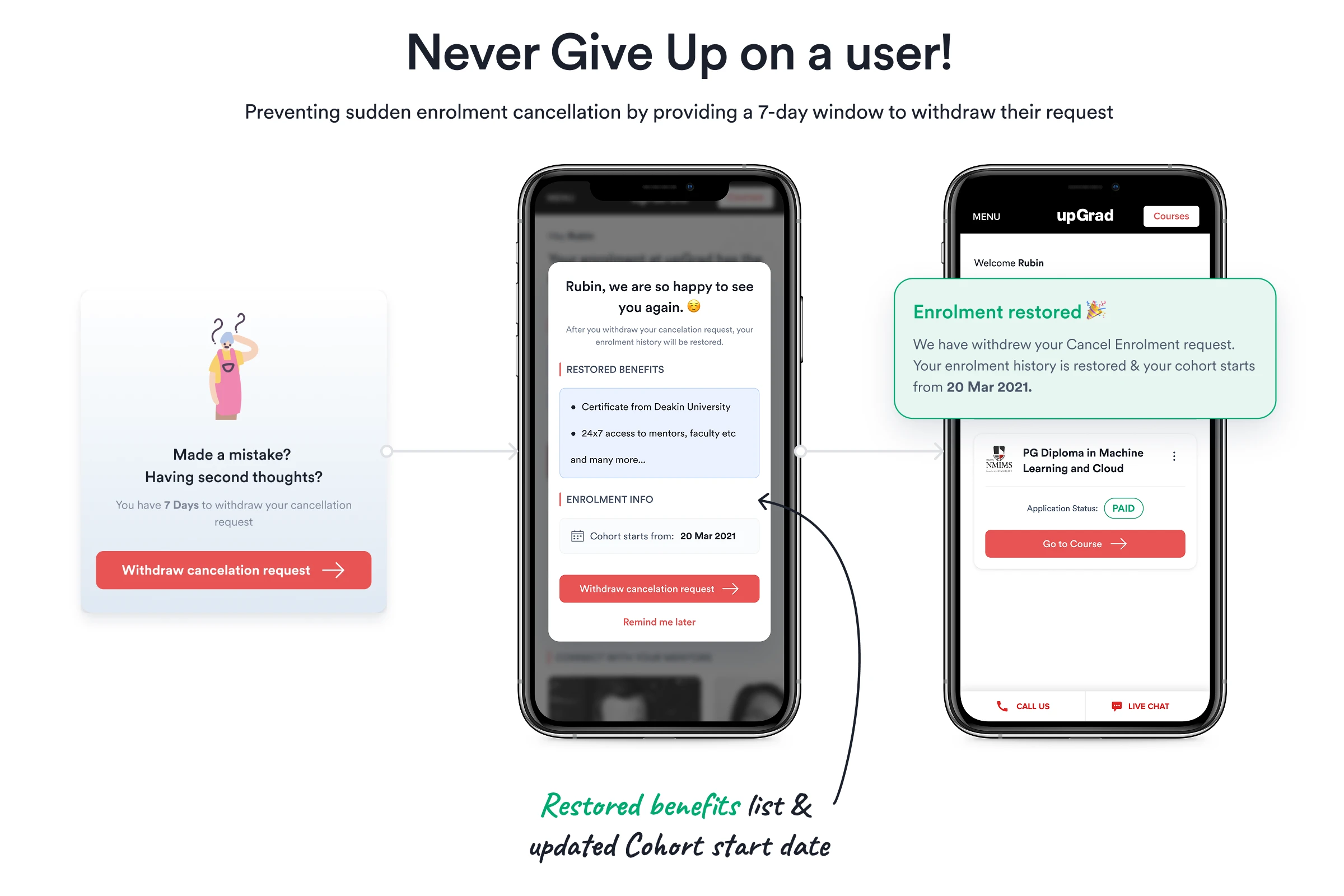
Cancellations are often driven by temporary panic. To combat this, I designed a 7-day withdrawal window.

If a user changed their mind within a week, they could click "Withdraw cancellation request" to instantly restore their enrollment, benefits, and cohort dates. This zero-friction "undo" button saved the business from permanently losing salvageable users.
7-day safety net
The 7-day safety net, a buyer's remorse feature that allows users to reverse their cancellation within a week, preventing impulsive churn and giving them a second chance to stay.

Operationalizing Trust (Fixing Backend Friction)

Improving the emotional UX is useless if the technical execution remains broken. I revamped the actual refund flow to kill the 40-day turnaround time and eliminate user anxiety.
⚡️
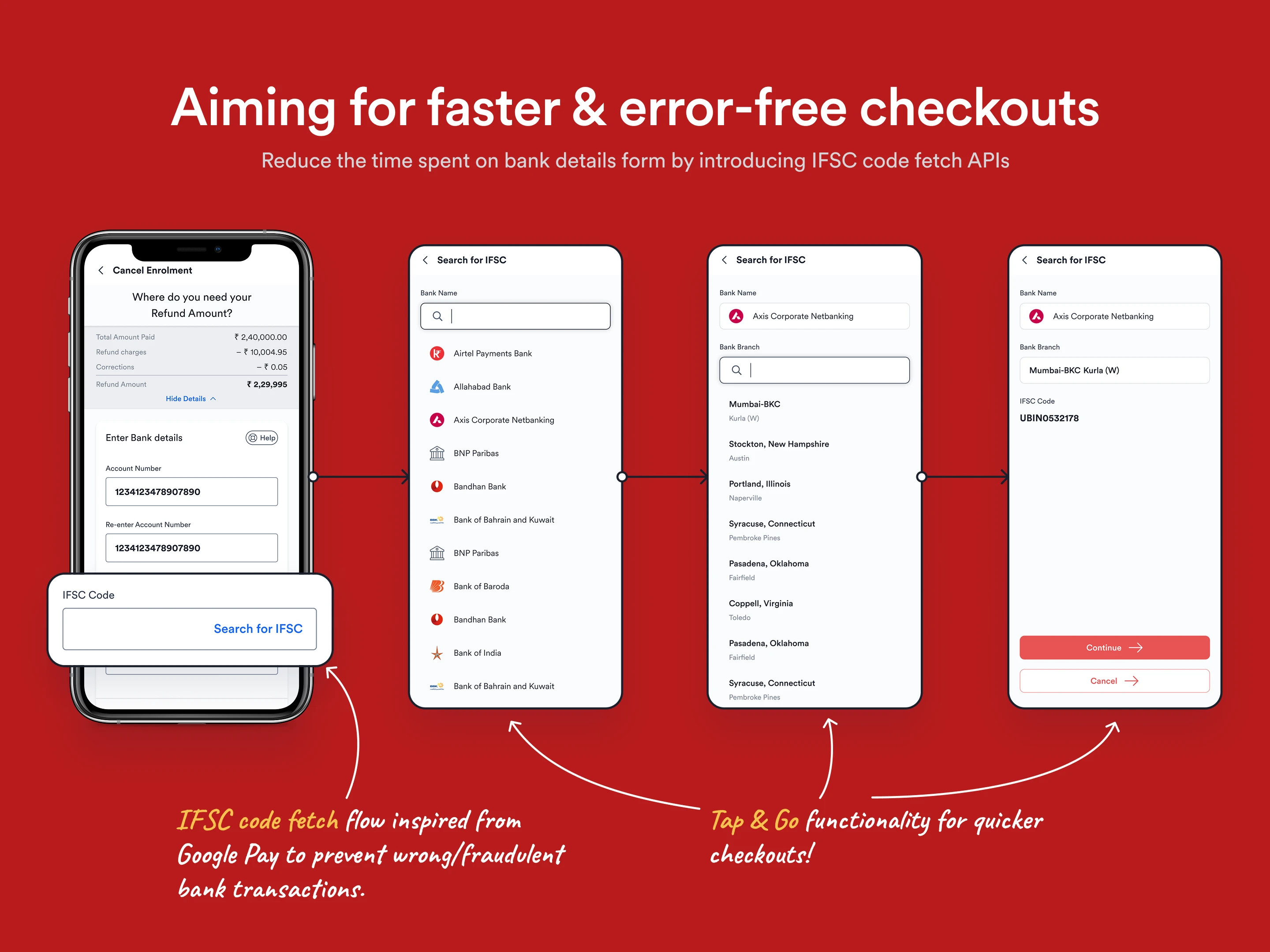
Google Pay-Inspired IFSC Fetch Replaced tedious manual bank entry with a "Tap & Go" bank search API, preventing incorrect submissions.
Real-Time Verification Designed a system to verify bank accounts instantly ("Takes as much time as sipping your coffee!"), providing immediate UI feedback (Success/Error).
🧾
Absolute Clarity Displayed the exact refund amount—accounting for deductions and corrections—so users knew precisely what would hit their bank account in 12-14 days.
IFSC fetch image
An intuitive IFSC fetch system that eliminates manual errors and speeds up the refund process, reducing user anxiety and operational overhead.
Real-time bank verification that provides instant feedback, turning a once-anxiety-inducing step into a seamless, confidence-boosting interaction.

Offboarding Walkthrough

A step-by-step breakdown of the final prototype and user flow.

Reflections

"The way we experience endings is important. First impressions last temporarily. Closure experiences are permanent."

This project proved that offboarding doesn't have to be a failure state. By replacing a tactless form with an empathetic, data-driven exit ramp, we proved that you can respect a user's decision to leave while still fighting to keep them.

Considerate copy, transparent math, and a frictionless exit ultimately breed the kind of brand loyalty that brings users back when they are ready.

Keep Exploring

Next Project
Next Part
📝 MINI CASE STUDY

Referrals

Home Work case studies About More about Pankhil Lab Digital garden Writing Shower thoughts, really! Contact Let's chat