BACK
Growth & Revenue / Referrals
📝 MINI CASE STUDY

Engineering a Viral Loop: Designing upGrad’s Referrals 2.0

Most referral programs fail not because the rewards are poor, but because the UX is an afterthought. A successful referral engine isn't just a UI feature—it is a behavioral loop built on psychology, discoverability, and trust.

Project hero image
Project hero image
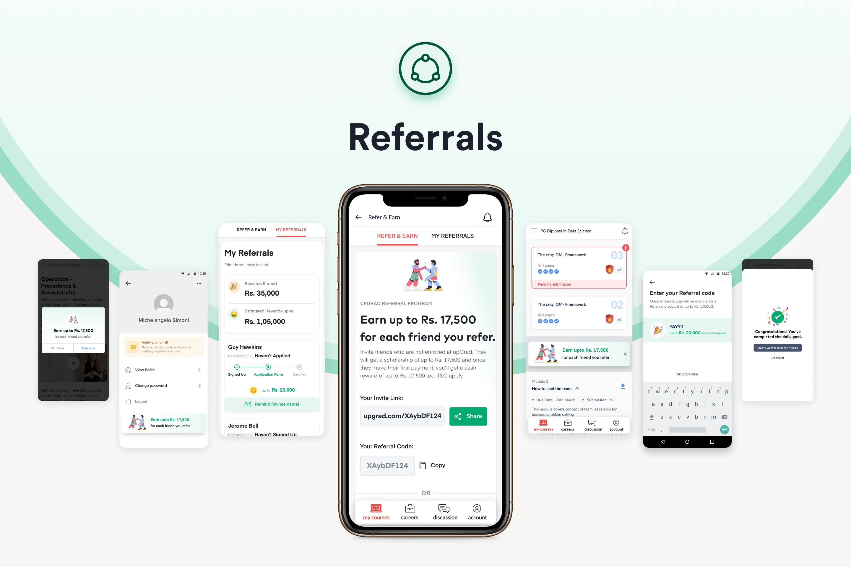
upGrad Referrals 2.0 showcasing the referral dashboard for both mobile and desktop, with a focus on a seamless omnichannel experience.

My objective was to completely overhaul upGrad’s referral system, transforming it from a buried desktop link into an omnipresent, psychology-driven growth engine aimed at pushing referral revenue from 12% to a massive 30%.

The Baseline: Why Referrals 1.0 Failed

Before designing the solution, I had to audit the failures of the existing system. The legacy referral program suffered from three fatal flaws that killed virality before it could start:
📱
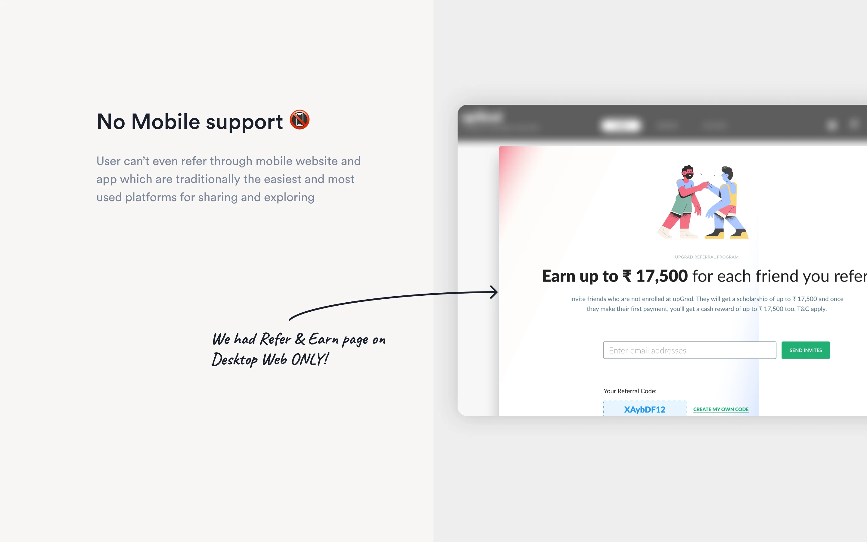
No Mobile Support The "Refer & Earn" page was desktop-only. For a feature that relies on users copying links to share via WhatsApp, iMessage, and social media, the lack of mobile support was a conversion killer.
pain point image 1
🙈
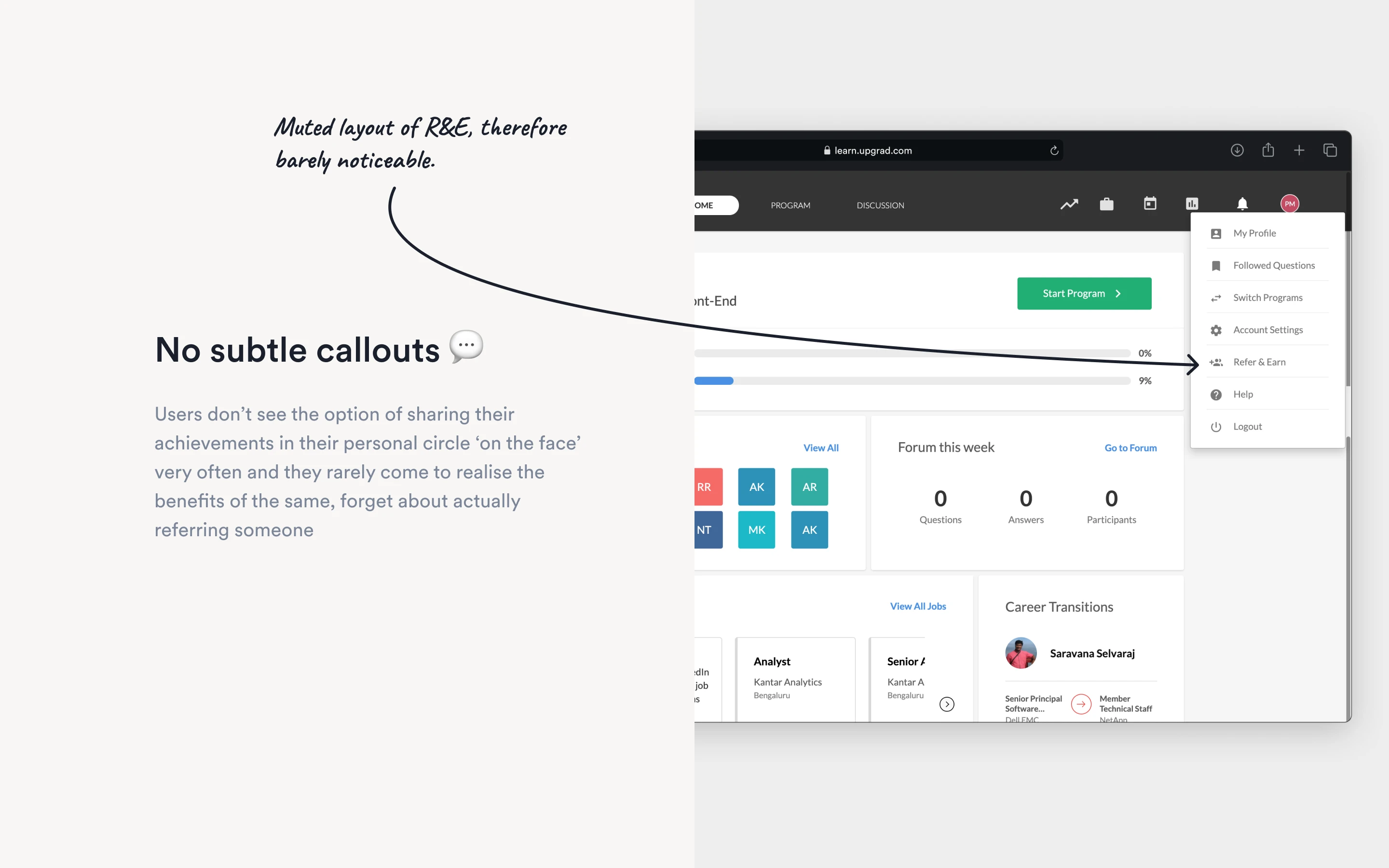
Buried Discoverability The referral option was muted and hidden deep within account settings dropdowns. Users rarely stumbled upon it naturally.
pain point image 2
🕳️
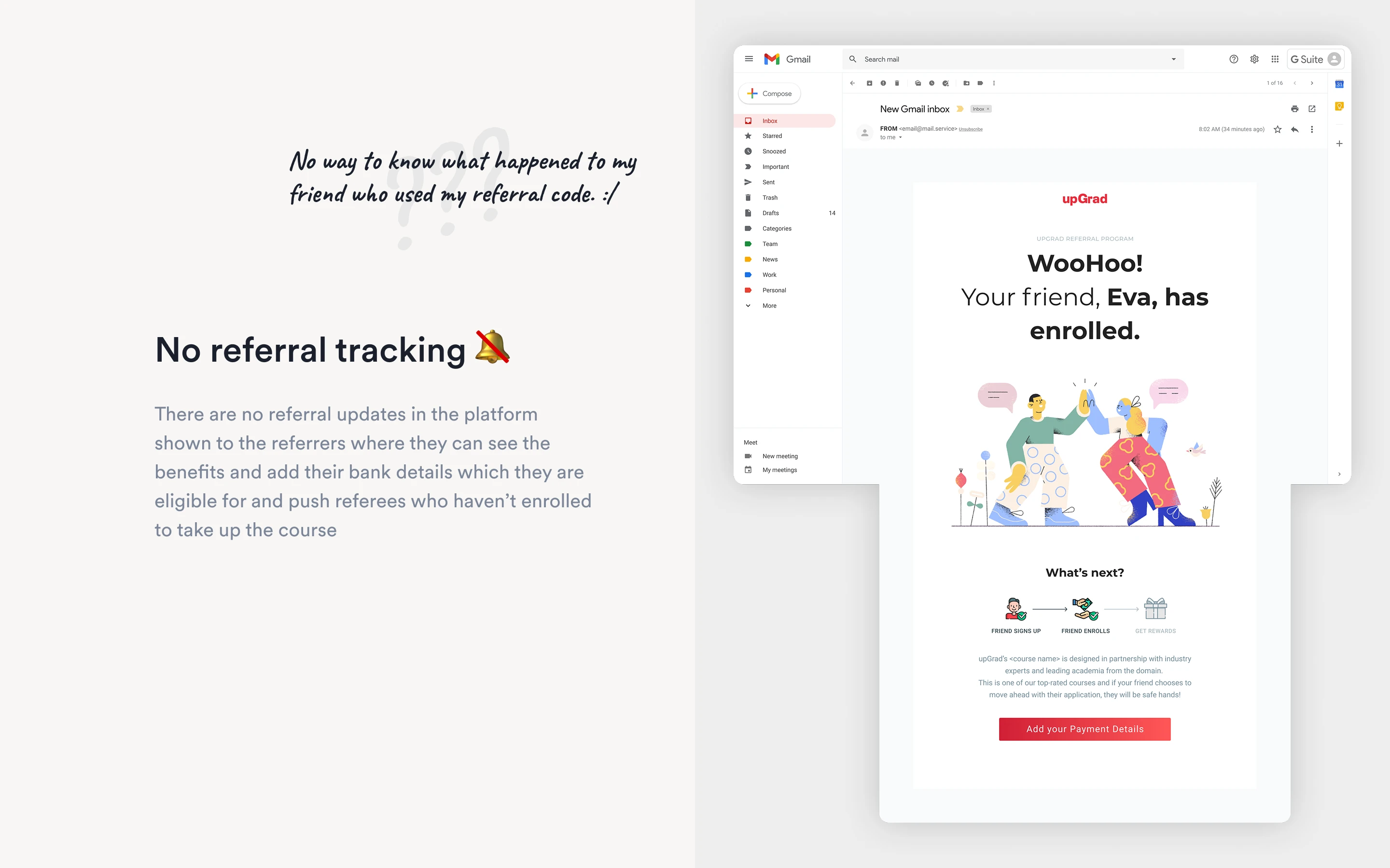
The "Black Hole" Effect There was zero tracking. Referrers would send a link and never know if their friend signed up, enrolled, or dropped off. Without feedback, motivation vanished.
pain point image 2

The Strategy: Mapping UI to Psychology

Growth design is behavioral design. Before wireframing, I mapped the motivations and blockers of both Referrers (existing learners) and Referees (prospective learners) against Cialdini’s Principles of Influence.
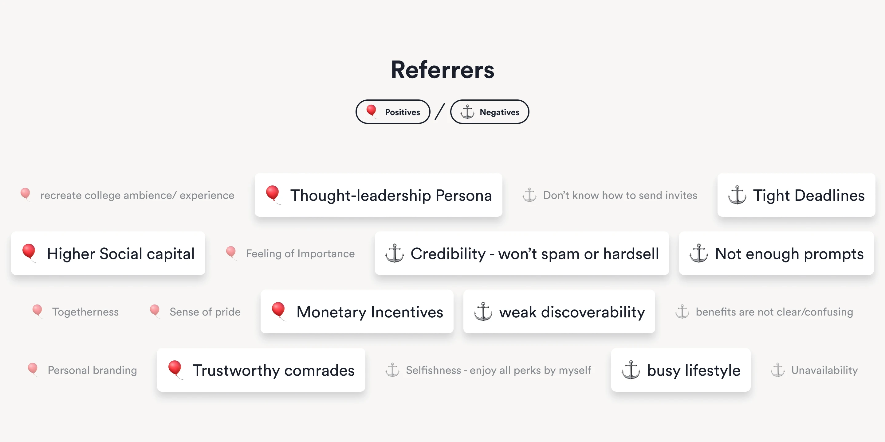
For the Referrer: We needed to leverage their desire for Thought-leadership and Social Capital while removing blockers like Busy Lifestyles and Weak Discoverability.
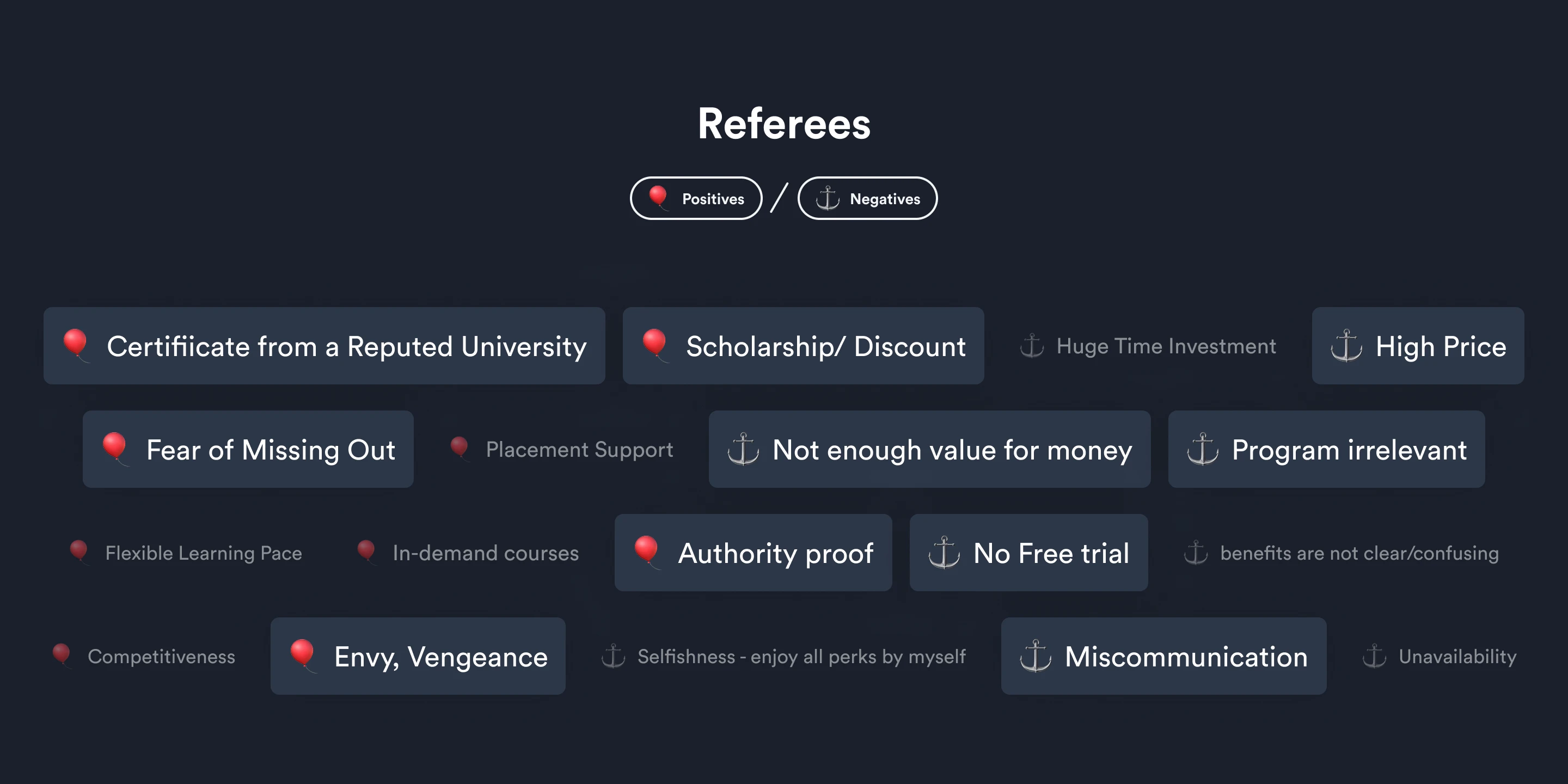
For the Referee: We needed to leverage Authority, FOMO, and Discounts to overcome their primary blockers: High Price and Time Investment.
pain point image 1
pain point image 2
What increases or decreases the chances of a user committing to a referral programme.

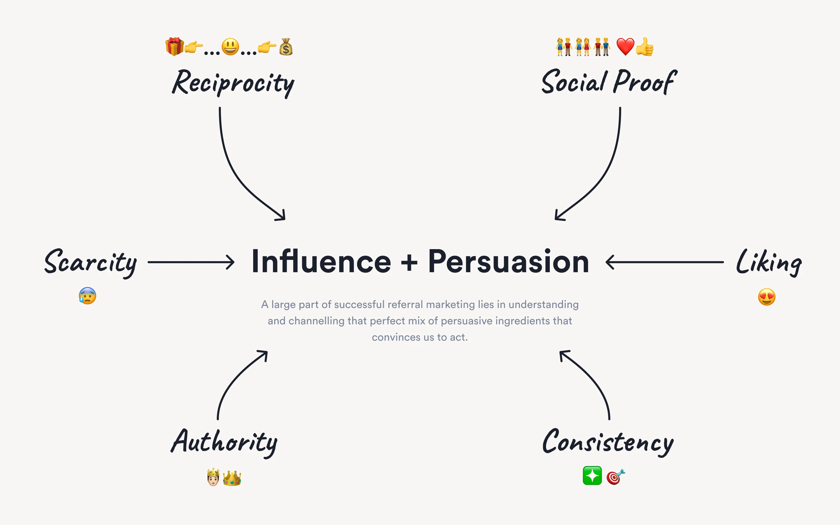
Every screen in Referrals 2.0 was designed to trigger specific psychological levers: Reciprocity, Social Proof, Scarcity, Authority, Liking, and Consistency.
user personas image
The psychological principles that formed the backbone of the referral system's design, mapped against the user journey of both Referrers and Referees.

The Execution: Designing Referrals 2.0

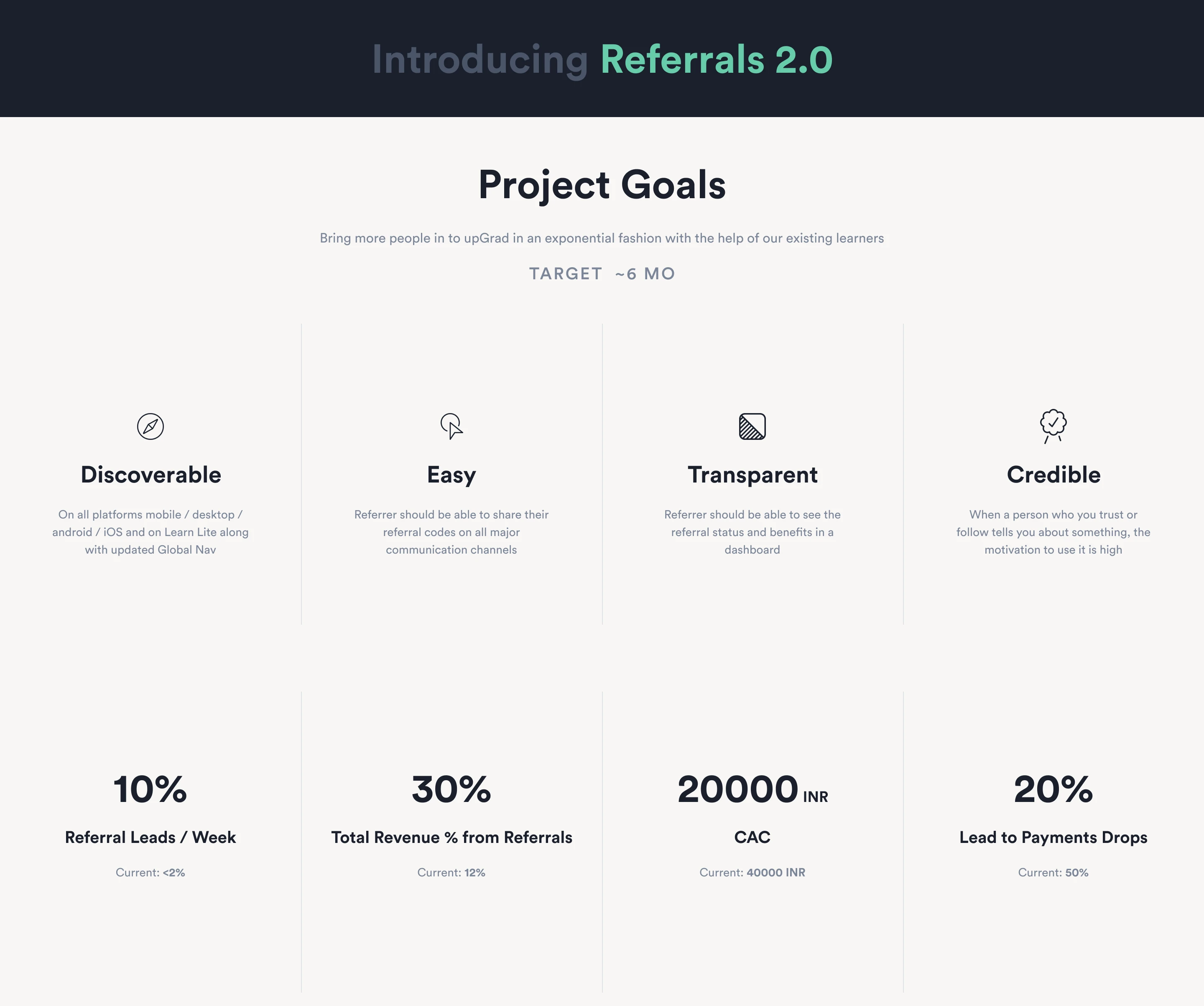
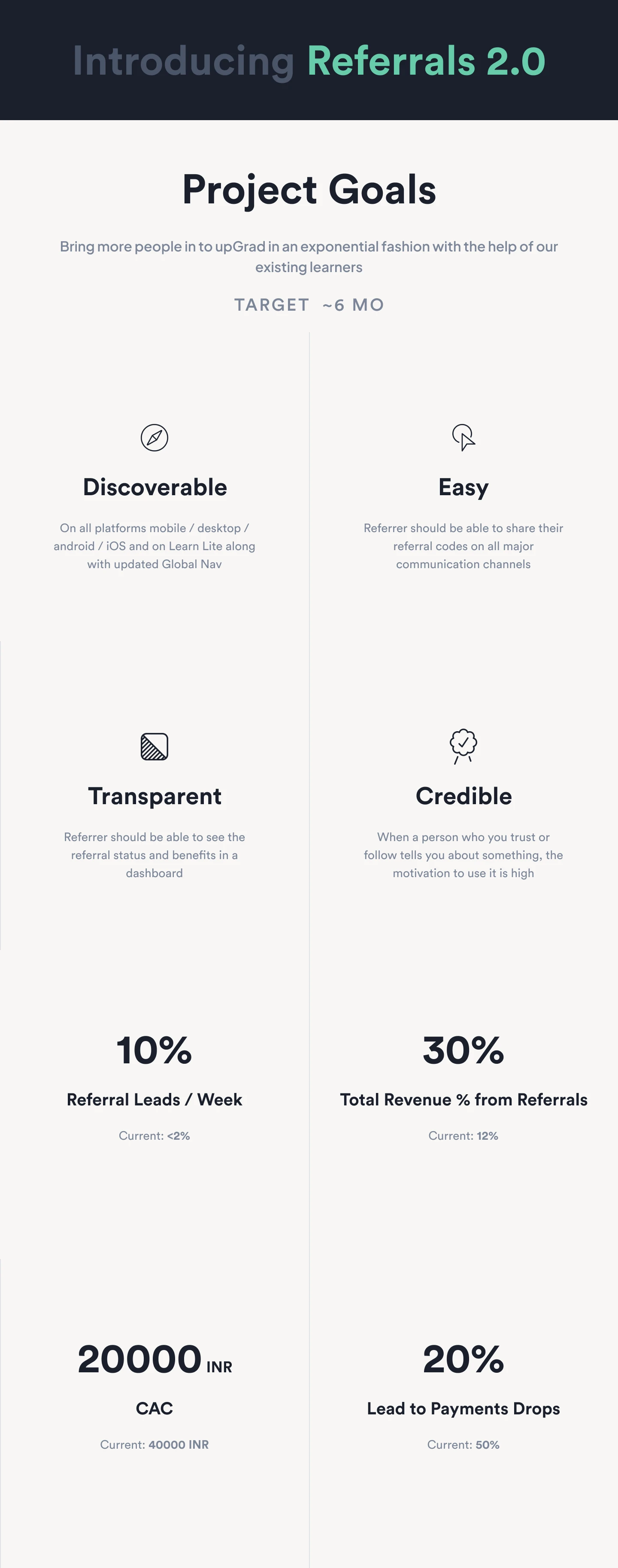
The new system was built around four strategic pillars to ensure it was discoverable, easy, transparent, and credible.
user personas image
Project pillars and their corresponding UI implementations that made up the core of Referrals 2.0's design strategy.

1.Omnipresence (Solving Discoverability)

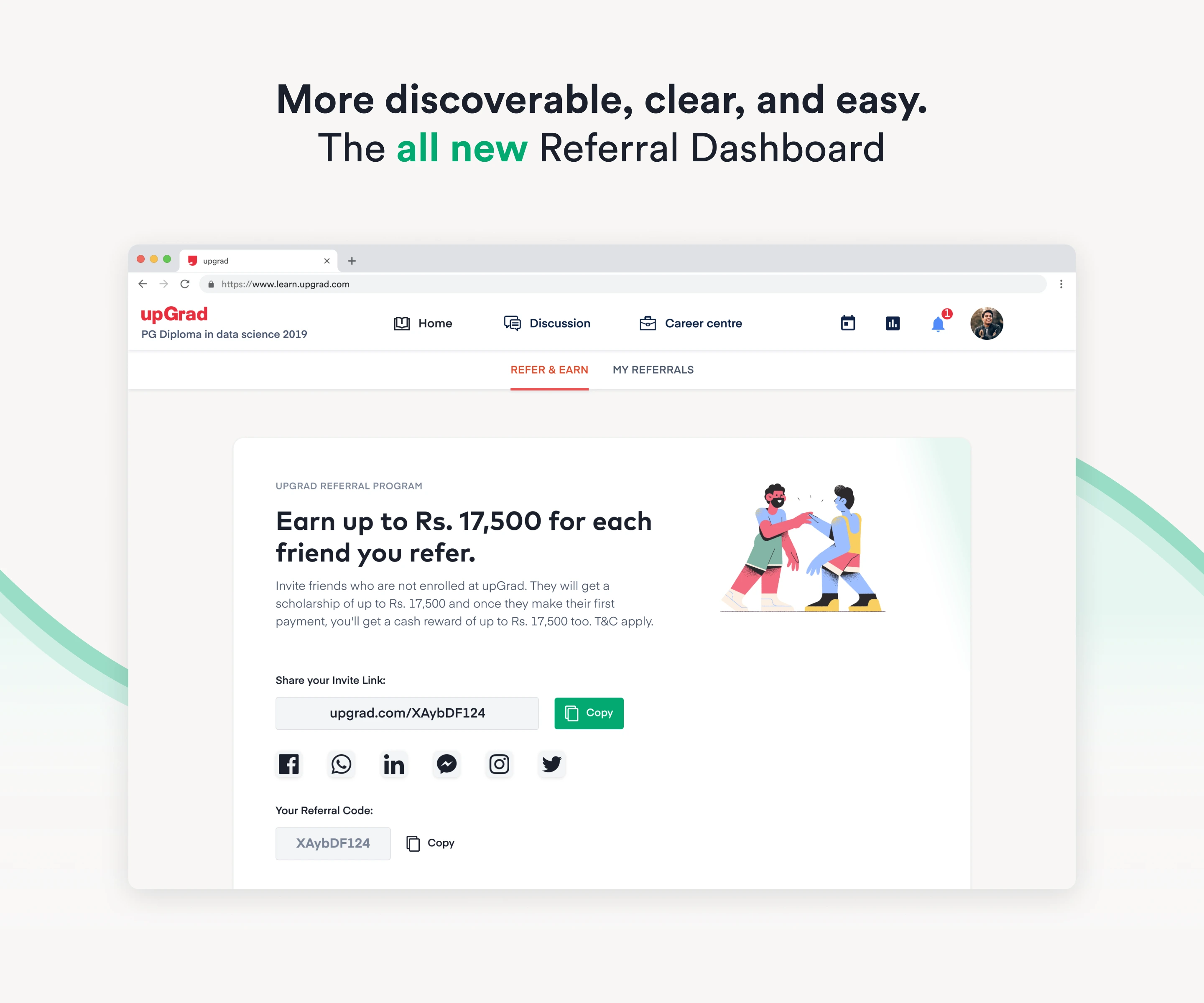
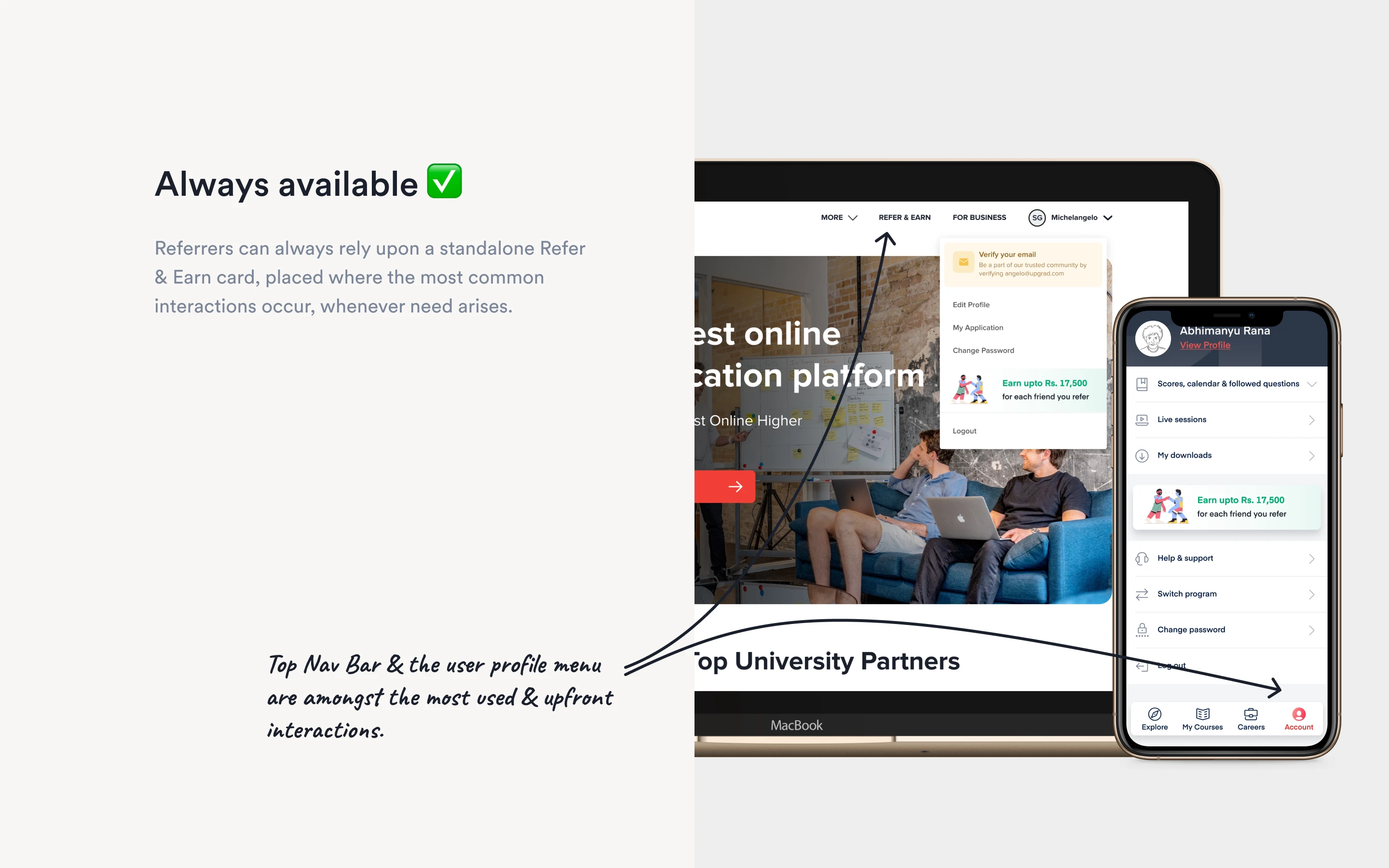
I pulled the referral entry points out of the dark. "Refer & Earn" was elevated to a standalone, permanent fixture in the top Global Navigation and the user profile menu—the highest-trafficked areas of the platform. It was no longer a hidden feature; it was a core part of the upGrad ecosystem.
user personas image
The referral program's new omnipresent entry points in the Global Navigation and user profile menu.

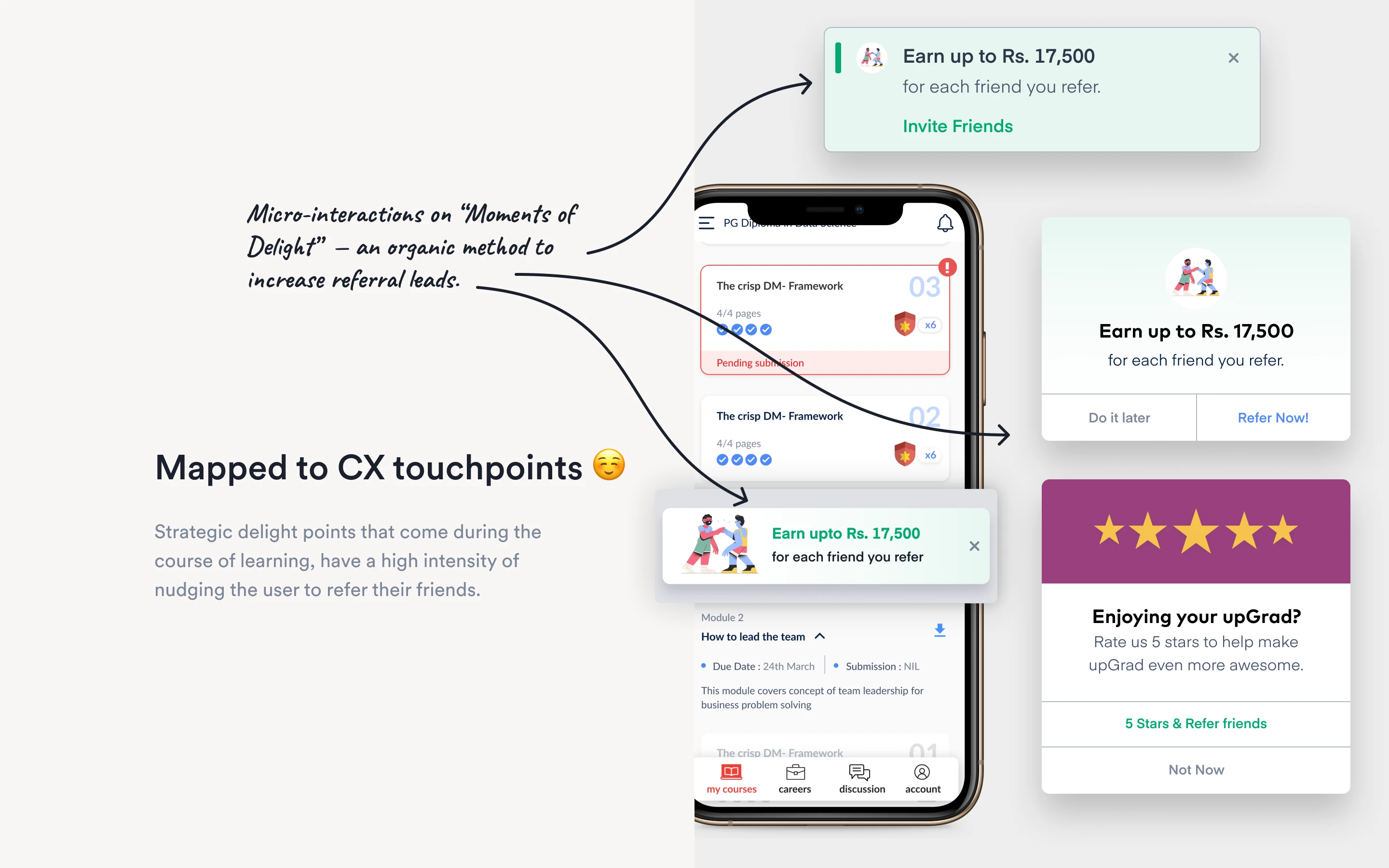
2.Contextual Nudges (Moments of Delight)

Instead of indiscriminately spamming users to refer their friends, we mapped prompts to the user's emotional high points.

Just scored 100% on a module?  👉 Prompt a referral.
Just gave a 5-star rating to the curriculum?  👉 Prompt a referral.

By triggering micro-interactions during "Moments of Delight," we captured users when their affinity for the brand was at its absolute peak.
user personas image
Contextual referral prompts triggered during "Moments of Delight".

3.The Transparency Dashboard (Solving the Black Hole)

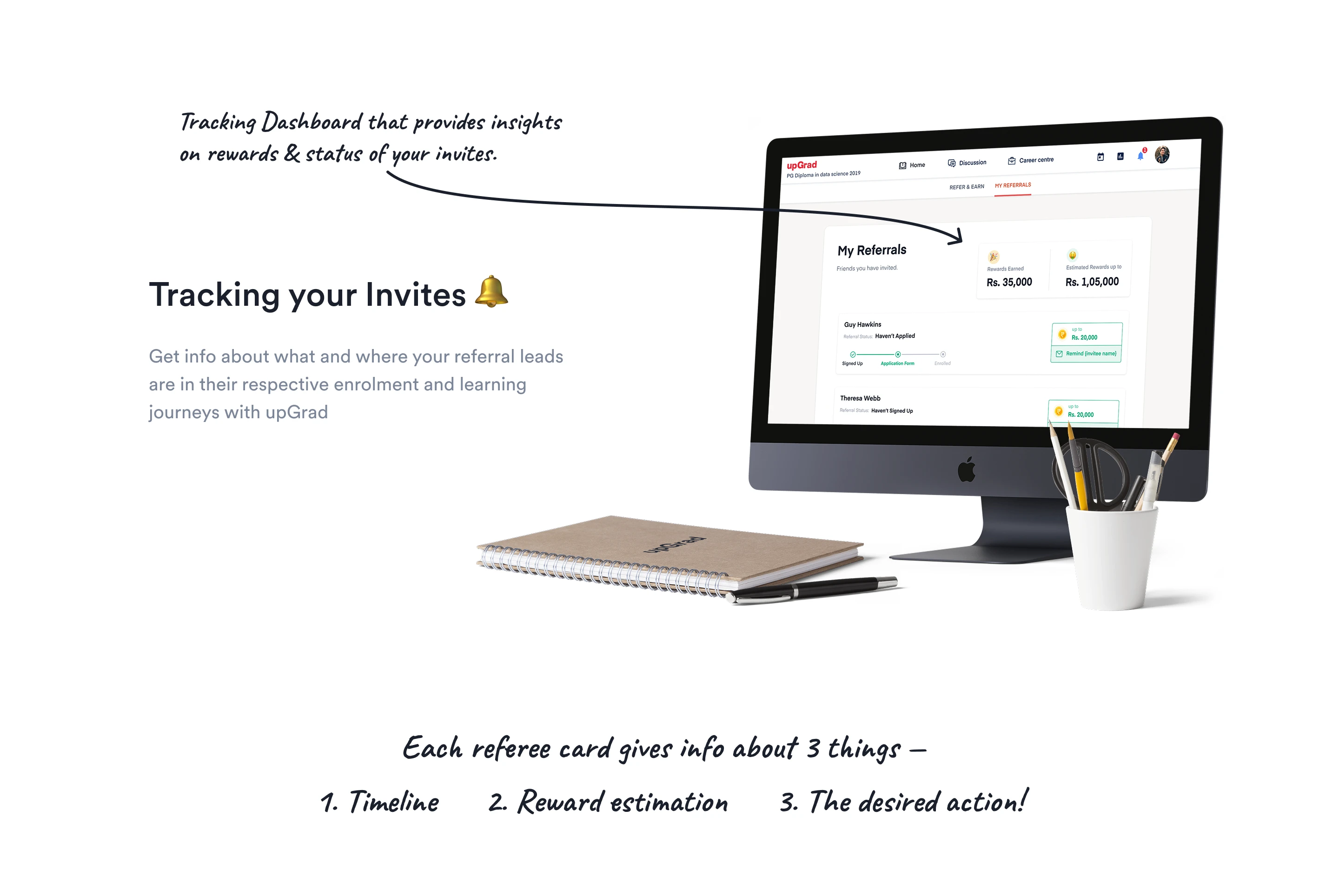
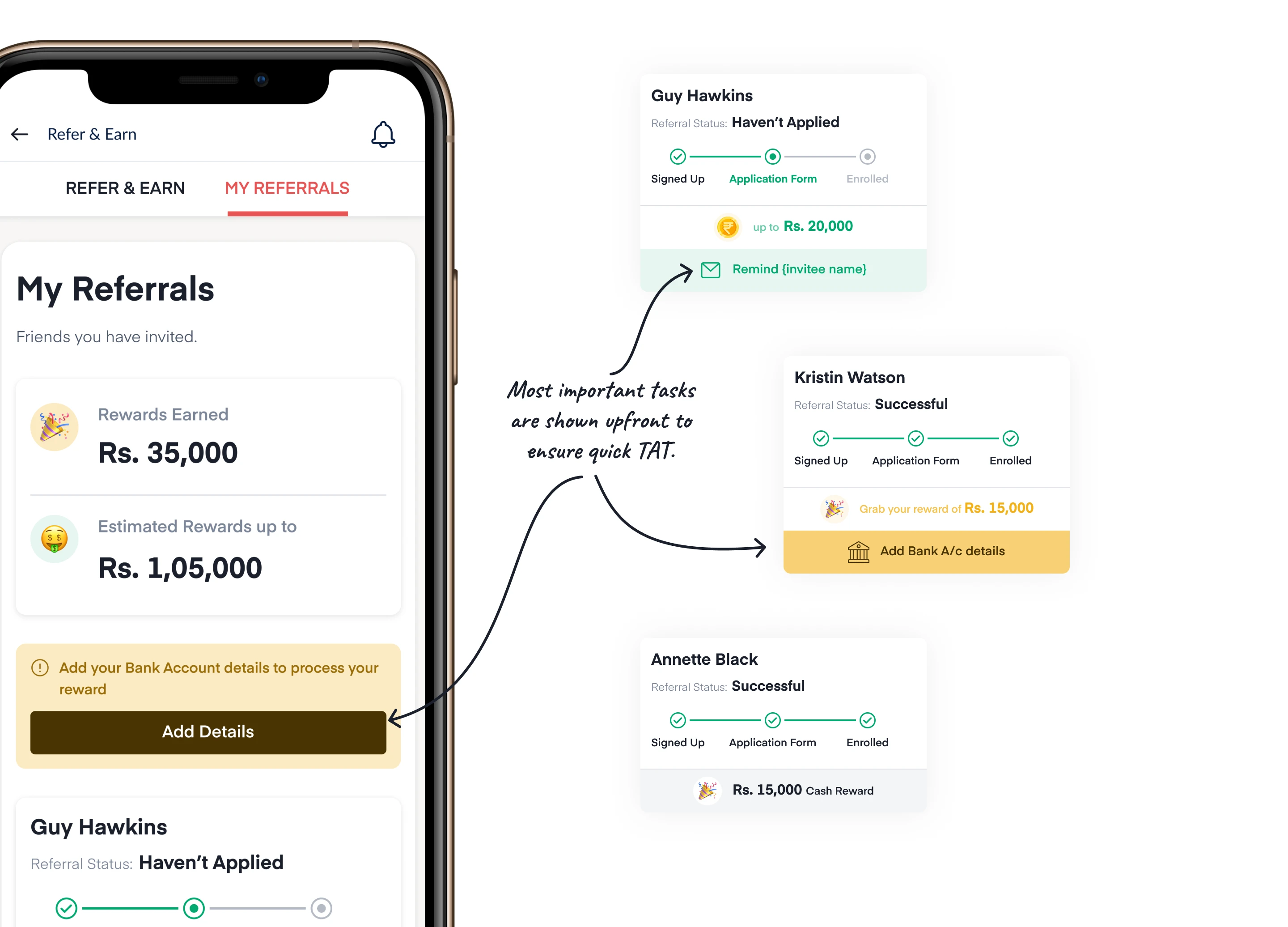
To encourage repeat referrals, users need to see their pipeline. I designed a comprehensive "My Referrals" dashboard that broke down the status of every invited friend into three clear metrics:
📍
Timeline Status Real-time tracking (Signed Up → Application Form → Enrolled).
💰
Reward Estimation Clear visibility into exactly how much cash was on the line (e.g., "Estimated Rewards up to Rs. 1,05,000").
🔔
Actionable Next Steps A simple, 1-click "Remind" button allowing the referrer to gently nudge their friend if they were stuck in the funnel.
pain point image 1
The "My Referrals" dashboard providing real-time tracking, reward estimation, and actionable next steps to solve the "Black Hole" effect.
pain point image 2
The "Remind" feature allowing referrers to nudge their friends with a single click, increasing conversion rates for pending referrals.

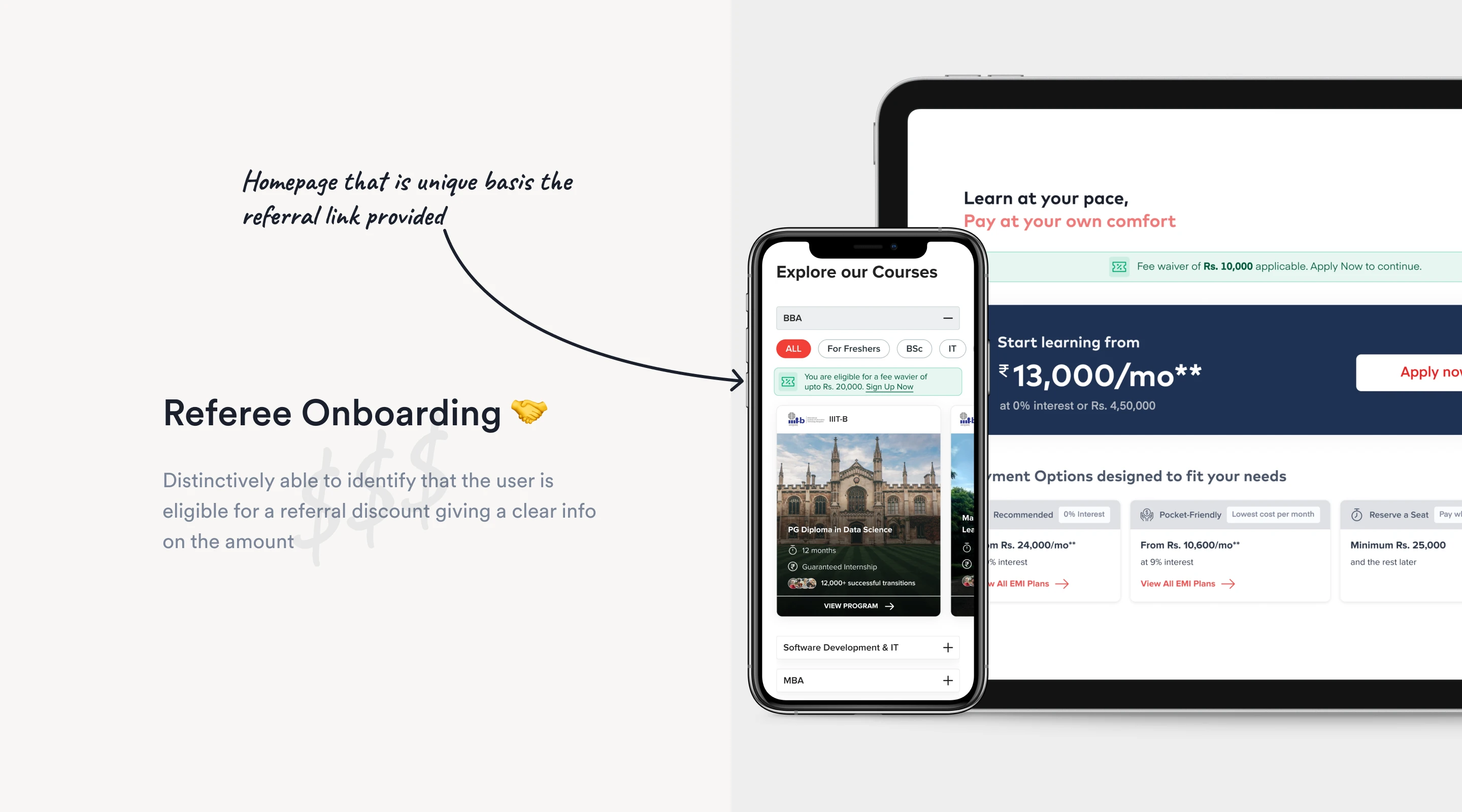
4.Frictionless Referee Onboarding

For the incoming referee, attribution had to be bulletproof. I designed the flow so that a referral code could be applied at any junction of the onboarding journey—whether during initial sign-up, inside the application form, or right at the final payment gateway.

"Never miss a beat" meant ensuring fair play and guaranteed payouts for the referrer.
user personas image
The referee onboarding flow designed to allow referral code application at any stage, ensuring accurate attribution and maximizing conversion rates.

The Vision: Referrals 3.0

To hit the aggressive target of reducing Customer Acquisition Cost (CAC) by 50% (from ₹40k to ₹20k), the future of the product needed to push the psychological levers even further.
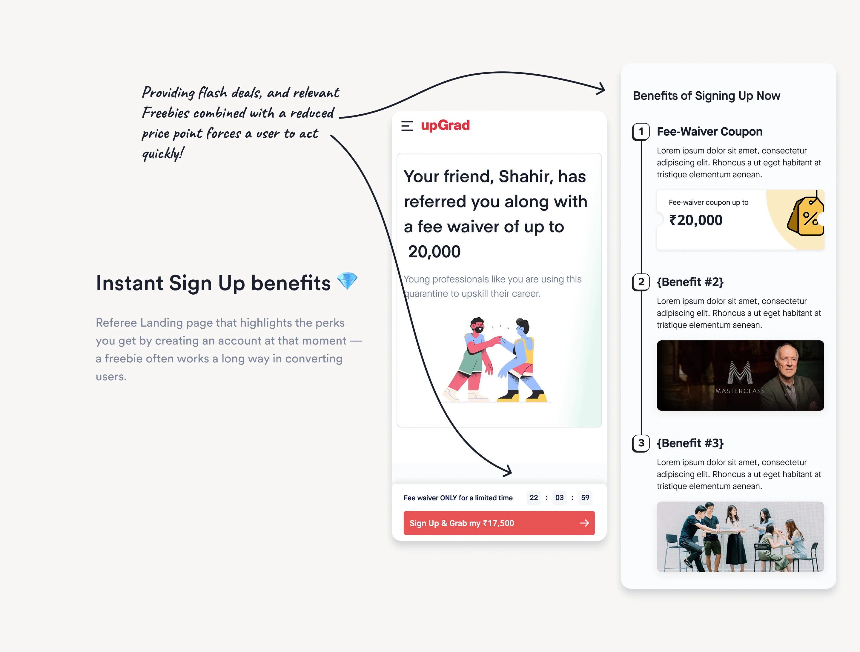
Scarcity & Reciprocity I designed dynamic Referee Landing Pages featuring flash deals—countdown timers for fee waivers coupled with high-value freebies (like Masterclass access) to force immediate action.
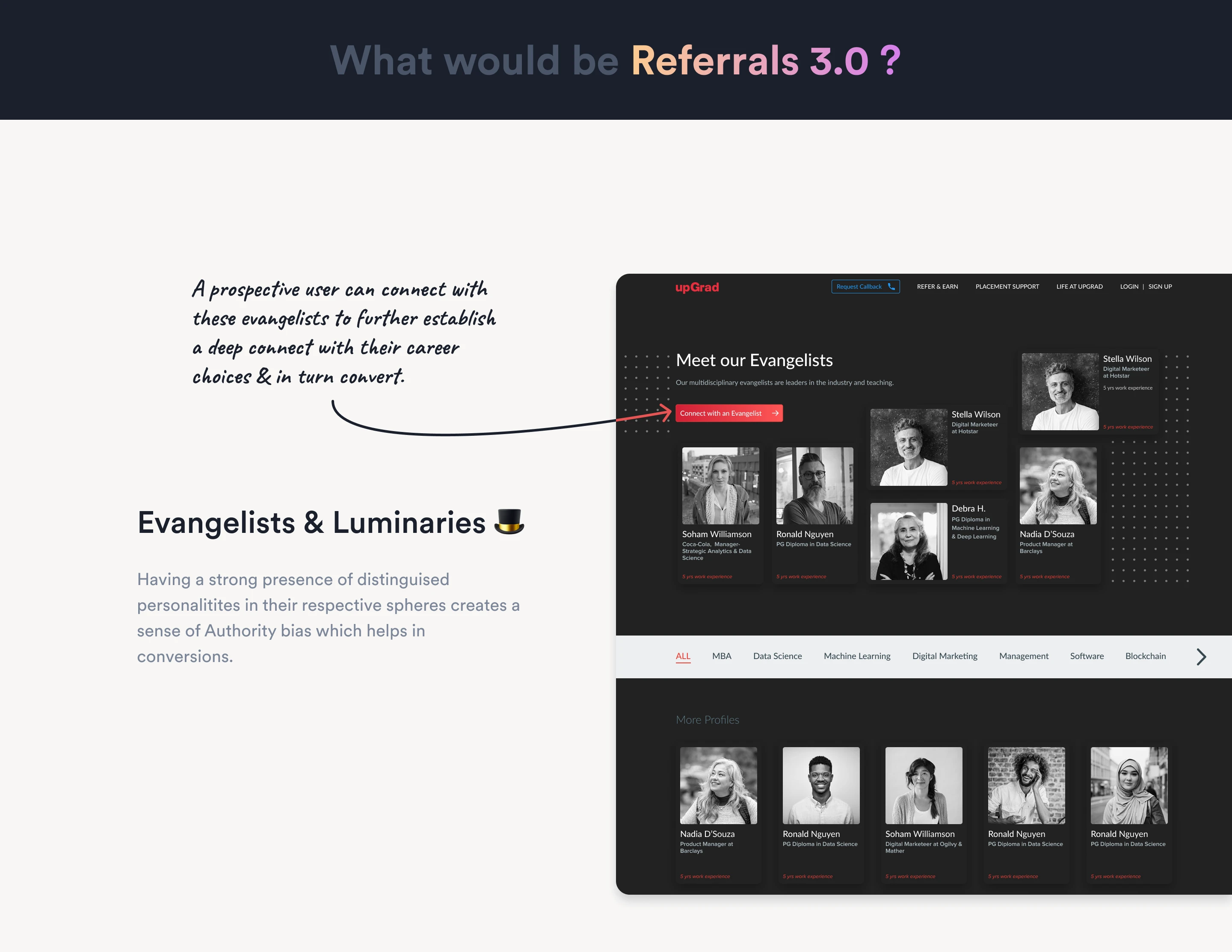
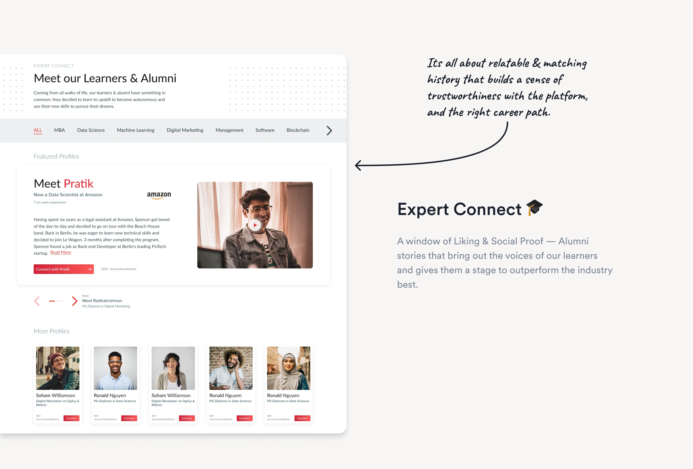
Authority & Liking (Expert Connect) To build immense trust, I conceptualized a directory of "Evangelists & Luminaries." Prospective users could read stories from relatable alumni who successfully transitioned their careers, leveraging social proof to convert high-friction leads.
pain point image 1
The "Evangelists & Luminaries" directory featuring relatable alumni stories to build trust and leverage social proof for converting high-friction leads.
pain point image 2
Dynamic Referee Landing Pages featuring flash deals with countdown timers and high-value freebies to create urgency and drive immediate action.
pain point image 2
A future vision of the referral dashboard incorporating advanced gamification elements like leaderboards, badges, and tiered rewards to further incentivize user engagement and foster a competitive community around referrals.

Reflections

"A referral is the ultimate form of user trust. You cannot hack it with dark patterns—you have to earn it with transparency and a flawless user experience."

By moving away from a static "share link" page and building a transparent, context-aware tracking system, this redesign proved that organic growth isn't just a marketing function—it is a deeply integrated product design problem.
Keep Exploring

Previous Project
Part 01
📝 MINI CASE STUDY

Offboarding

Next Project
Part 03
📝 MINI CASE STUDY

Checkout

Home Work case studies About More about Pankhil Lab Digital garden Writing Shower thoughts, really! Contact Let's chat