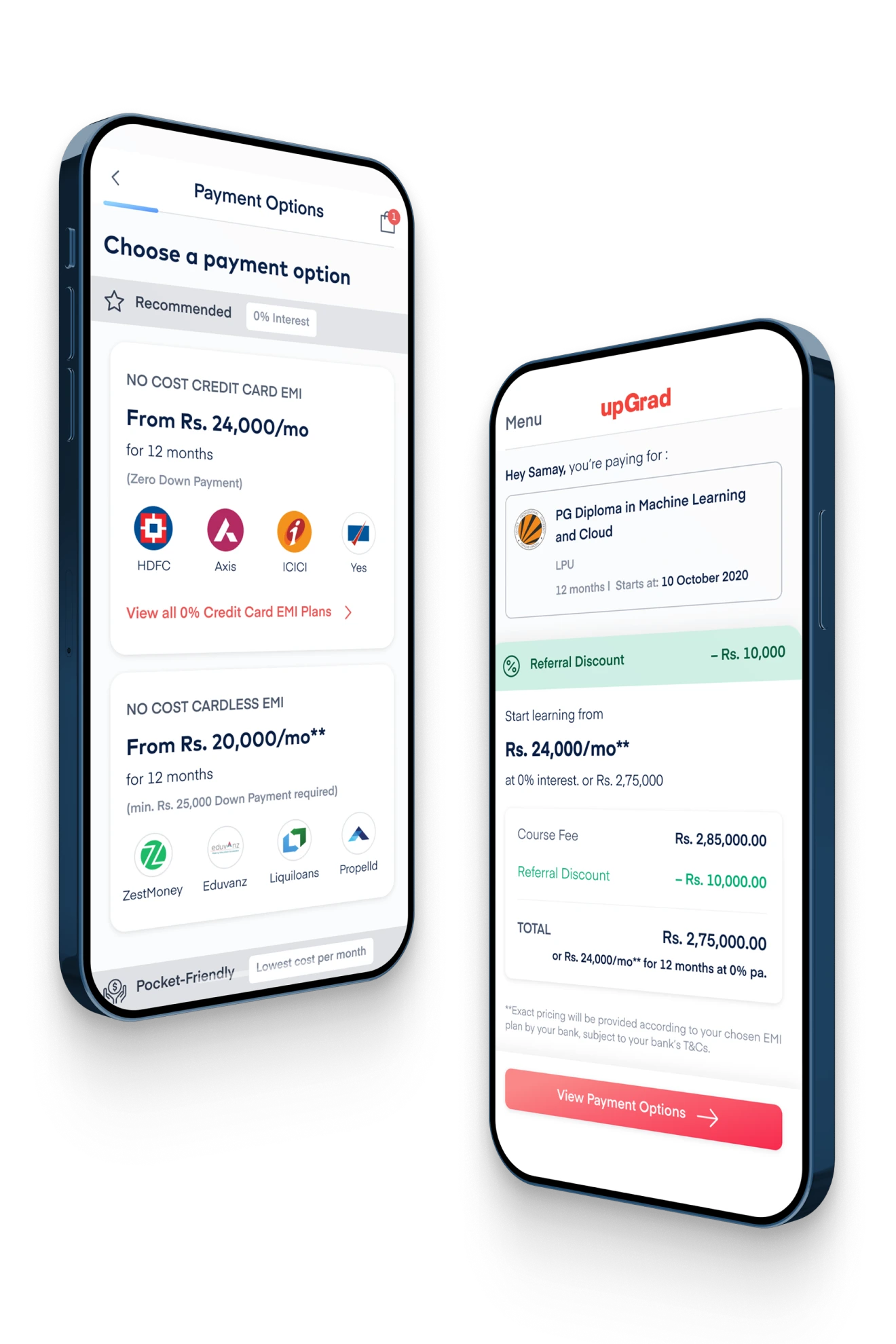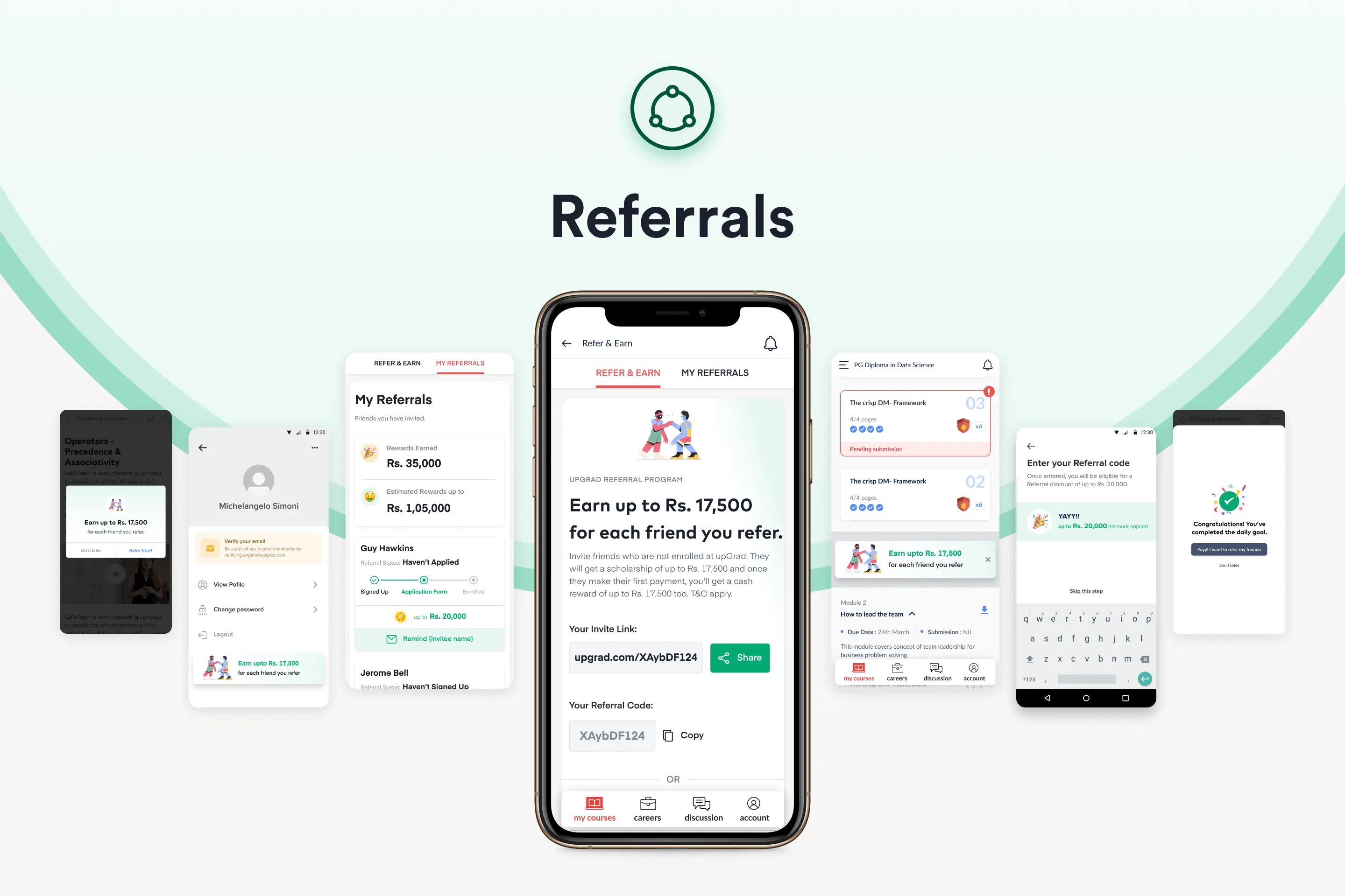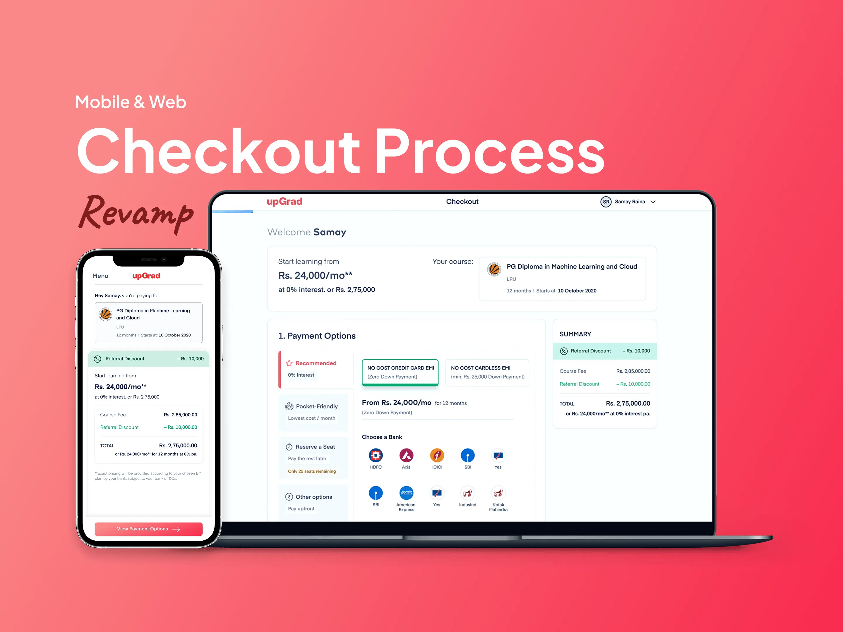
My objective was to completely deconstruct and rebuild upGrad’s payment flow. The goal was to replace an administrative, human-dependent legacy system with an intuitive, self-serve e-commerce checkout experience across all platforms.
The Baseline: Diagnosing a 70% Drop-off
To fix the funnel, we first had to understand where it was breaking. A deep dive into the analytics revealed a brutal reality:
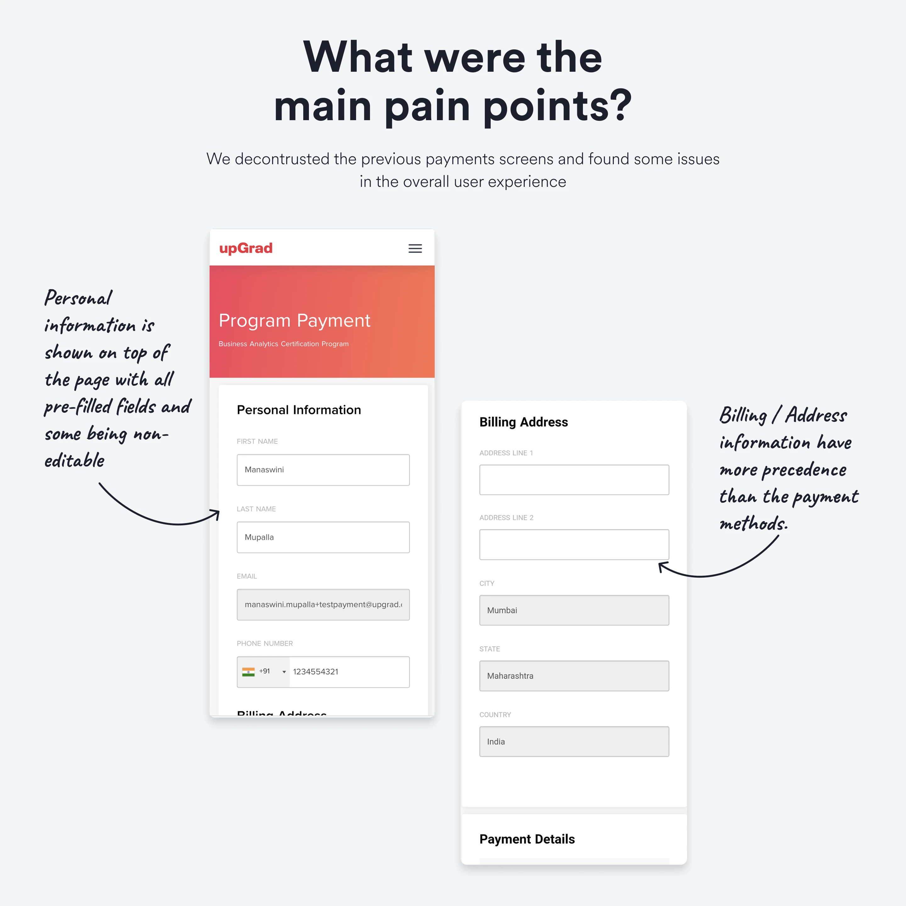
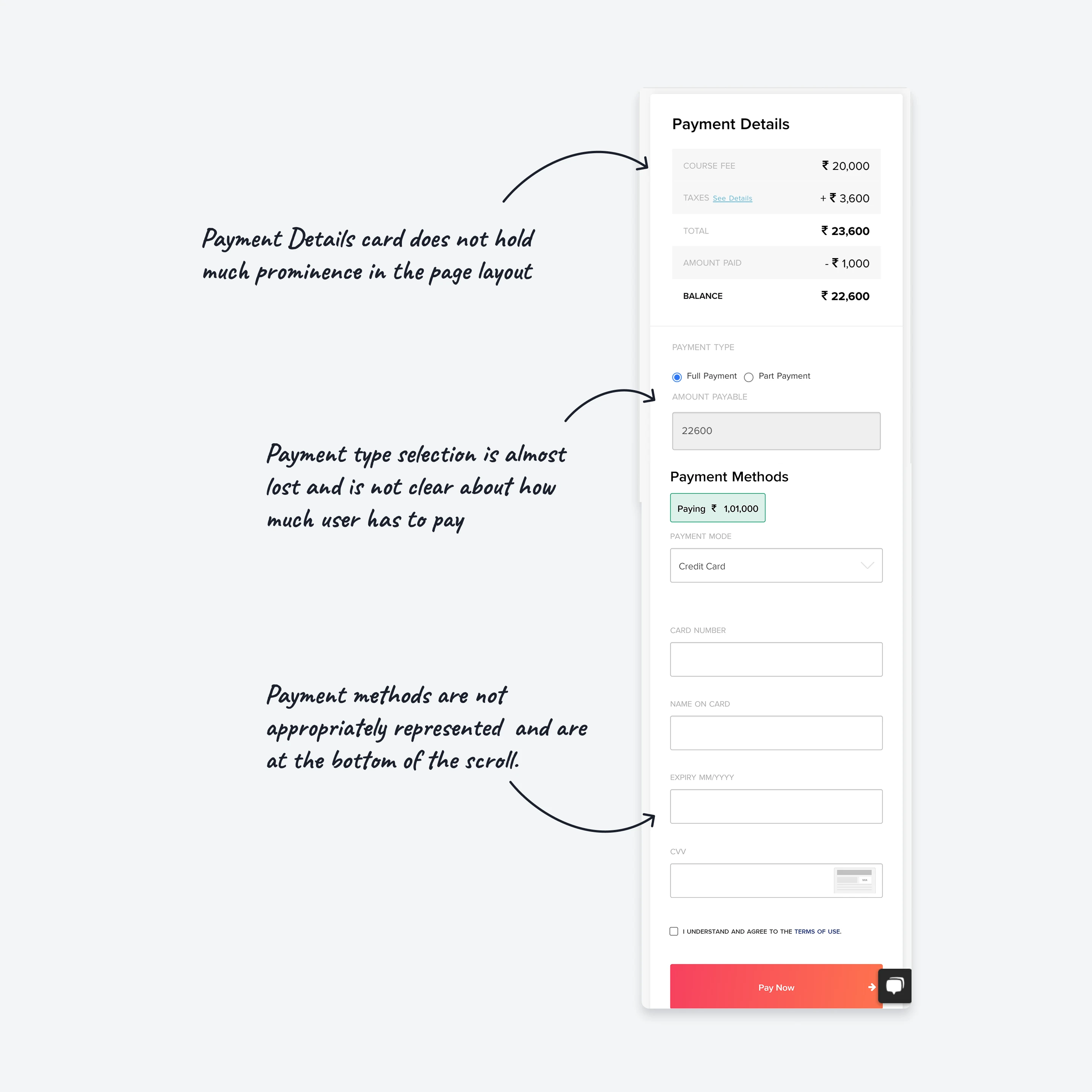
An audit of the legacy UI made the problem obvious. The checkout felt like a bureaucratic form, not a modern consumer experience. Personal information and billing addresses took visual precedence, pushing the actual payment methods and cost breakdowns to the absolute bottom of the scroll.
Payment types were confusing, and users lacked clarity on exactly how much they were required to pay today versus later.
The Strategy: Designing for Financial Personas
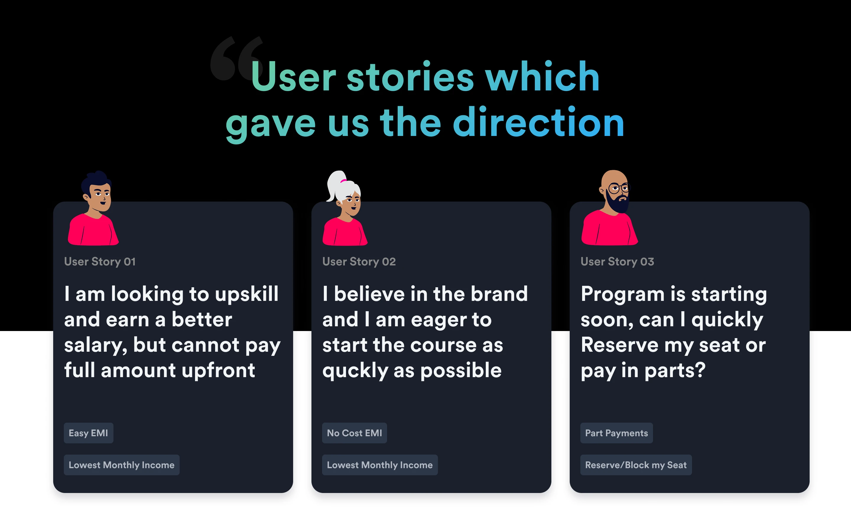
We couldn't just redesign the UI; we had to redesign the decision-making process. I identified three distinct user personas based on their financial realities:
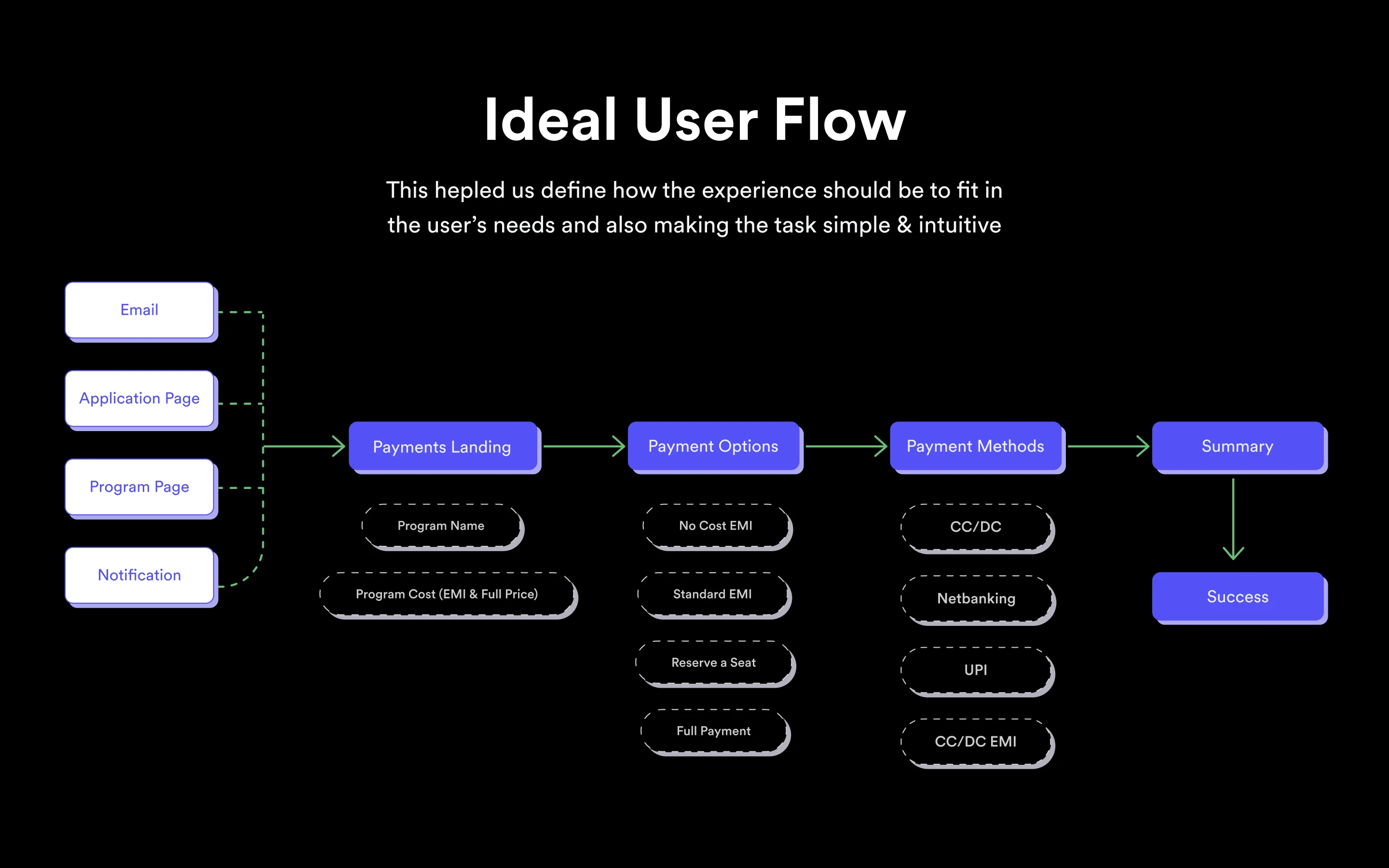
I restructured the entire Ideal User Flow (IUF) to accommodate these realities: Payments Landing → Payment Options (Affordability) → Payment Methods → Summary → Success.
The Execution: A Consumer-First Checkout
1.Intent-Based Categorization & FOMO
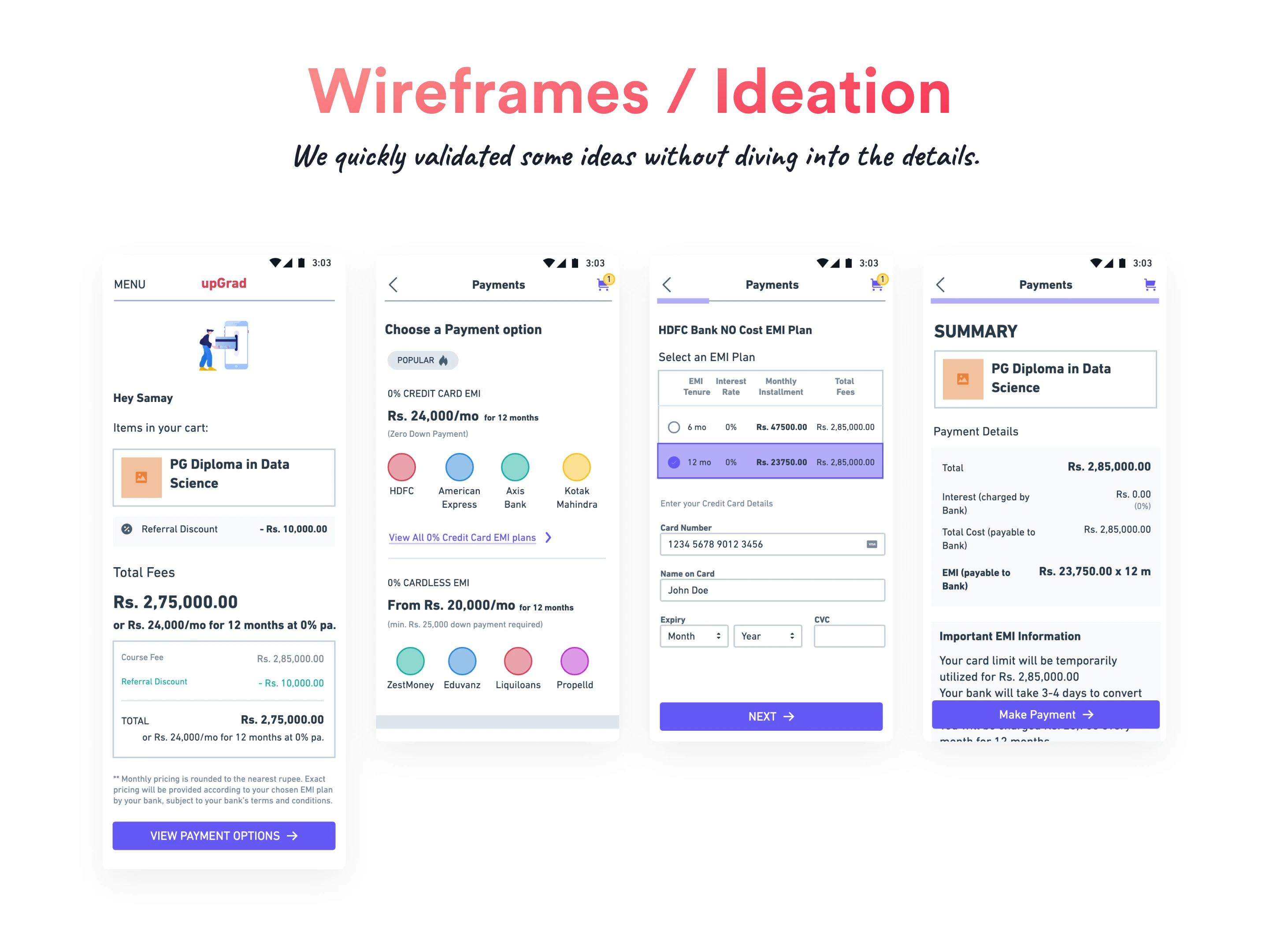
Instead of overwhelming users with a massive list of banks, I categorized payment options by user intent. The UI featured clear, distinct tabs:
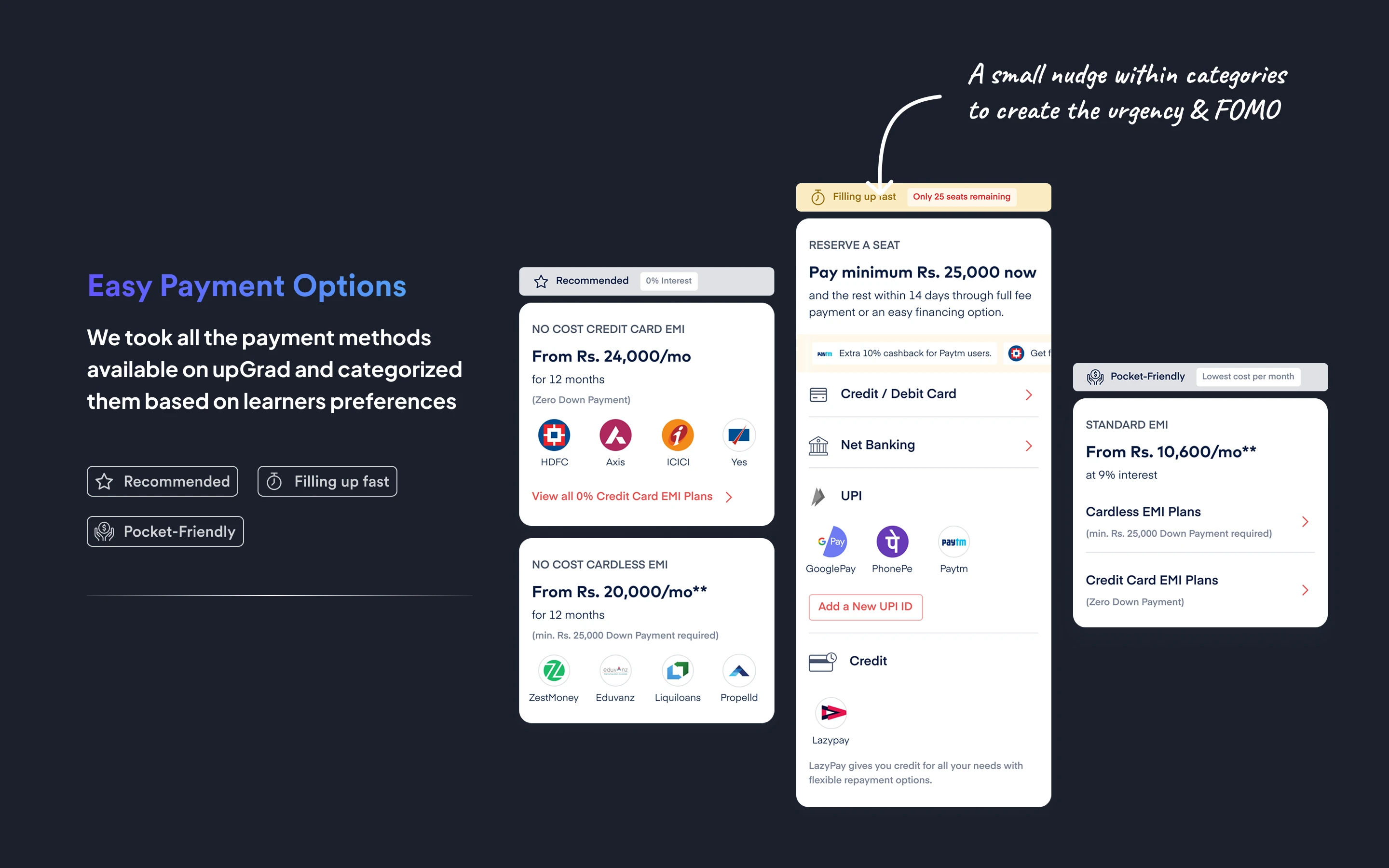
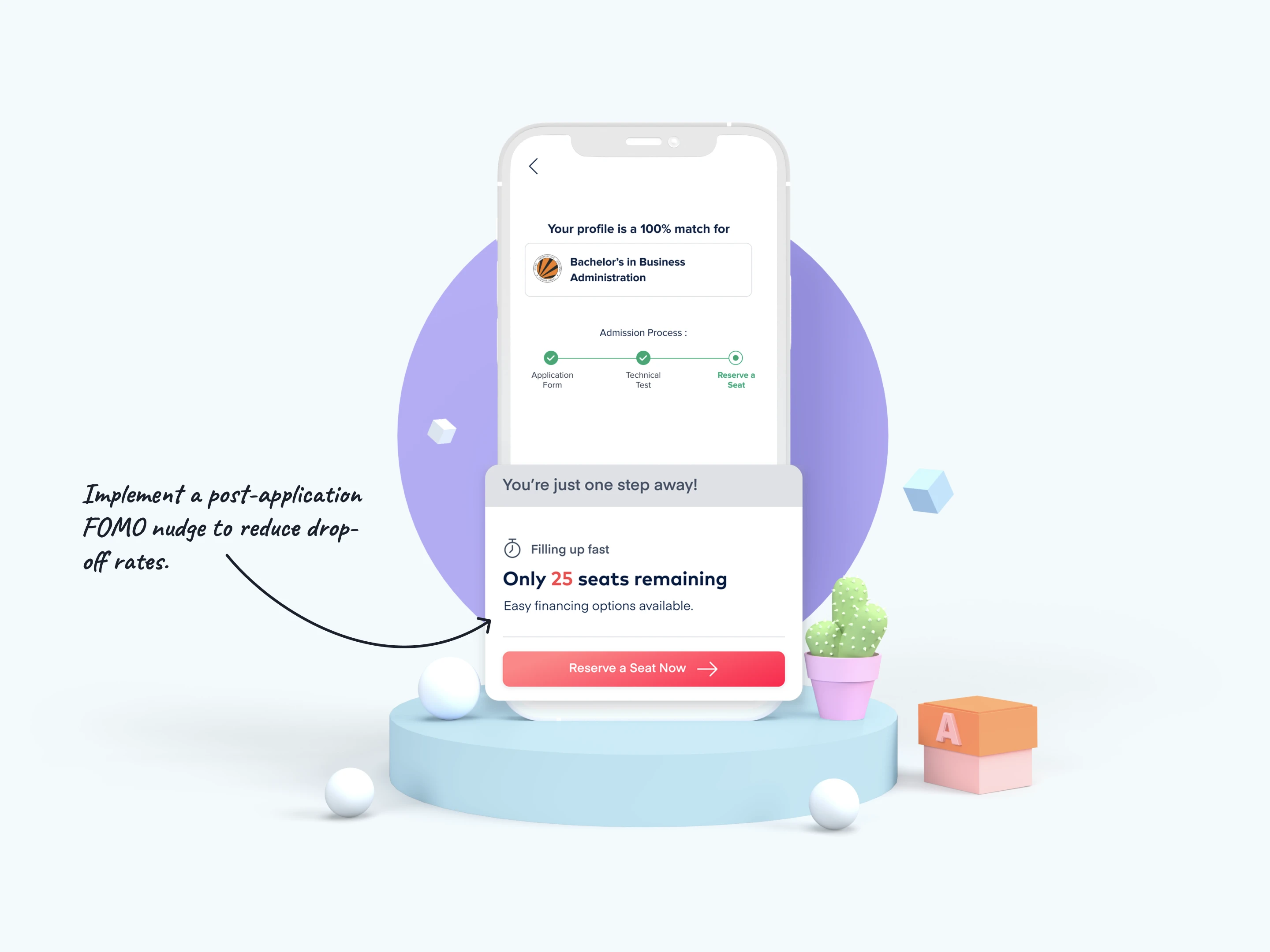
We paired the "Reserve a Seat" option with a subtle post-application nudge ("Only 25 seats remaining") to ethically manufacture urgency and drive immediate micro-conversions.
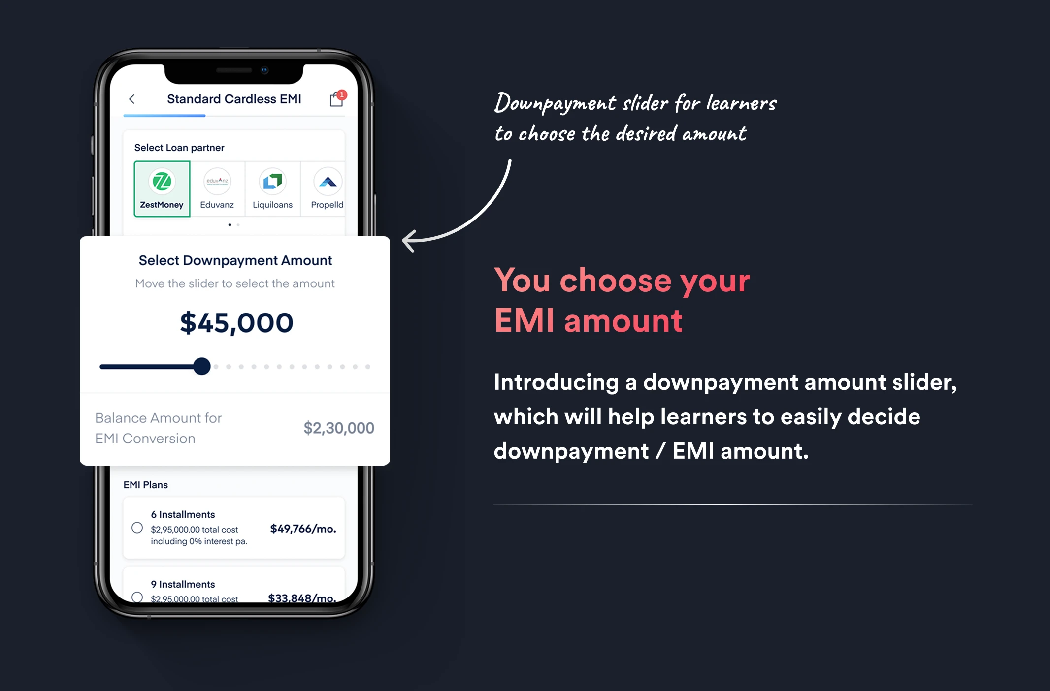
2.Giving Control Back: The Downpayment Slider
One of the most significant points of friction in high-ticket EMIs is the inflexibility of terms. I introduced a dynamic downpayment slider. Users could literally drag a slider to choose their upfront payment amount, which instantly updated their subsequent EMI balances. This transferred financial control from the system back to the user, drastically reducing payment anxiety.
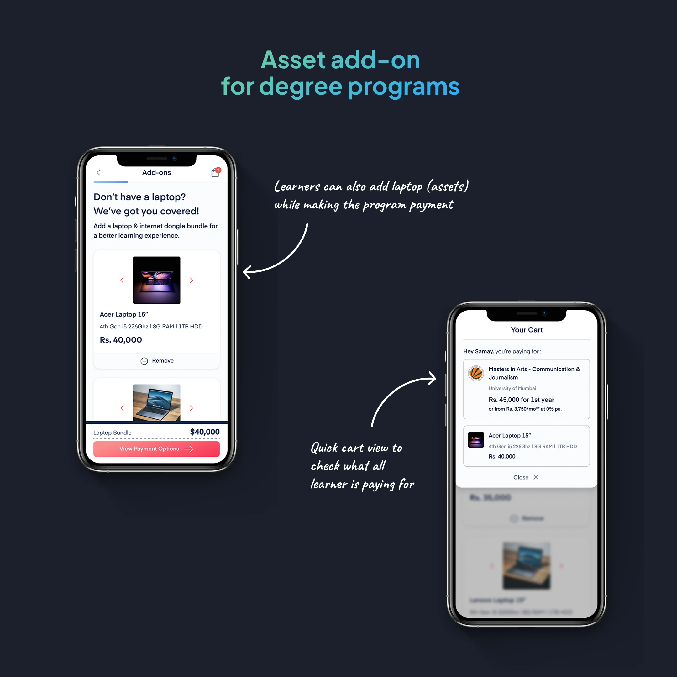
3.E-commerce Dynamics: Cart Views & Hardware Upsells
Education is an investment, but it shouldn't feel devoid of modern shopping conveniences. For specific degree programs, I designed a seamless "Add-on" flow allowing learners to bundle assets (like a laptop or internet dongle) directly into their program payment. A quick, slide-up "Cart View" allowed users to verify exactly what they were paying for before proceeding.
4.Radical Transparency & Instant Gratification
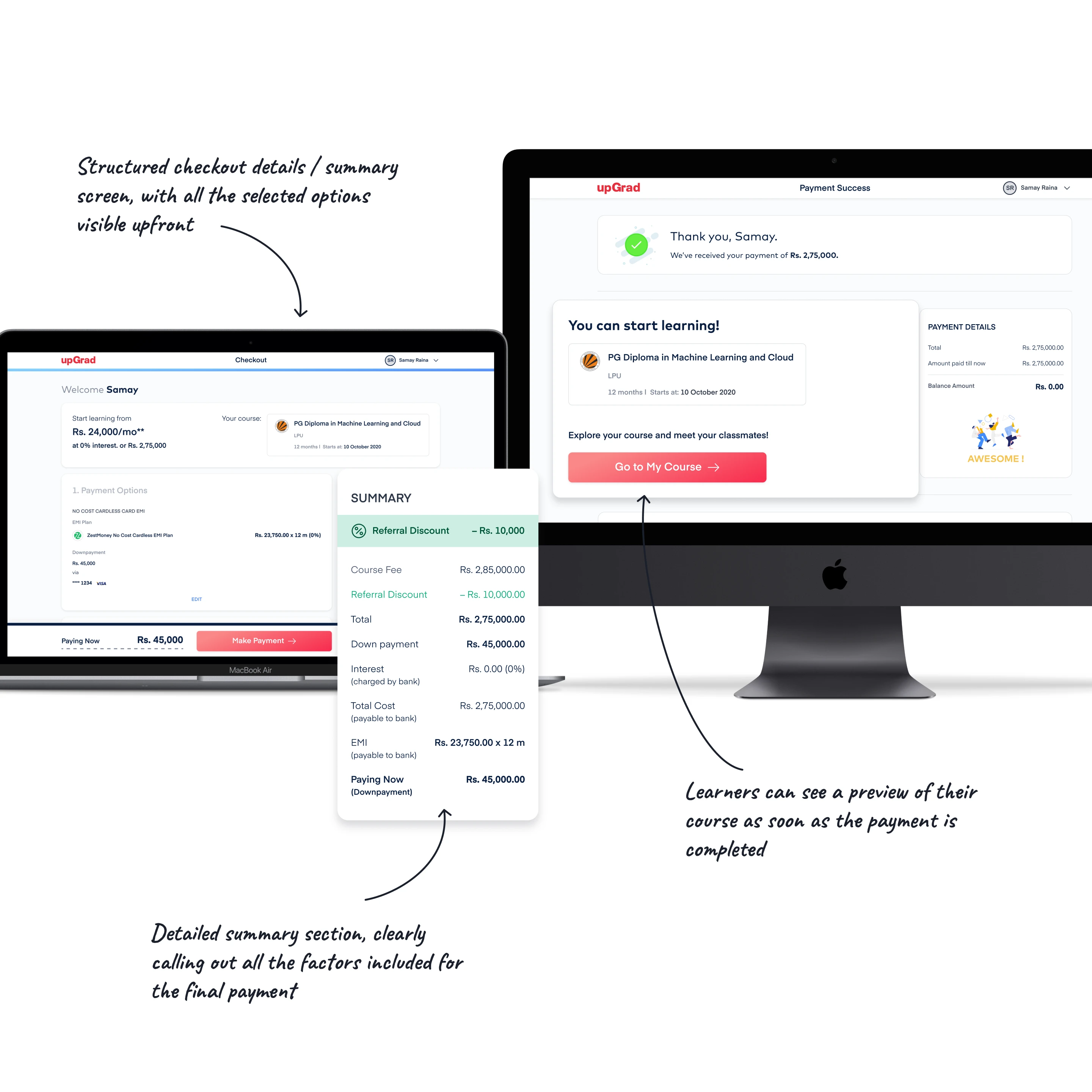
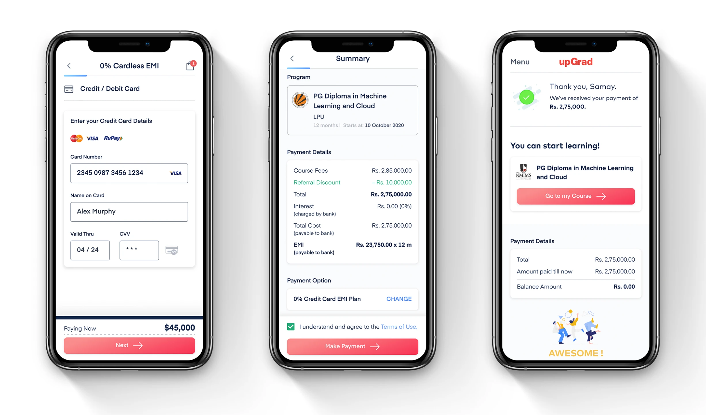
Hidden fees kill trust. The new checkout featured a highly structured, persistent Summary Card. It explicitly detailed the course fee, referral discounts, downpayments, interest charges, and the final EMI breakdown.
Finally, the success state was redesigned. Instead of a generic "Thank you for your payment" dead-end, the success screen instantly dropped them into their cohort: "You can start learning! Go to My Course →".
Reflections
"Checkout design is not just about routing money; it is about managing cognitive load and financial anxiety at the exact moment a user is most vulnerable."
By shifting the paradigm from a "Billing Form" to a "Guided E-commerce Checkout," this redesign proved that even high-ticket, complex educational purchases can be completely self-served when you prioritize clarity, flexibility, and transparency.